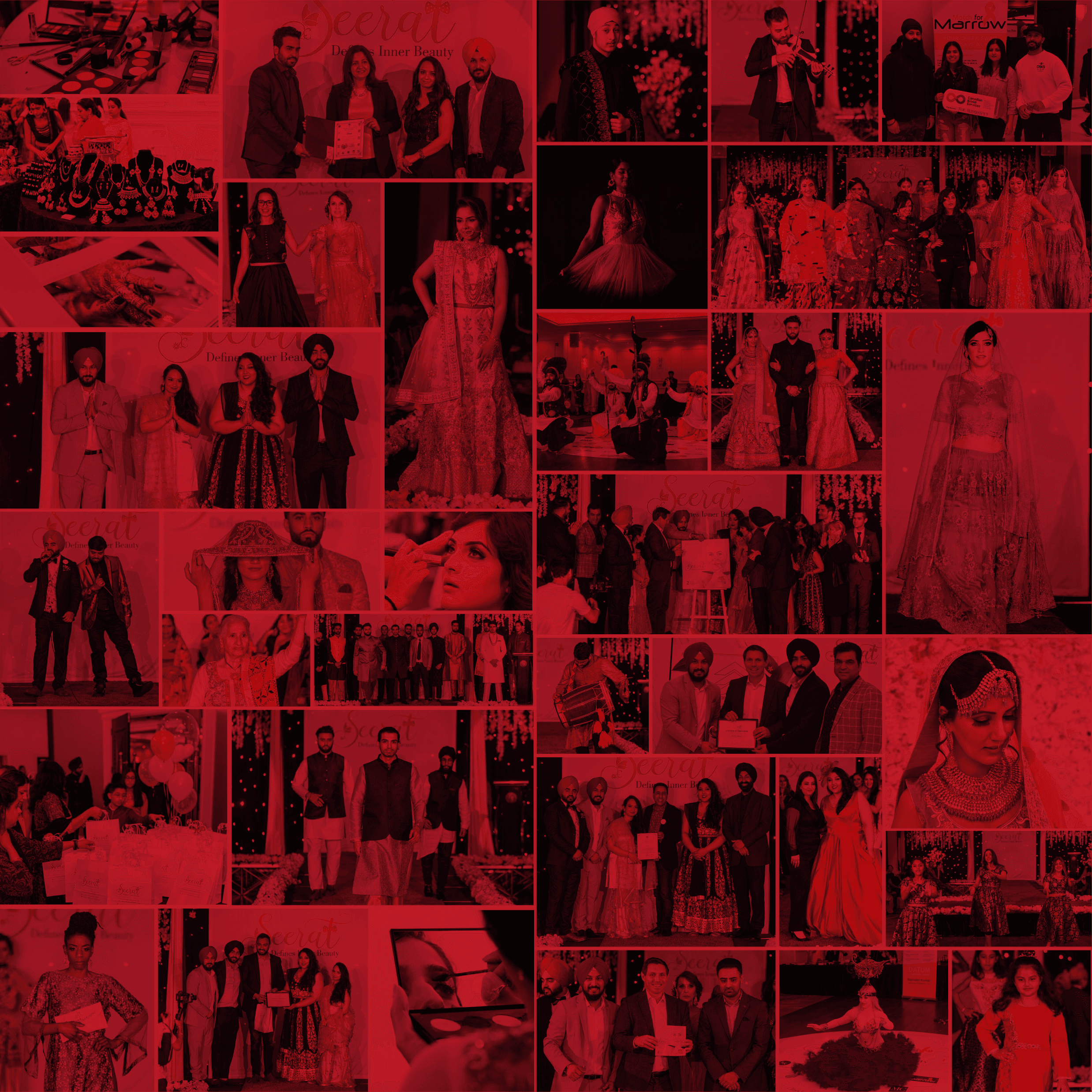
SEERAT
DEFINES INNER BEAUTY
2+
YEARS AS CREATIVE DIRECTOR
3
MAGAZINE
ISSUES
DESIGNED
5+
CHANNELS MANAGED
1
COHESIVE
BRAND
SYSTEM
Building a cause-driven fashion brand from concept to multi-channel system.
FASHION WITH A CAUSE
THE BRIEF
Fashion as a vehicle
for human dignity
Seerat Canada is a free, full-day global fashion extravaganza that blends the latest innovation with traditional design craftsmanship — with a deeply human core. Each edition champions a cause: celebrating the people society often overlooks. I joined as Creative Head and overhauled the entire brand, building a unified visual identity across print, digital, social, video, and live event design.
The brand needed to hold two ideas simultaneously: the glamour and craft of high fashion, and the raw emotional weight of its social mission. Neither could overpower the other. The visual language had to feel elevated enough for a fashion event and human enough to honour grandmothers, cancer survivors, and Paralympic athletes walking the runway.
This was not a rebrand exercise — it was building a complete design system from the ground up across every channel the brand touched.
THE CAUSES
Three issues.
Three stories
of inner beauty.
Each magazine issue was built around a cause — not as a theme, but as the entire editorial and visual direction. The runway, the copy, the photography, the layout: all in service of the humans being celebrated.
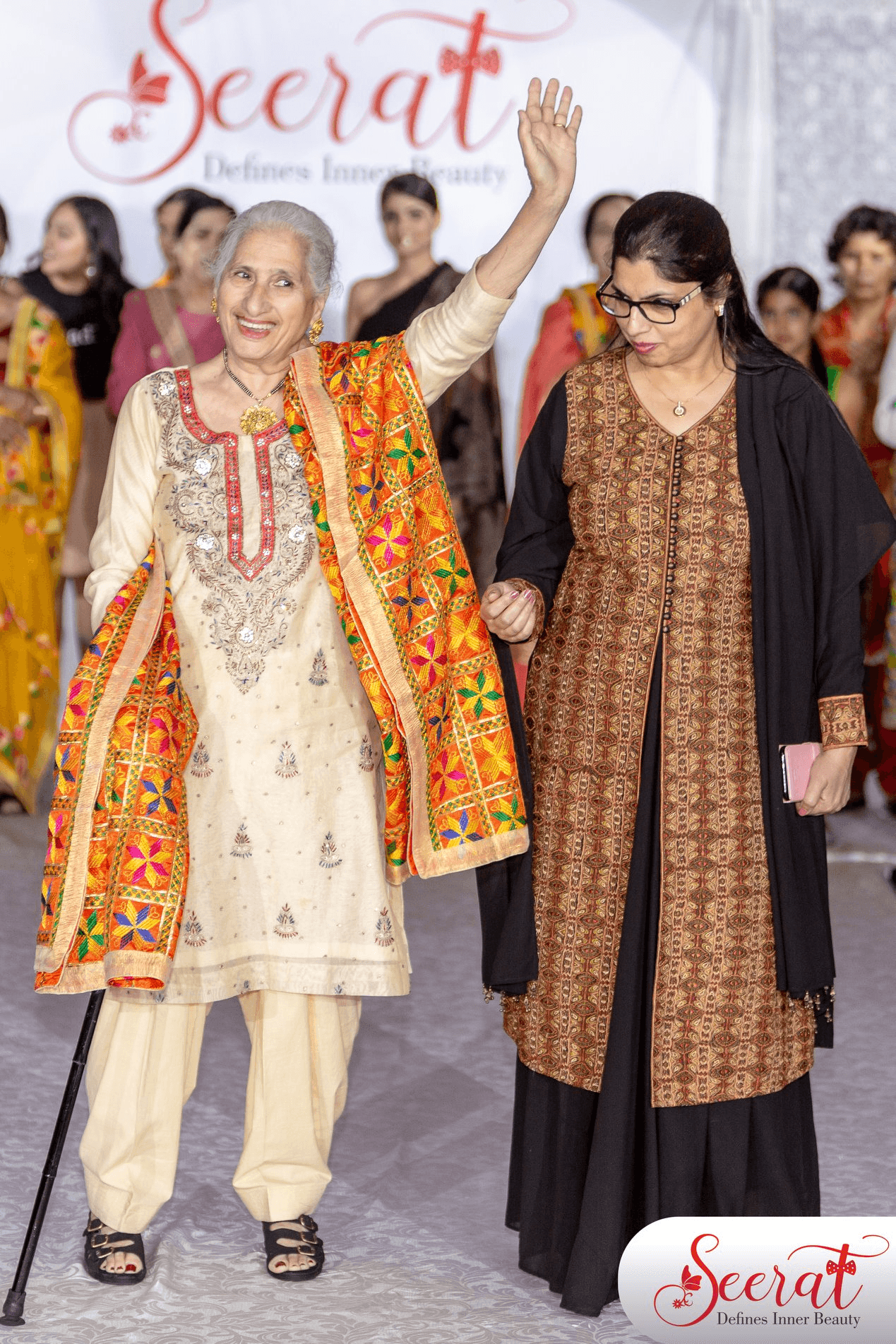
Supporting
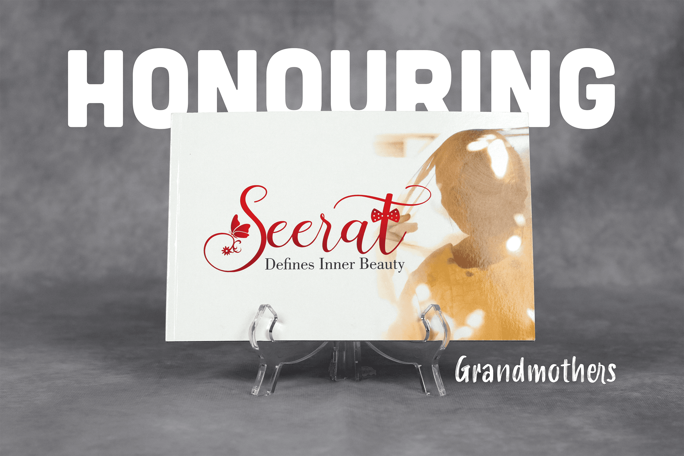
Grandmothers
A celebration of the women who shaped our cultures and carried traditions across continents. Grandmothers walked the Seerat runway — not as a novelty, but as the centrepiece. The design language drew from warmth, memory, and timeless elegance.
ISSUE
01
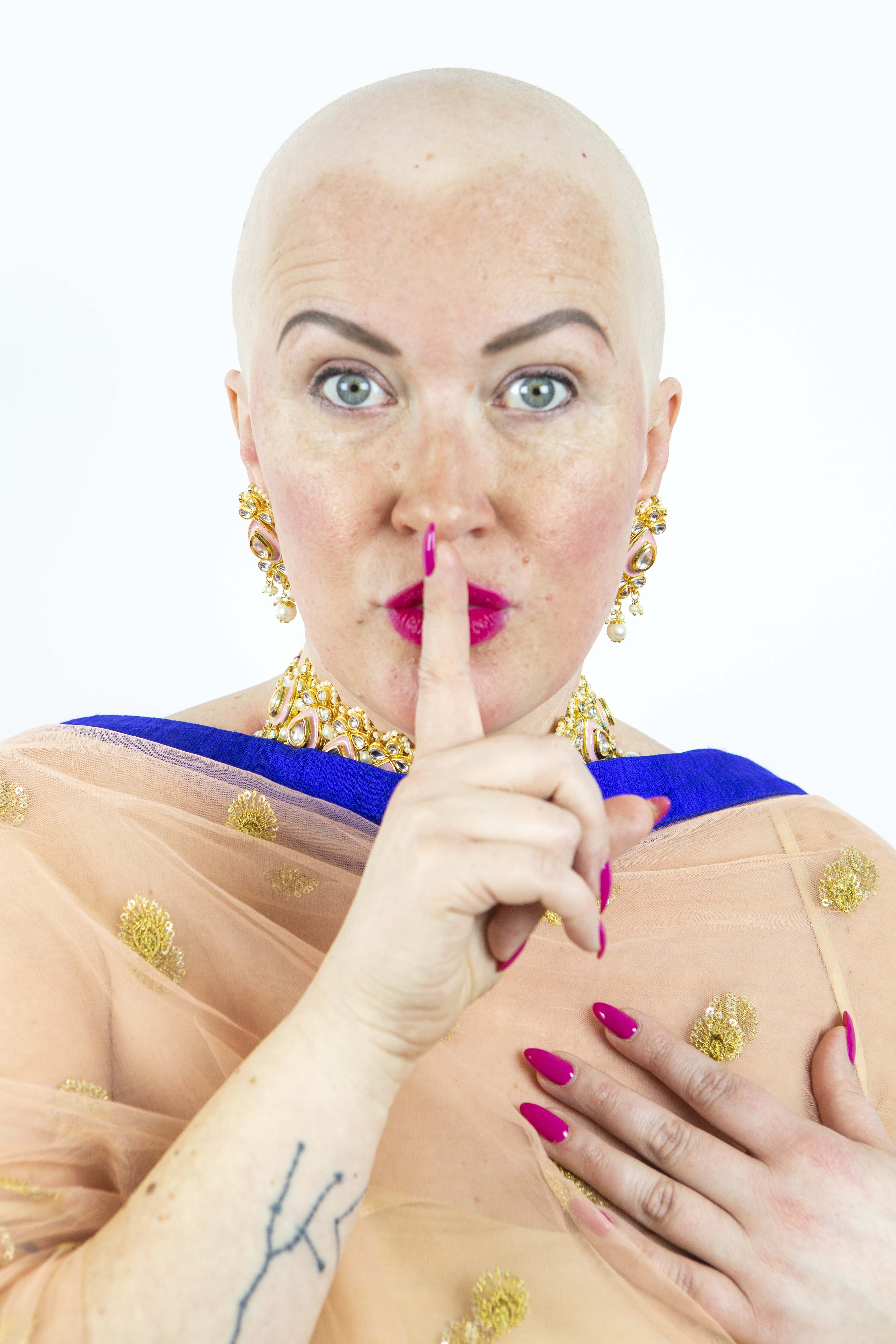
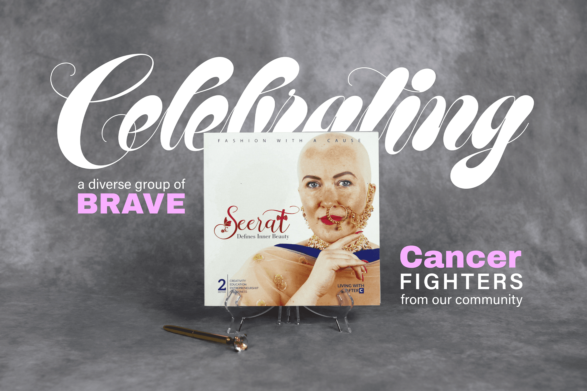
Celebrating Cancer Patients
Where glamour meets courage. This issue shone the spotlight on cancer patients and survivors — reframing vulnerability as strength. The visual approach balanced tenderness with boldness, honouring resilience without reducing it to sentiment.
ISSUE
02
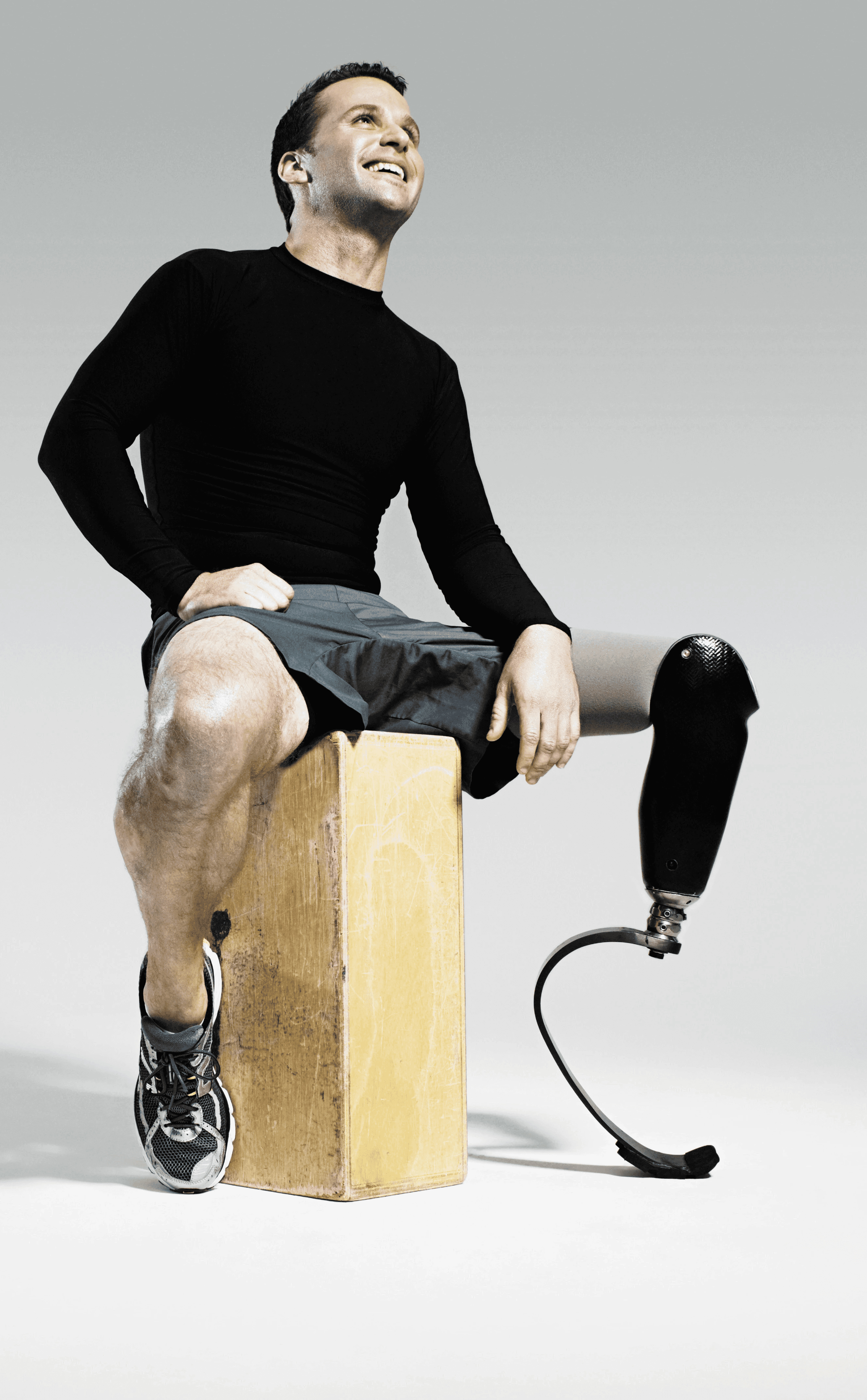
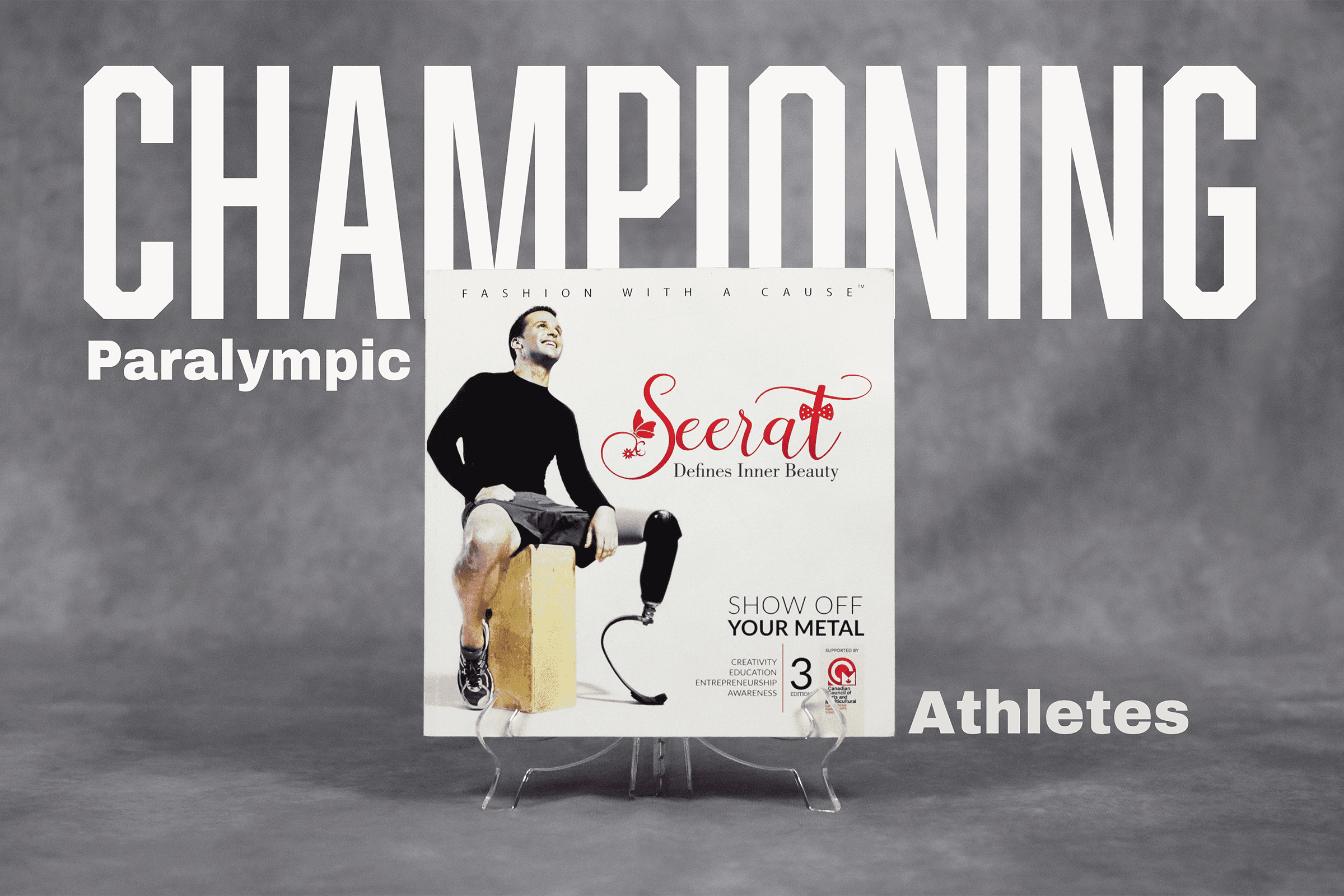
Championing Paralympic
Athletes
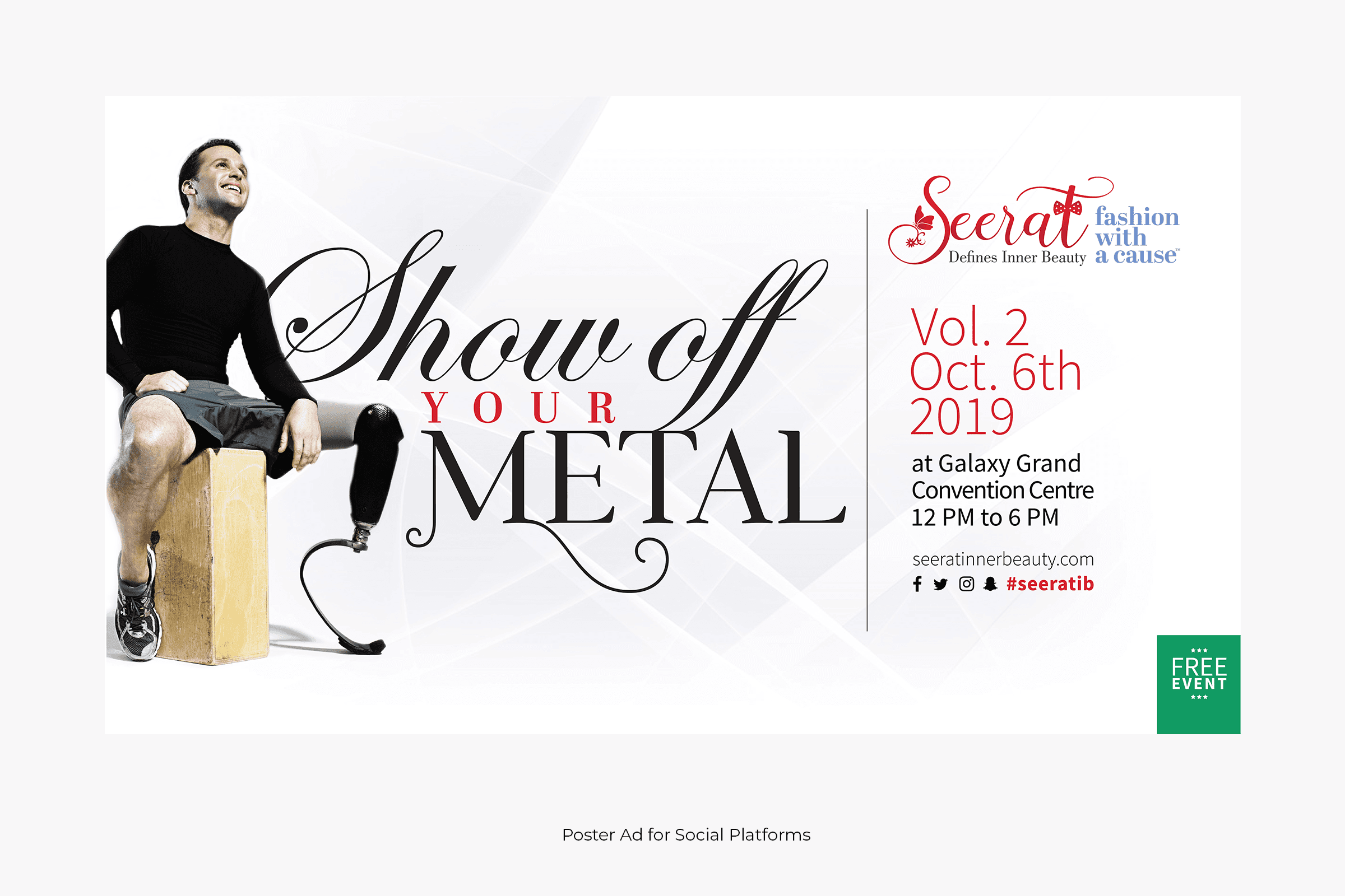
A full-day event giving Paralympic and disabled athletes the runway they deserved — to show their true mettle and share their stories with the community. The design reflected power, precision, and the beauty of the human form in all its expression
ISSUE
03
THE PROCESS
From fragmented
to fully unified
PHASE 01 — DISCOVERY
Auditing the existing brand
I began by mapping every existing touchpoint — past event materials, social posts, web pages, and print pieces. The audit revealed the core problem: there was visual effort, but no system. Colours, typography, and layout decisions were made per-piece with no connective tissue.
Brand audit
Competitor review
Stakeholder brief
PHASE 02 — IDENTITY
Building the brand system
I developed the core identity: a refined typographic palette that could feel both fashion-forward and emotionally grounded, a colour system with a primary ramp and cause-specific accent layers, and a layout grid that worked across A4 print and digital screen formats simultaneously.
Logo refinement
Typography system
Colour palette
Layout grid
PHASE 03 — PRINT
Designing three magazine issues
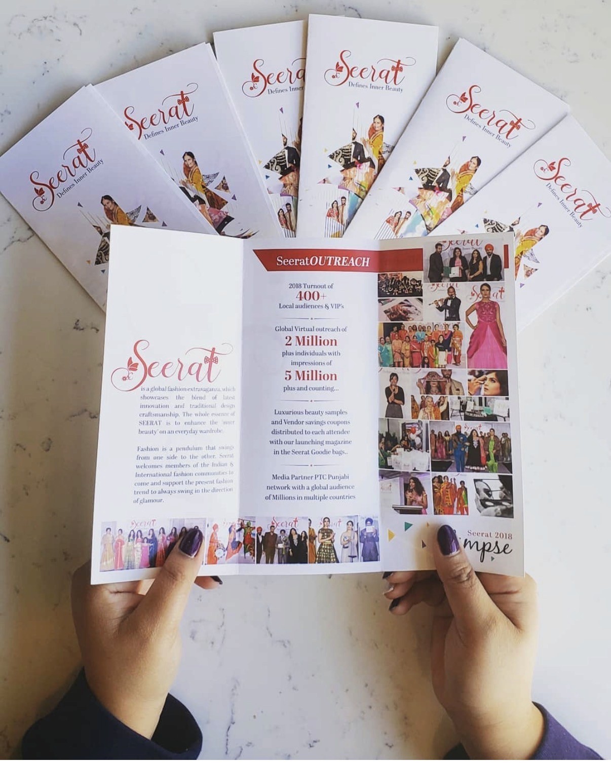
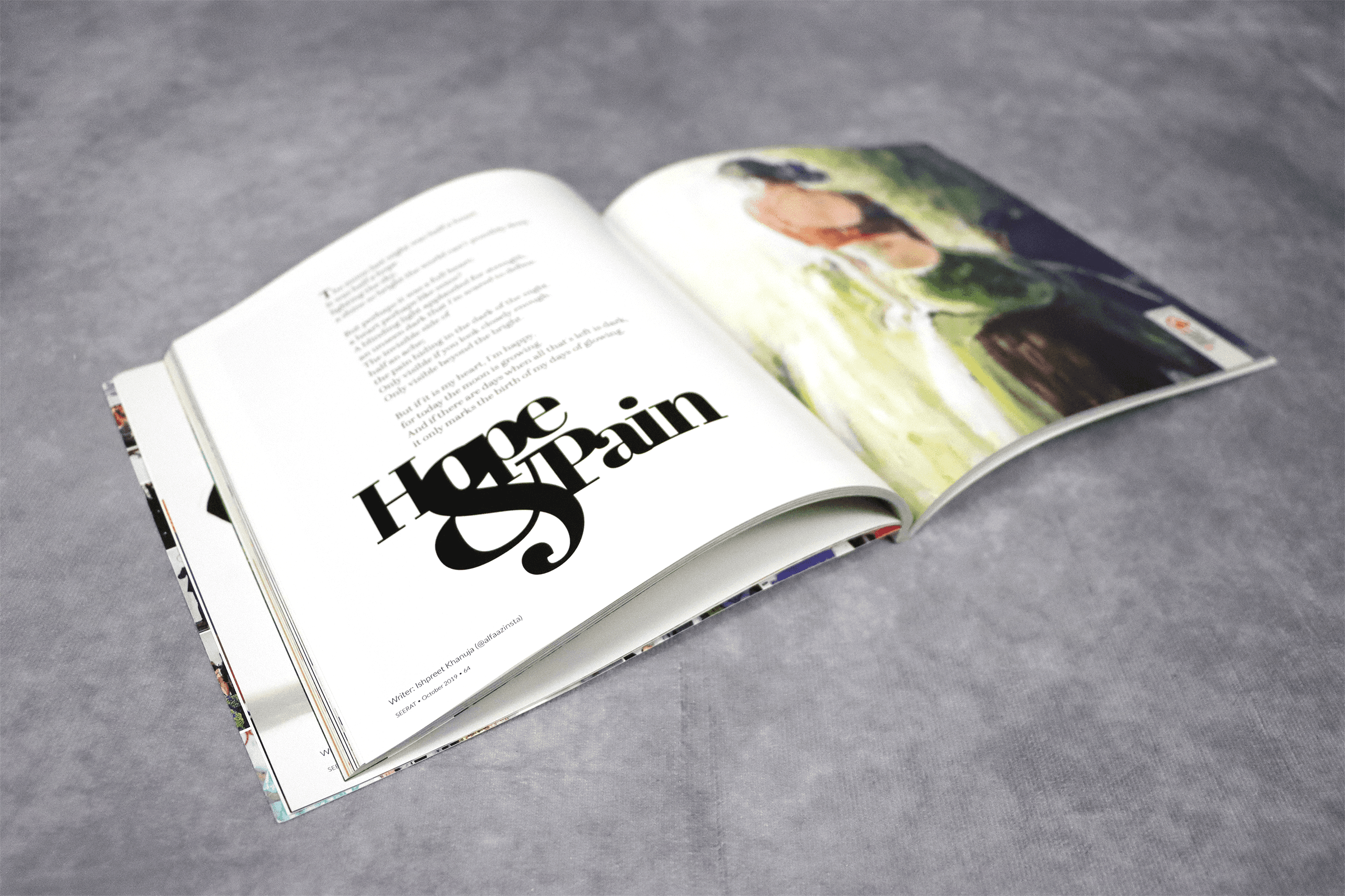
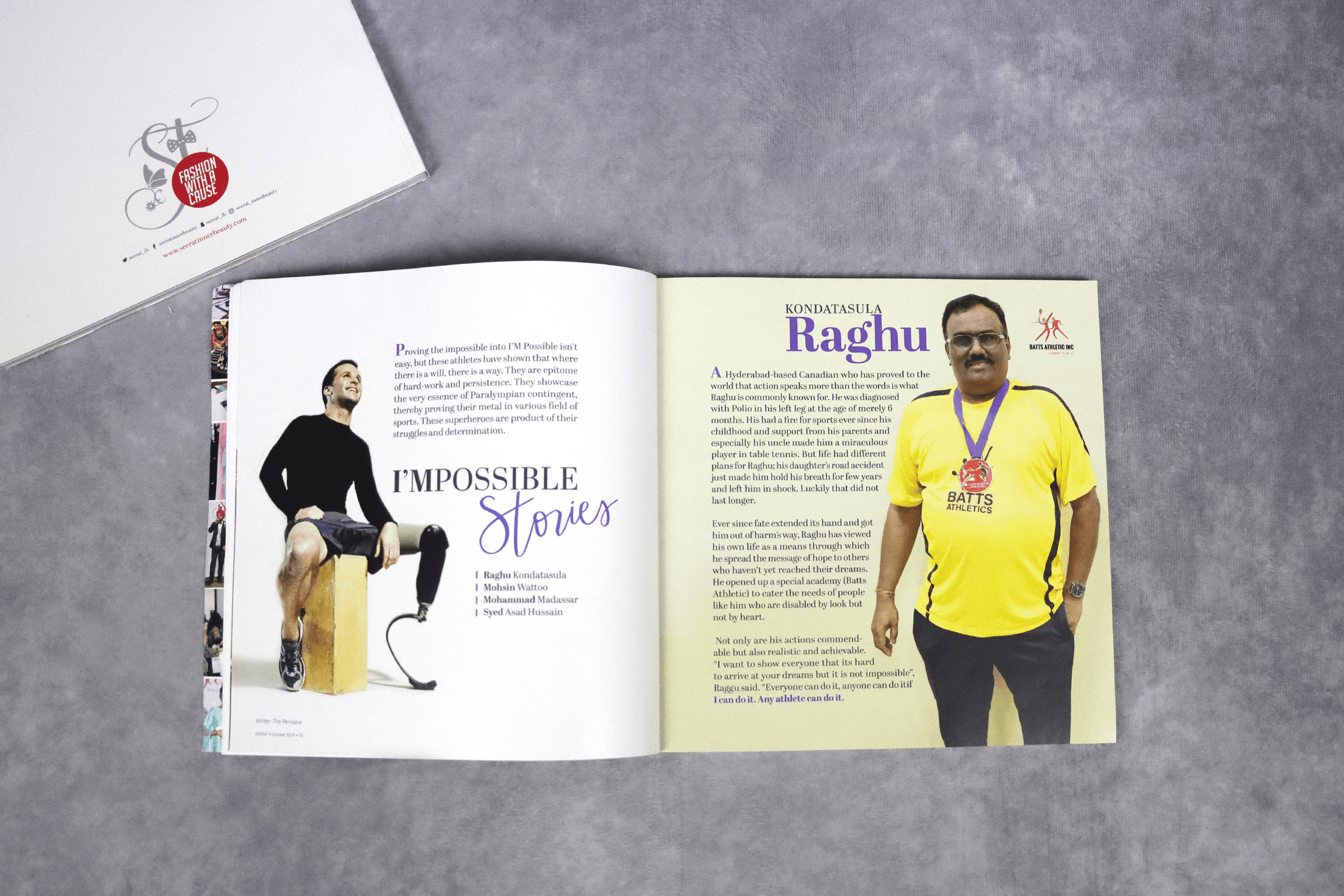
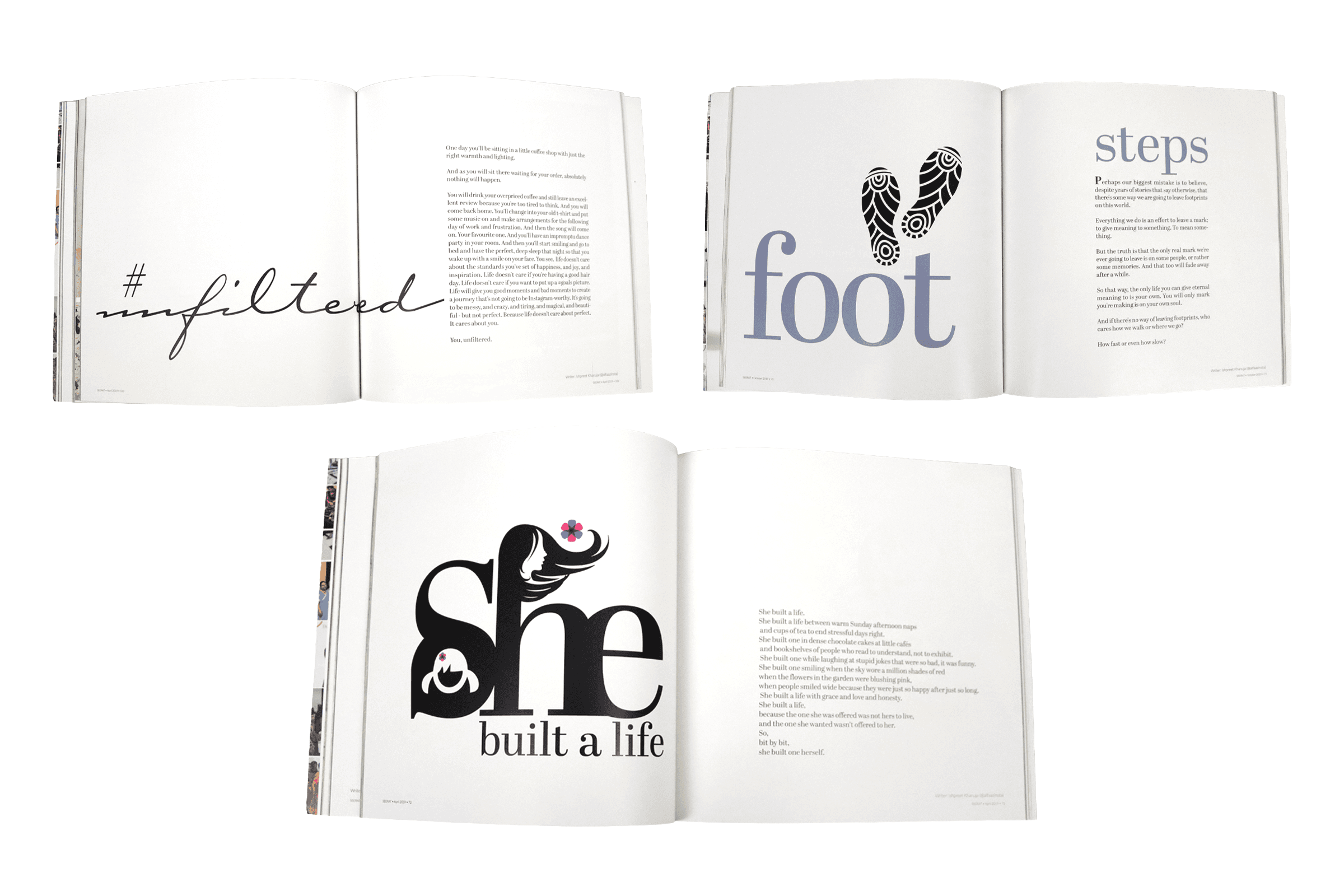
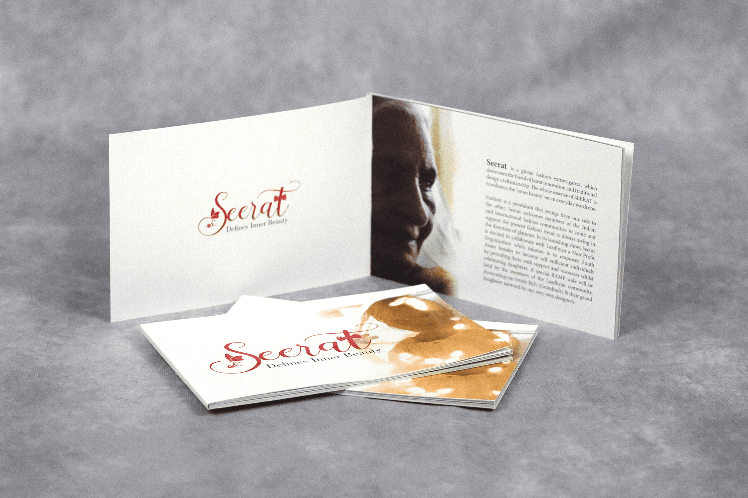
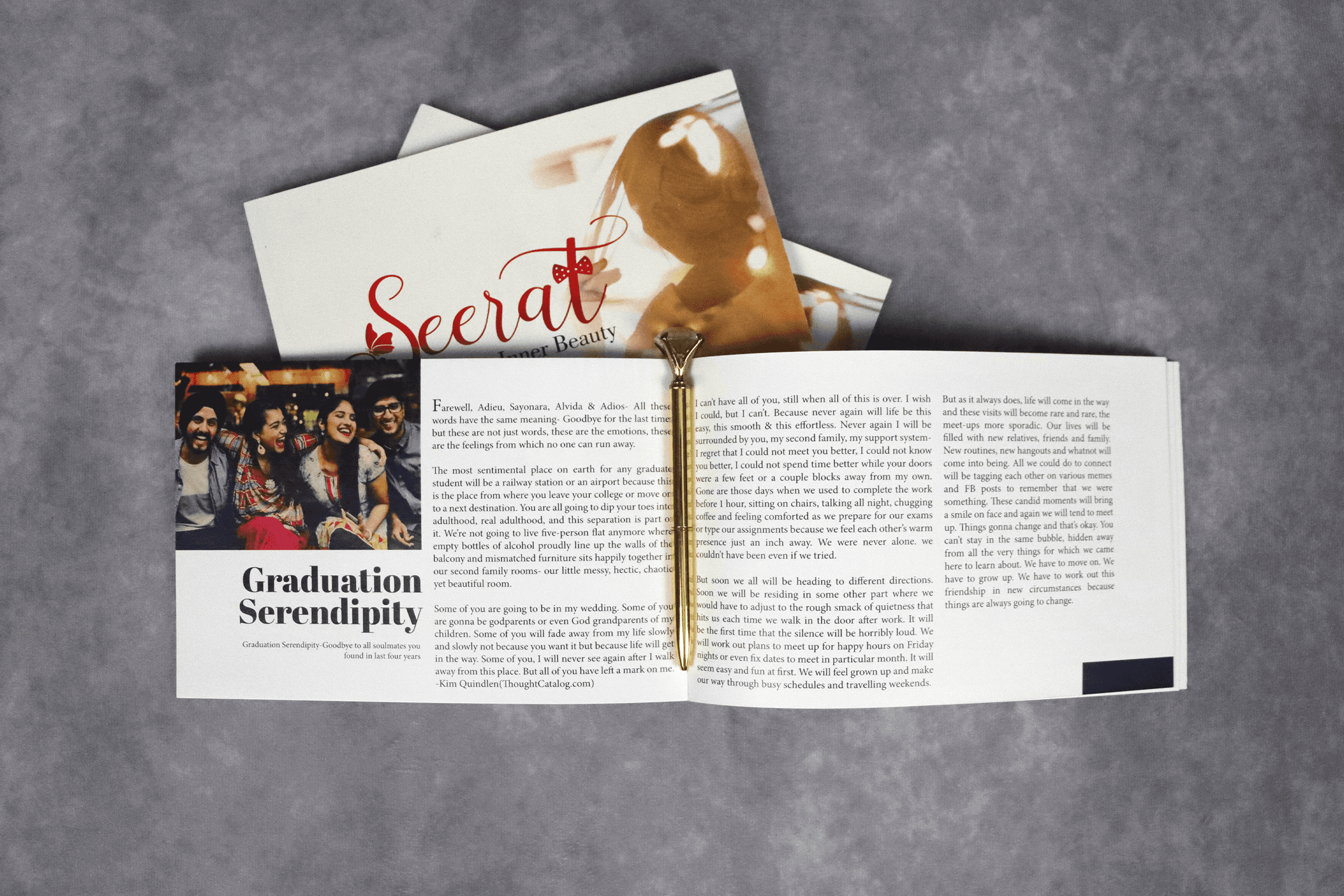
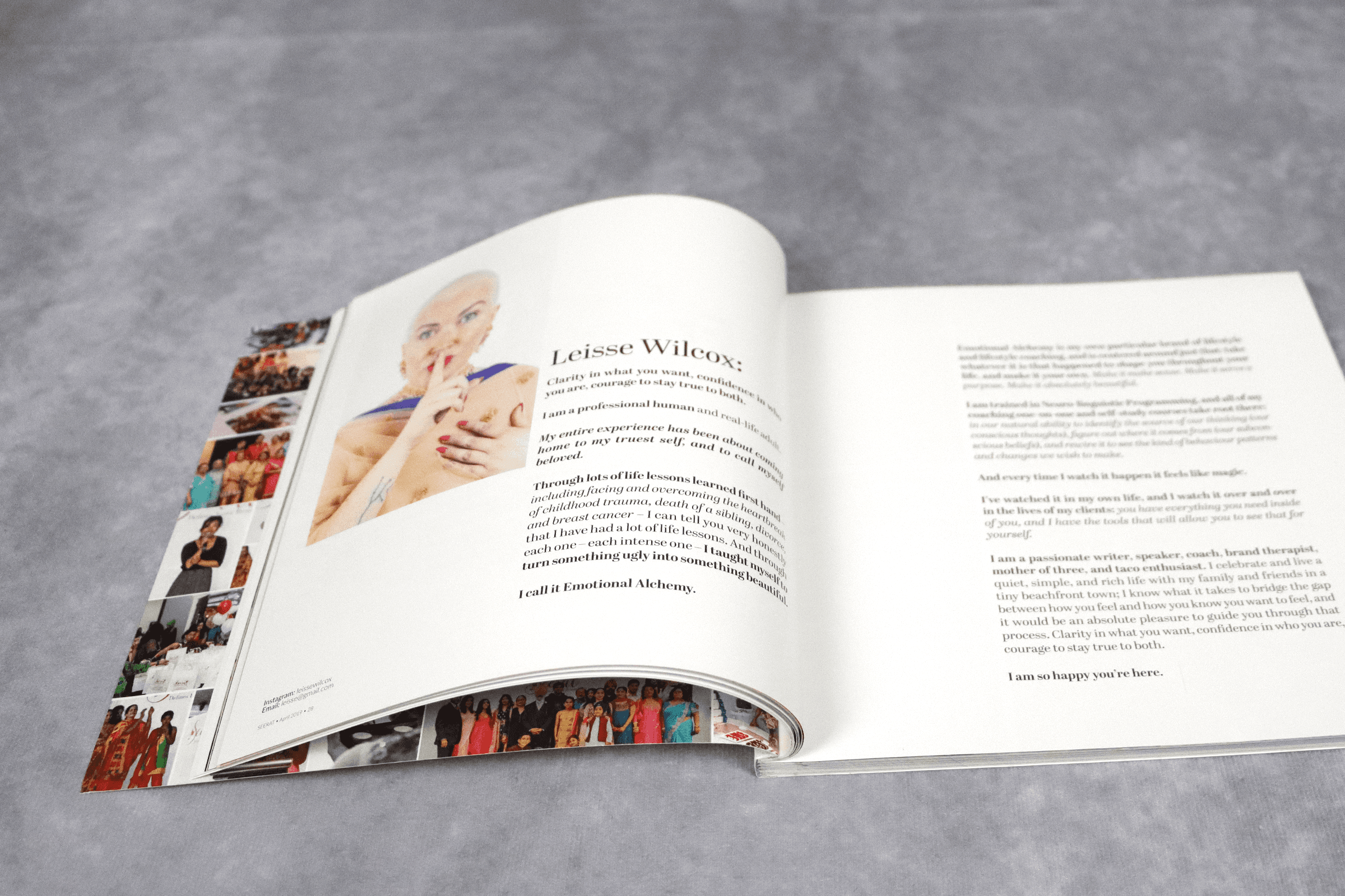
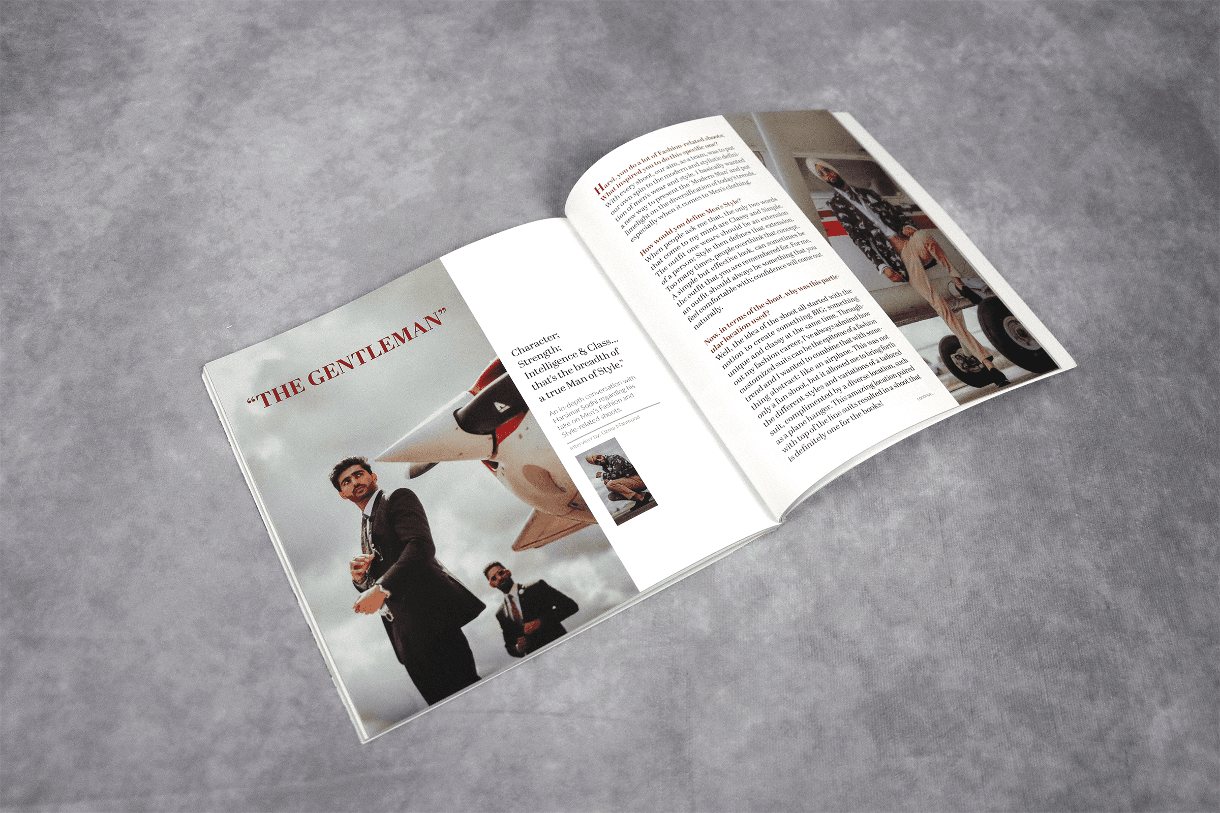
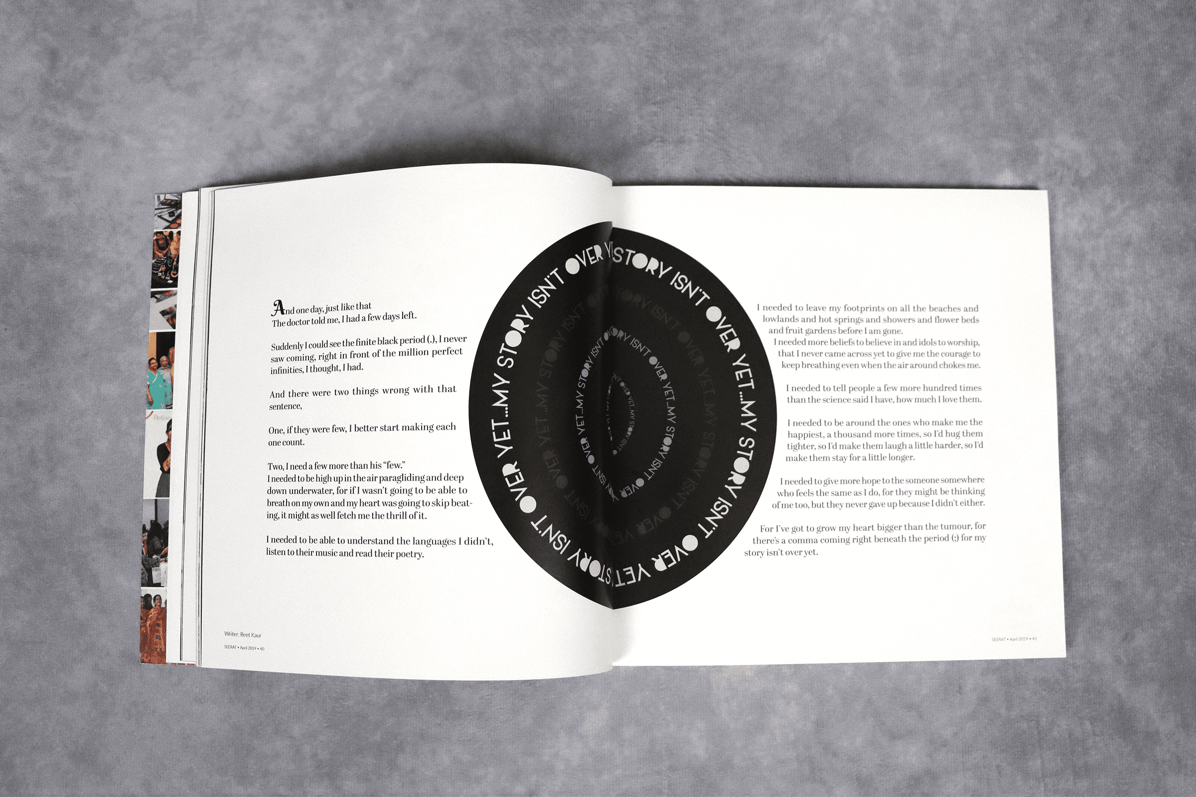
Each issue was designed end-to-end in Adobe InDesign — cover, editorial spreads, event photography, designer profiles, and cause spotlights. The challenge was maintaining brand consistency while giving each cause its own emotional weight and distinct visual register.
3 magazine issues
Cover design
Editorial layout
Print production
PHASE 04 — DIGITAL & SOCIAL
Extending the system across channels
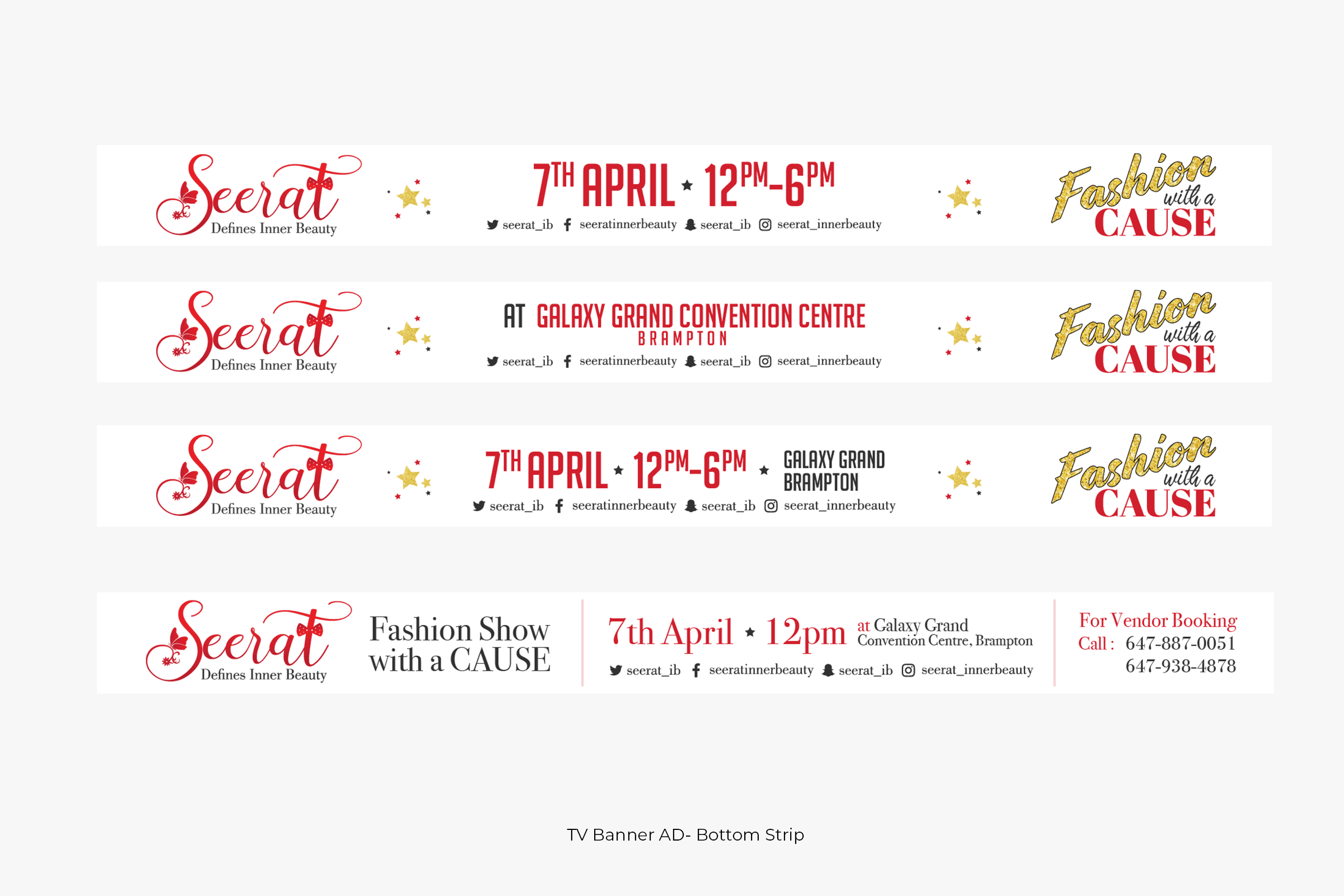
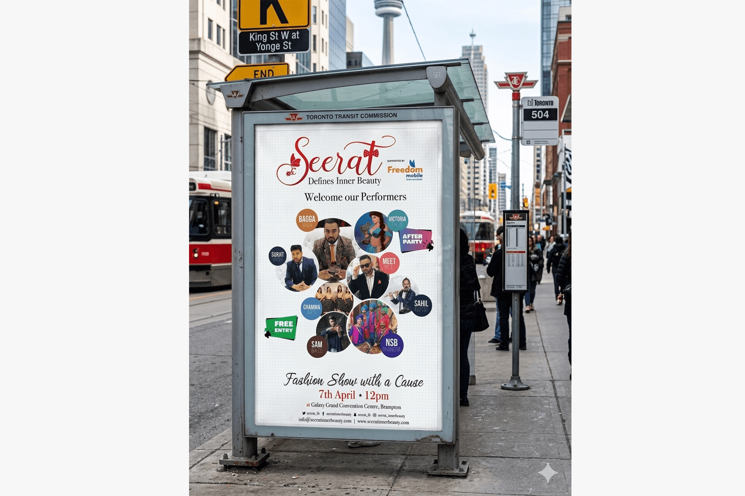
I built a social media template system in Illustrator that the team could execute consistently — announcement posts, countdown graphics, sponsor acknowledgements, and post-event coverage. Website wireframes translated the print brand to web. Each template maintained the typographic rigour of the magazine.
Social templates
Website Ads/Banner
Ad campaigns
Email design
PHASE 05 — MOTION
Bringing the brand to life
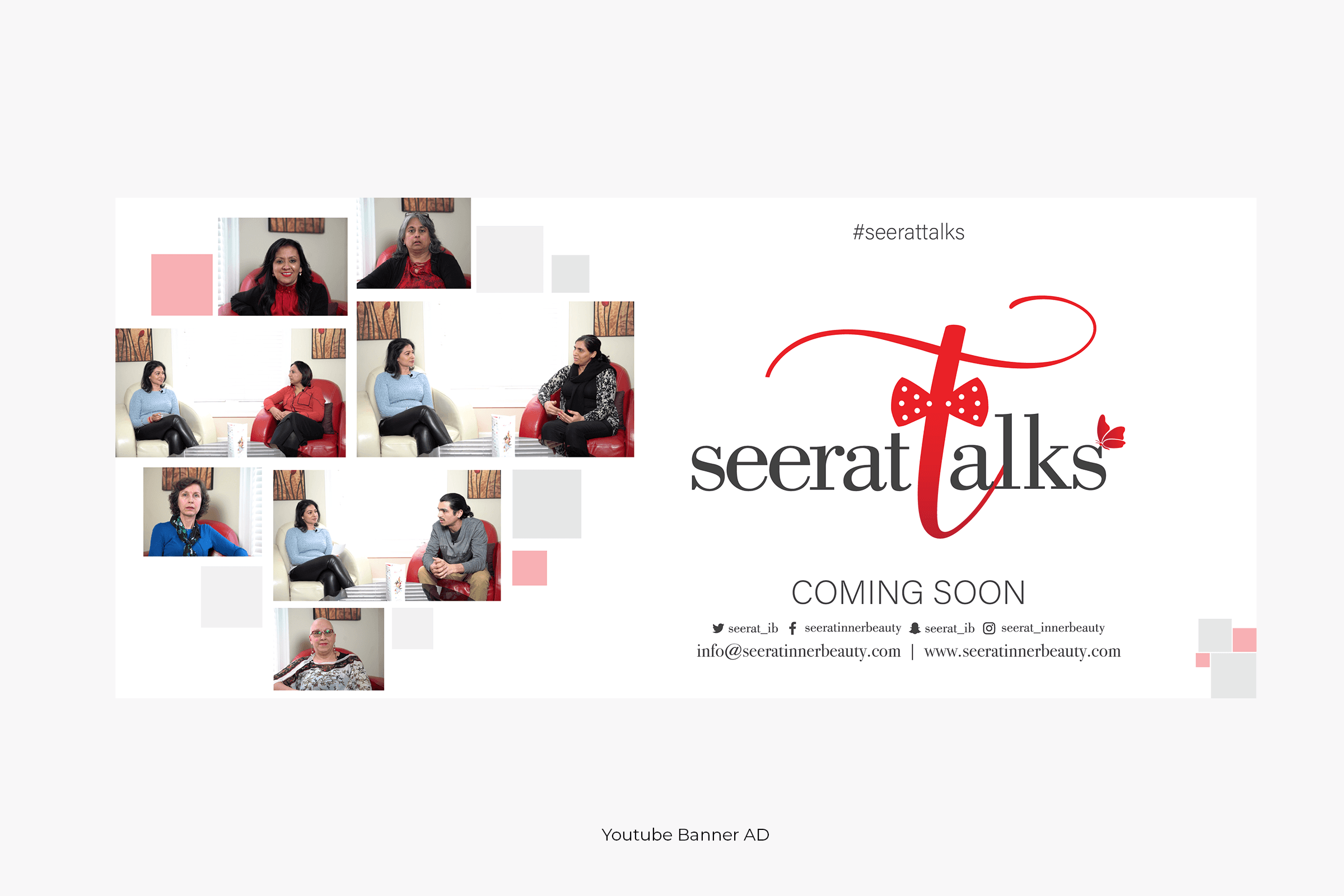
Video content and motion graphics in After Effects extended the brand into moving image — event promos, social video content, and stage visuals for the live runway event. Motion added the dimension of time to a brand whose core message was about transformation and dignity.
Event promos
Motion graphics
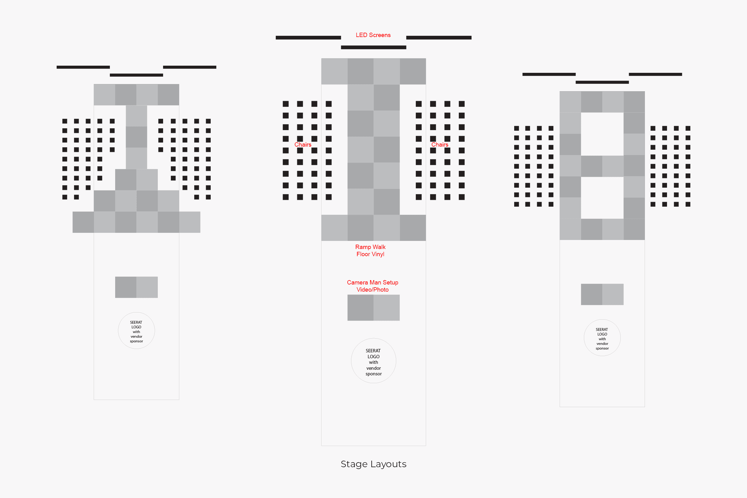
Stage visuals
Social video
THE BRAND SYSTEM
A system built for
fashion and feeling
Aa
Typography
A high-contrast serif for headlines and display — evoking fashion editorial authority. A clean, neutral sans for body copy that steps back and lets the stories breathe. Hierarchy created through weight and scale, never decoration.
Fonts:
Abril and Lato
Size:
41pt
21pt
18pt
16pt
11pt
10pt
8pt
◈
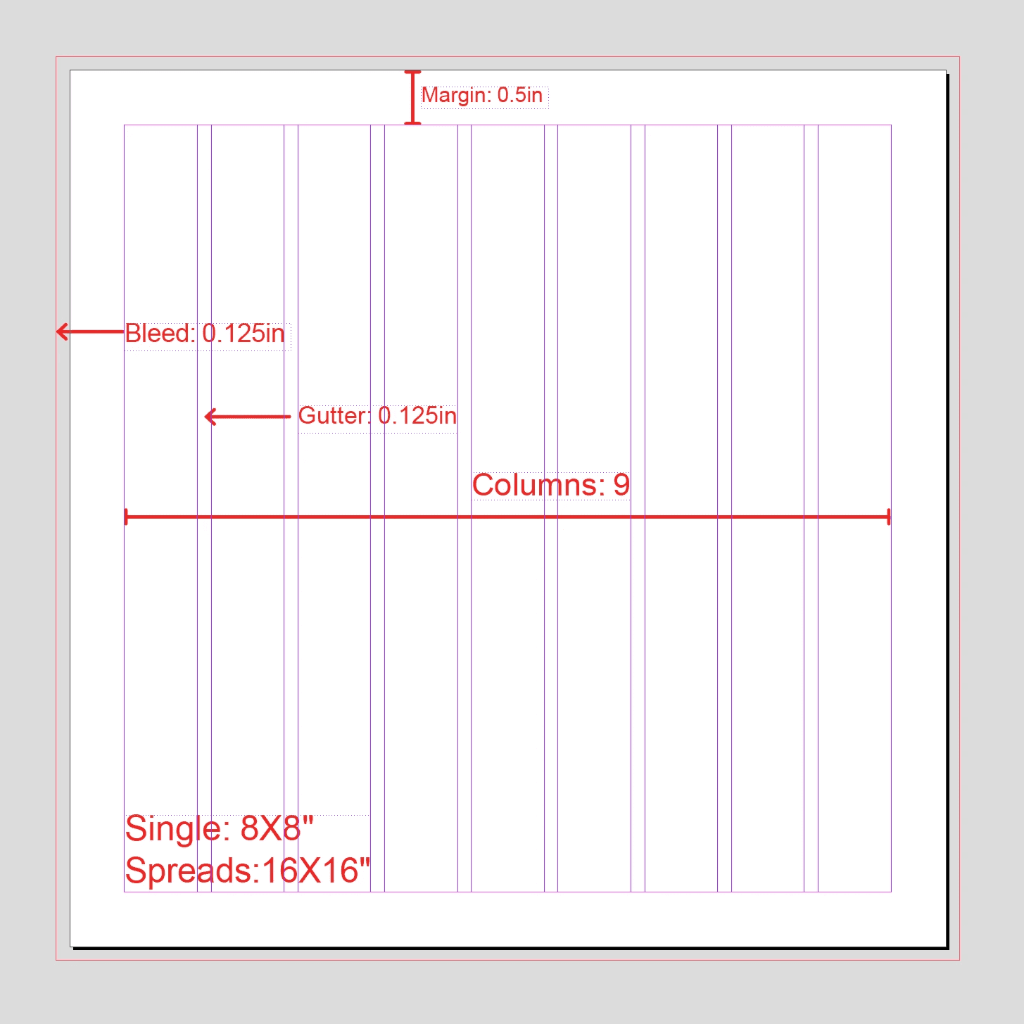
Layout System
A Margin grid adapted for both 8X8" print and digital screens. Asymmetric layouts create energy and movement on spreads, while consistent column margins ensure legibility and calm. The grid works across all three magazine issues without modification.
▲
Photography Direction
High-contrast editorial photography for fashion coverage. Warm, intimate framing for cause stories. The two modes of photography coexist in every issue — the contrast between them tells the story of glamour meeting humanity.

D1202E
414042
7596CE
DELIVERABLES
What was
built and shipped
IDENTITY
Brand System Overhaul
A complete visual identity system to replace inconsistent legacy materials — built to scale across every channel.
Refined logo and wordmark
Typography and colour system
Layout grid for print and digital
Brand usage guidelines
Template library for the team
Magazine Design
Three full editorial magazine issues, each built around a distinct cause. Designed end-to-end from cover concept to print-ready files.
Cover design for all three issues
Editorial spread layouts
Cause spotlight features
Designer and photographer profiles
Print production and
pre-press files
DIGITAL & SOCIAL
Multi-Channel Content System
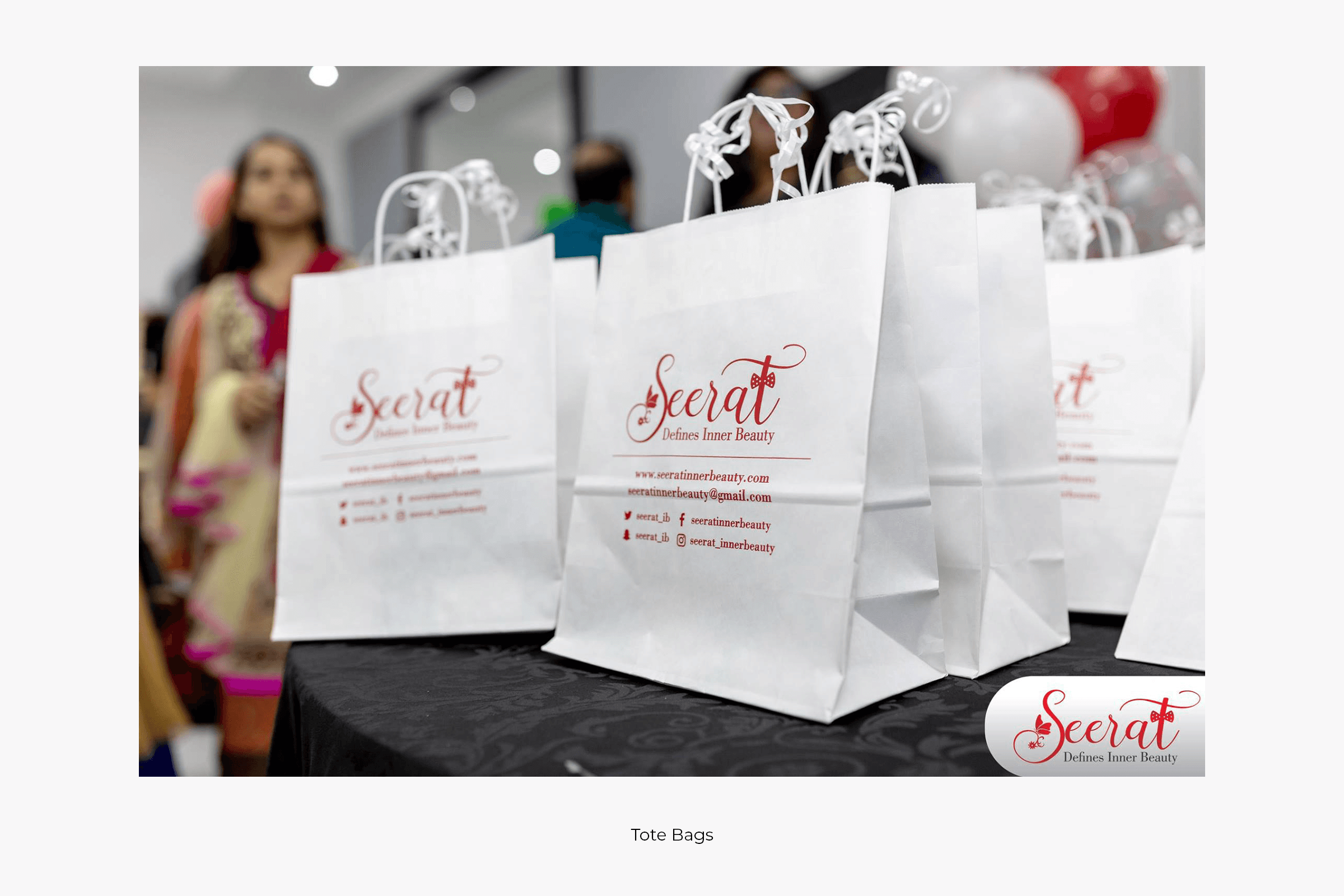
A scalable social media template system and website wireframes that maintained brand consistency without requiring a designer for every post.
Instagram and Facebook template sets
Event countdown and announcement graphics
Sponsor acknowledgement formats
Website wireframes and design direction
Ad campaign visuals
MOTION & EVENT
Video & Live Event Design
Motion graphics and video content that extended the brand into moving image — for both social distribution and the live runway event itself.
Event promotional videos
Animated social content
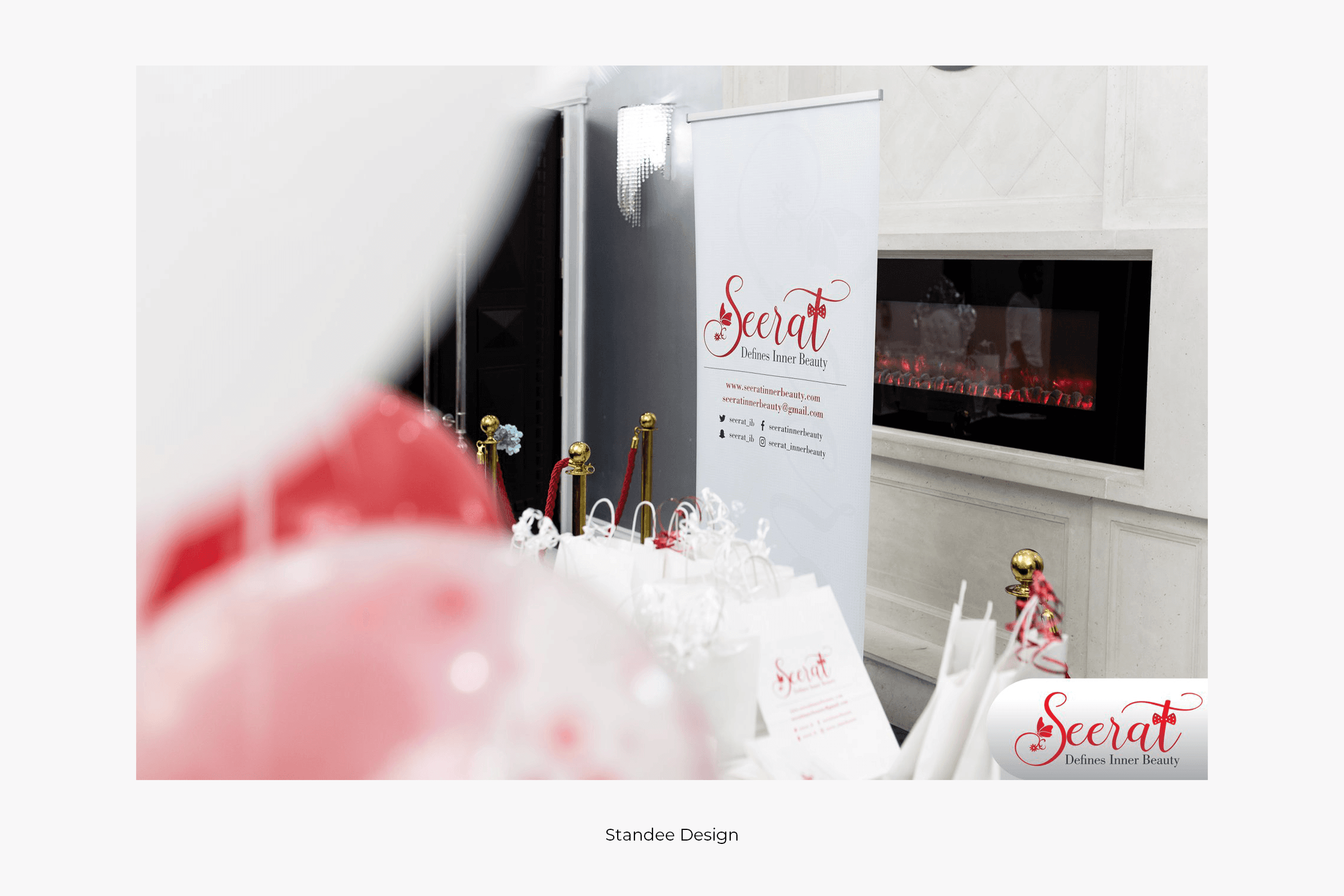
Stage and event environment design
Post-event recap content
Storyboards and concept direction

REFLECTION
What this project
taught me
Seerat Canada was the most complete creative leadership experience of my career to that point. It demanded every discipline I had — and pushed me into new ones.
"Design is most powerful when it makes the invisible visible — when it gives a voice to the people who are never usually centred. Seerat was the clearest example of that I've ever worked on."
KARAMVIR SINGH · CREATIVE DIRECTOR/ BRAND DESIGN LEAD
SEERAT CANADA
01
Systems thinking at scale
Building a brand system that works across five channels simultaneously taught me that the most important design decisions are the ones that create constraints — the right constraints free the creative work, rather than limit it.
02
Emotional design has rules, too
The cause-driven brief could easily have become sentimental and visually soft. Keeping the design rigorous — holding the tension between glamour and humanity — was a deliberate, constant editorial choice that significantly sharpened my design judgment.
03
Creative leadership is design work
Managing a team, briefing copywriters, directing photographers, and presenting to organizers — these aren't separate from design; they are design. The decisions made in those conversations shaped the work as much as any software.