Roles: UX Designer · UX Researcher
Duration: 3 Weeks
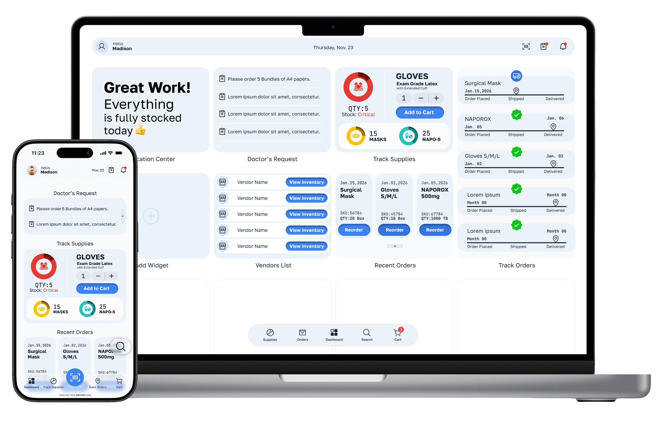
Order And Track Supplies App and Website
A mobile app and website that replaced manual spreadsheet-based supply management for doctor's office staff — reducing friction at every step of the ordering workflow.
5 Pain Points Solved · 5 Key Screen Designed · 2 Platforms
User Persona
Meet Madison
User research revealed a clear primary user. Madison represents the pharmacy clerks who
carry the operational load of a doctor's office — talented professionals whose skills were being
wasted on manual paperwork.
Madison
Pharmacy Clerk
AGE
30 years old
EDUCATION
University Graduate
TECH COMFORT
Moderate — practical
CHARACTER
Jolly, Professional, Organized
"I spend more time hunting through spreadsheets than actually helping patients.
I just need to know what we have, what we need, and to order it — all in one place."
GOAL
Know current stock levels at a glance without walking the stockroom.
Get automatic alerts before supplies run critically low.
Order from all vendors in one centralized place
Give doctors visibility so they stop interrupting Madison
Delivery automatically updates the inventory — no manual logging
PAIN POINTS
Manually walking the supply room with a clipboard to audit stock.
No automatic alerts when items run low — discovers it too late.
Logging into multiple vendor portals to place separate orders
Constantly interrupted by doctors asking if items have been ordered
Manually updating the inventory log after every delivery
User Journey Map
Five Actions.
one frustrated user.
Mapping Madison's current workflow revealed not just inefficiencies but emotional friction — the anxious, frustrated, distracted feelings that accumulate through a single supply management cycle. Every feeling became a design opportunity.
EMOTIONAL ARC ACROSS THE JOURNEY
Determined
Anxious
Determined
Frustrated
Relieved
MADISON'S JOURNEY
Action 1
INVENTORY
AUDIT
Action 2
LOW-STOCK
DISCOVERY
Action 3
CROSS-STAFF CHECK
Action 4
SUPPLIER ORDERING
Action 5
DELIVERY & LOGGING
TASKS
Walk through the supply room with a clipboard
Manually count physical boxes
Note numbers on the paper ledger
A.
B.
C.
Identify critical items running low
Check previous months' usage
Highlight "urgent" items
A.
B.
C.
Ask doctors if they need special items
Verify if orders are already pending
Update the spreadsheet manually
A.
B.
C.
Log into multiple vendor portals
Enter item codes and quantities
Double-check the budget vs prices
A.
B.
C.
Receive physical shipment
Inspect for damage or missing items
Manually update the inventory log
A.
B.
C.
FEELING
Determined
Anxious
Determined
Frustrated
Relieved
OPPORTUNITY
Barcode Scanning
Eliminate pen and paper for faster, accurate counting
Automatic Alerts
Notifications when stock dips below par level
Unified Dashboard
Doctor request portal so Madison isn't interrupted
Centralized Cart
Order from multiple vendors in one app
Digital Receipting
Scan arrivals to sync inventory automatically
Research Insight
What the research
Revealed
Three core insights shaped every design decision. The journey map didn't just show where time was wasted
— it revealed where trust and confidence were being eroded.
🔔
Reactive, not proactive
Madison only discovered low stock when physically walking the supply room — always reactive, never proactive. The biggest anxiety spike came from the fear of running out mid-shift. The system needed to flip this: alerts before the problem, not after.
🔗
Fragmentation is the enemy
The most frustrating moment wasn't the manual counting — it was logging into five different vendor portals to place what should be one order. Fragmentation across systems created cognitive load that drained Madison's time and focus every ordering cycle.
👩🏼⚕️
Interruption kills productivity
Doctors repeatedly interrupting Madison to ask about supplies was not a people problem — it was an information visibility problem. If doctors could check the supply status themselves, Madison could focus. The solution needed a dual-user information layer.
Design Solution
Five pain points.
Five solutions.
Each design decision maps directly back to a specific point of friction in Madison's journey. Nothing was added for aesthetics — every feature earned its place.
01
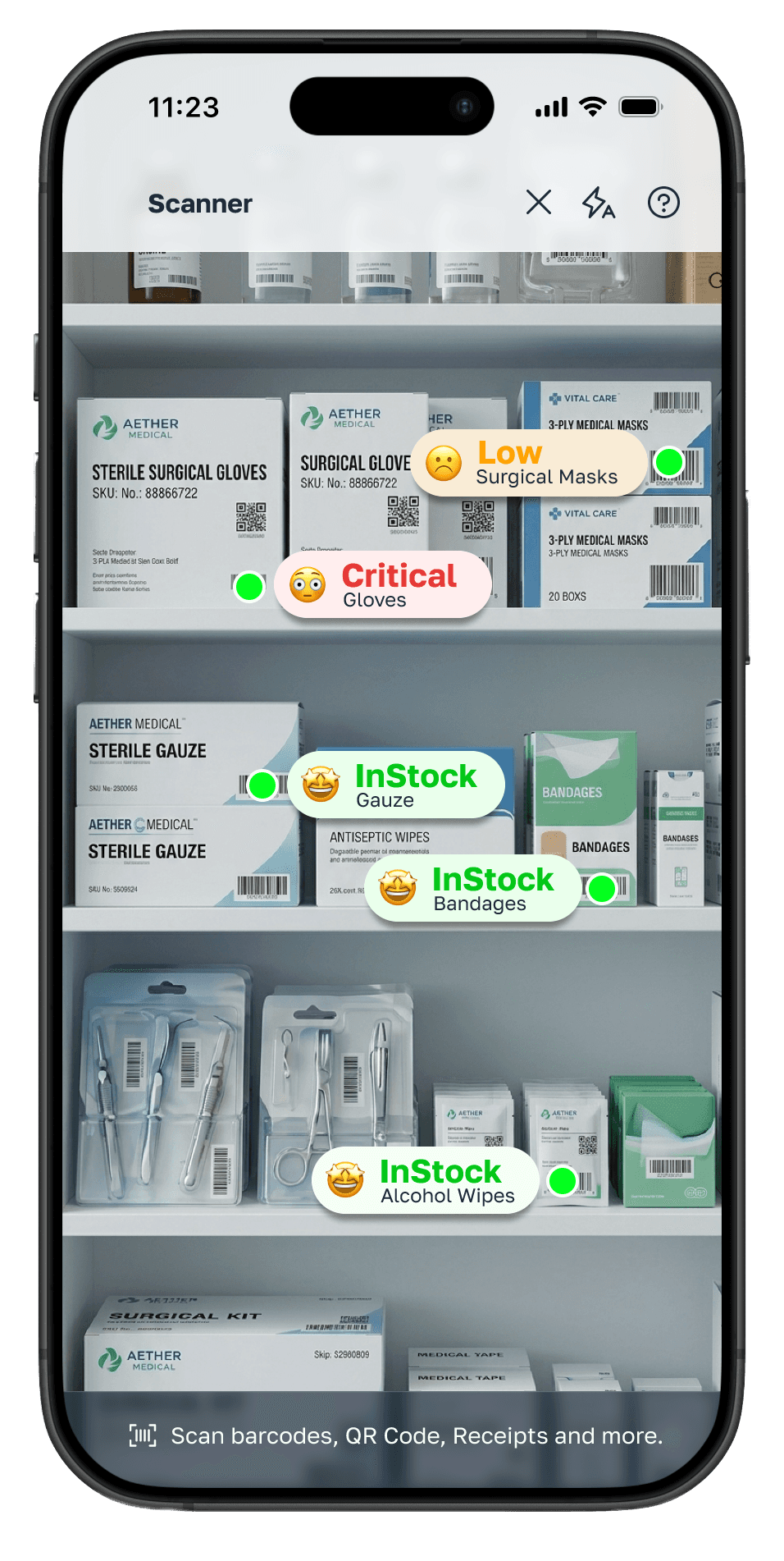
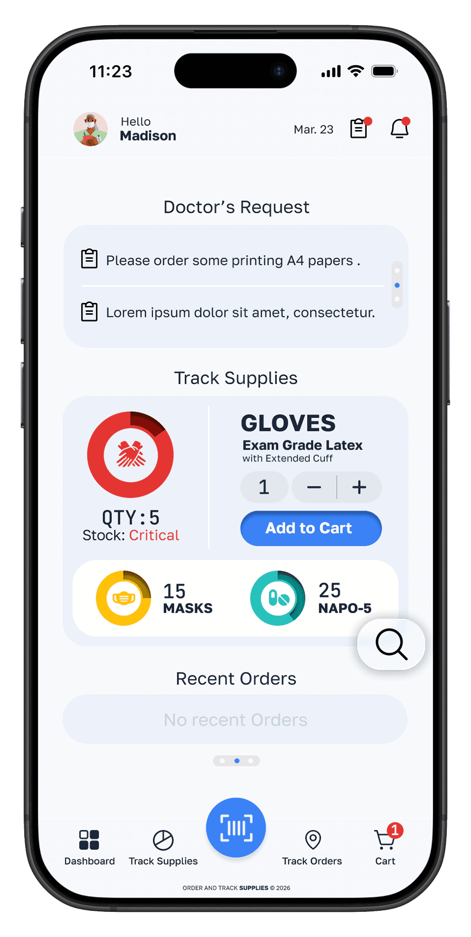
Real-time inventory Scanner
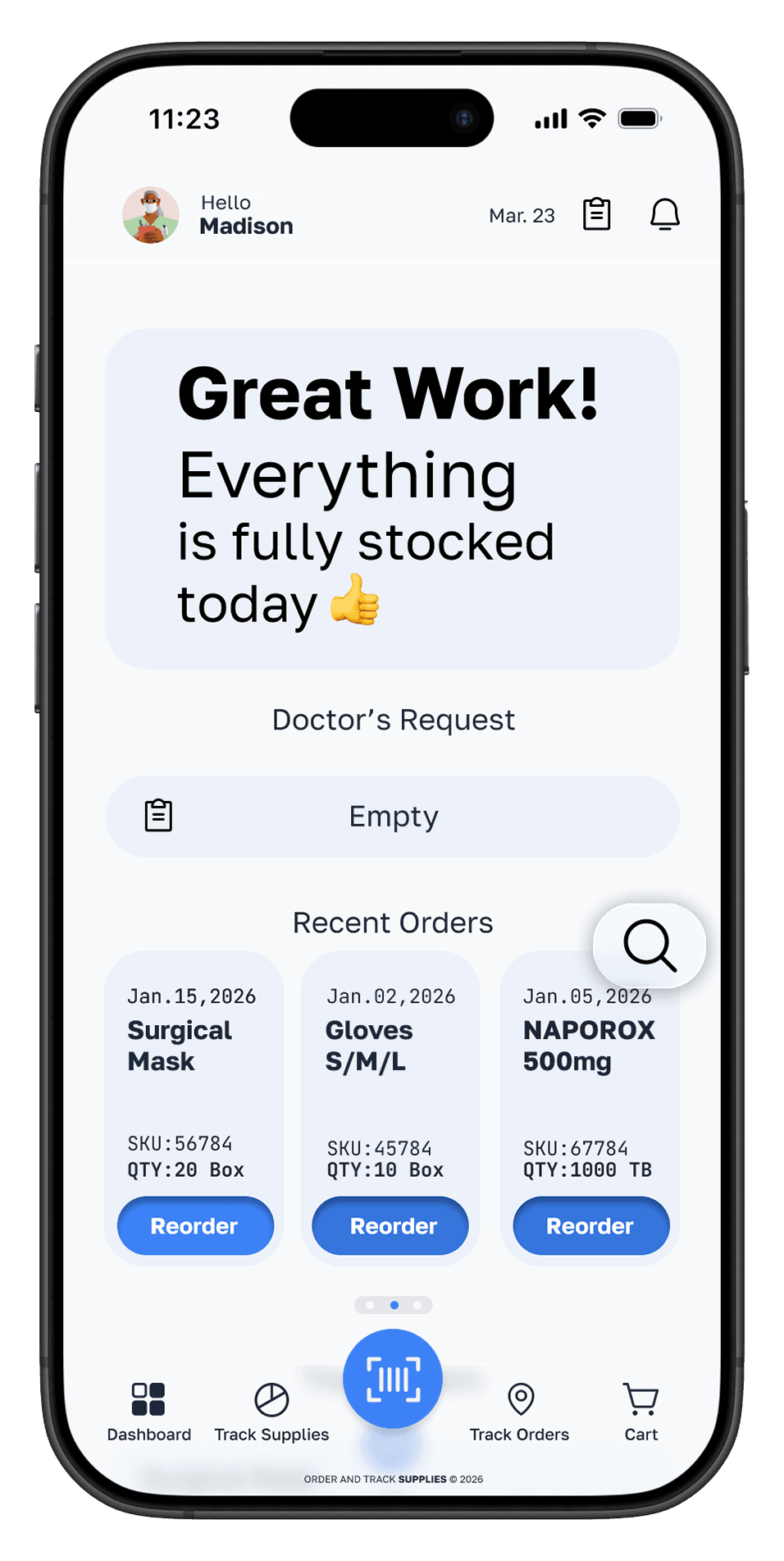
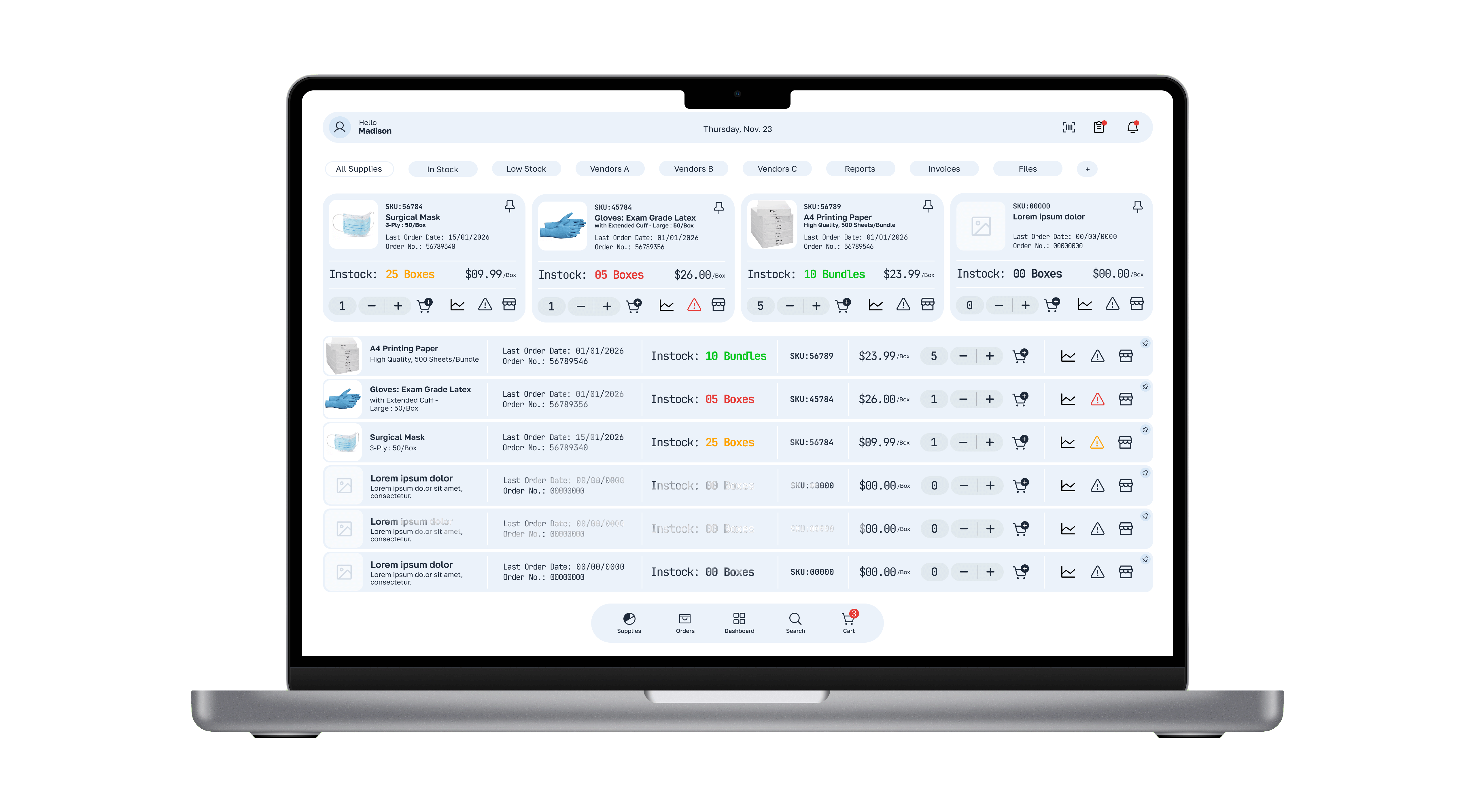
A live view of all supply levels — accessible from phone or desktop — replacing the clipboard audit entirely.
Before: Walking the stockroom with pen and paper
After: Live stock levels visible on any device, any time
02
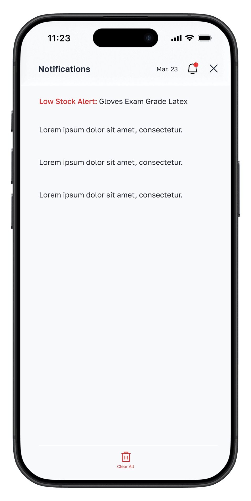
Automatic low-stock alerts
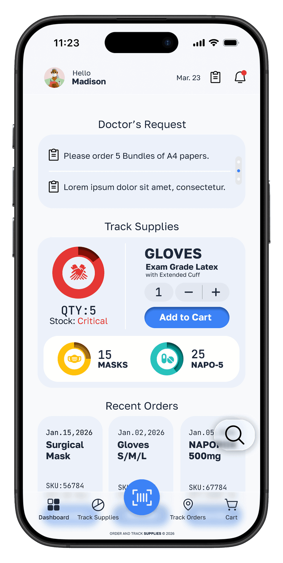
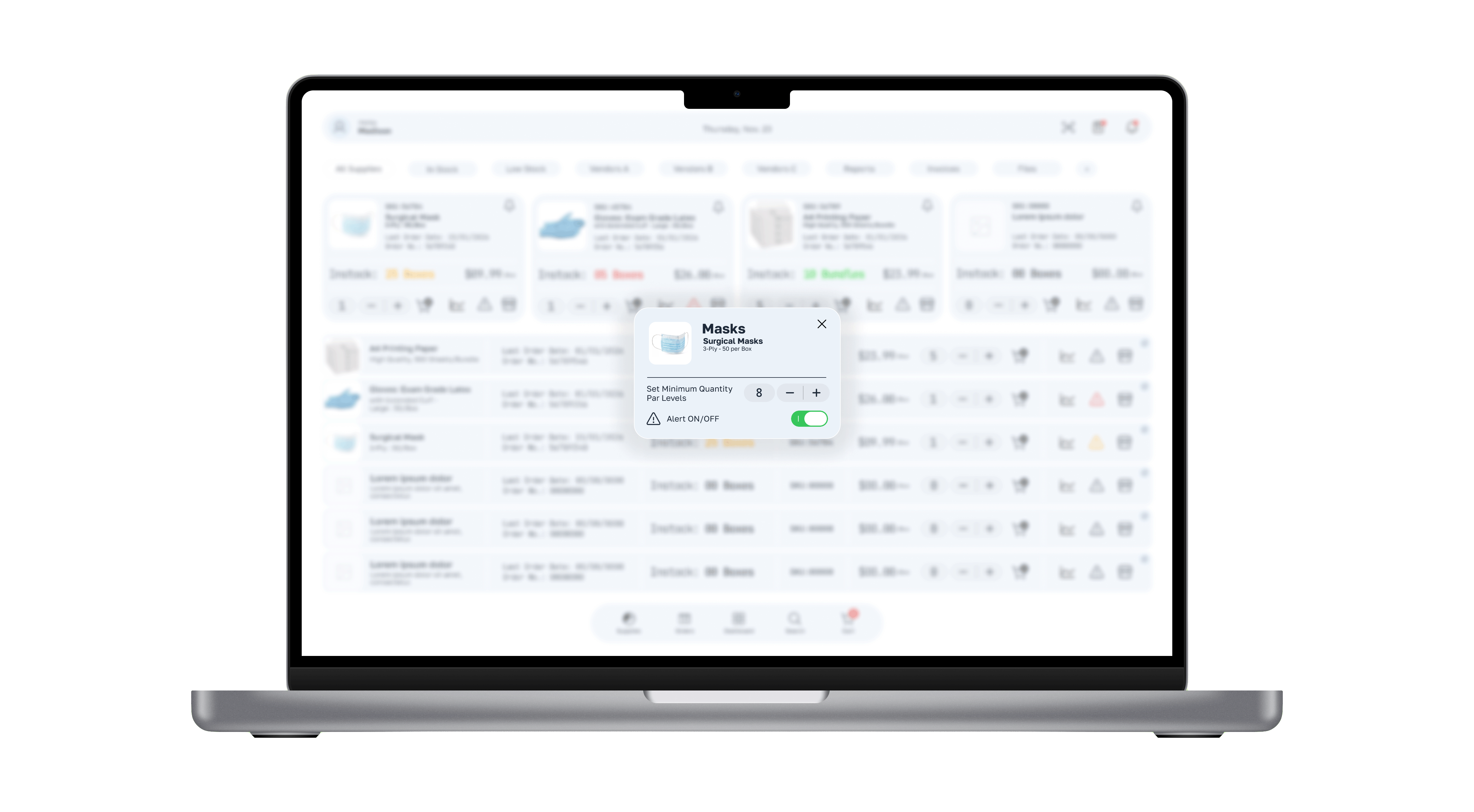
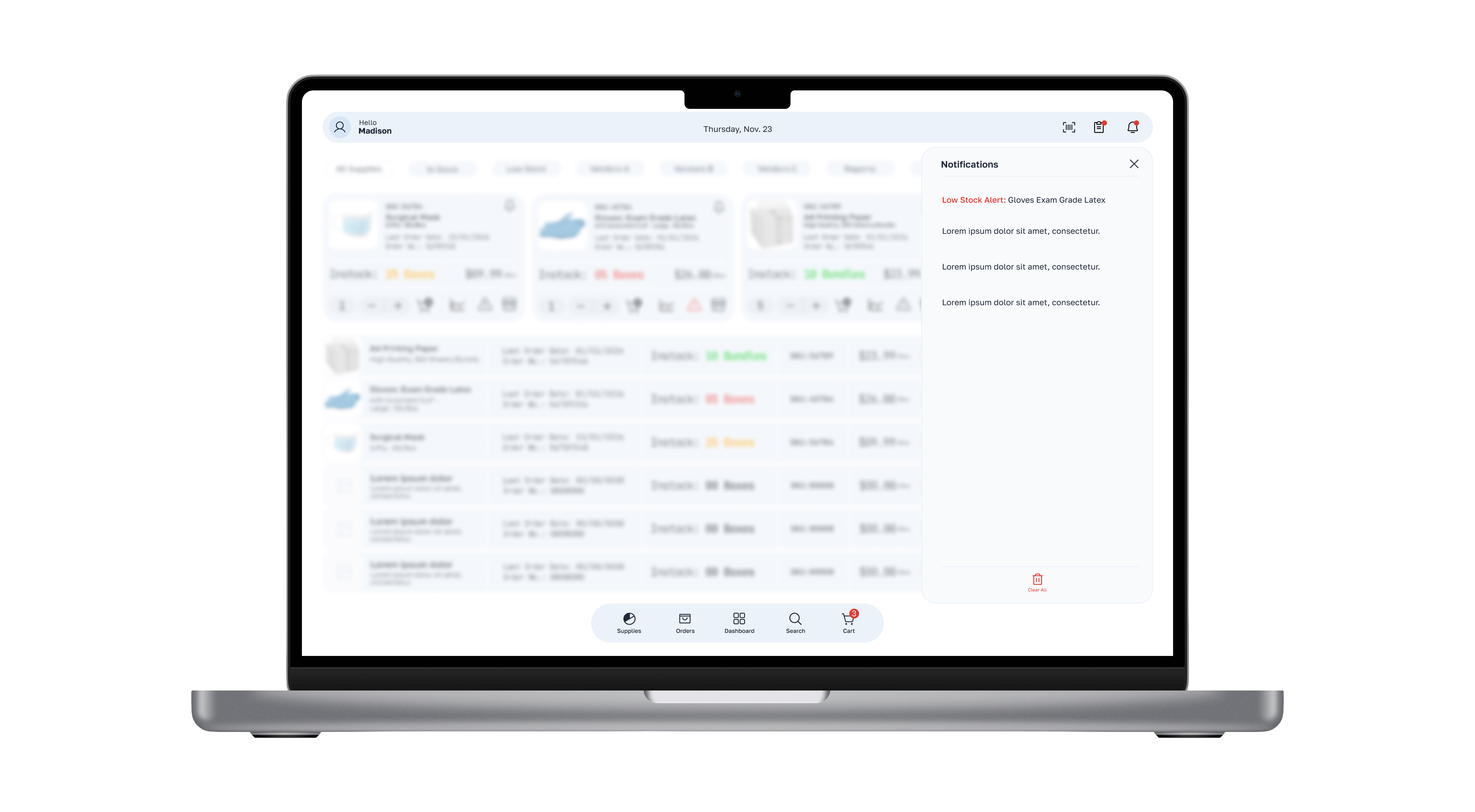
Par levels set per item. Push notifications trigger automatically when stock drops below threshold — before it becomes critical.
Before: Discovering shortages during the audit — often too late
After: Proactive alerts before stock runs out
03
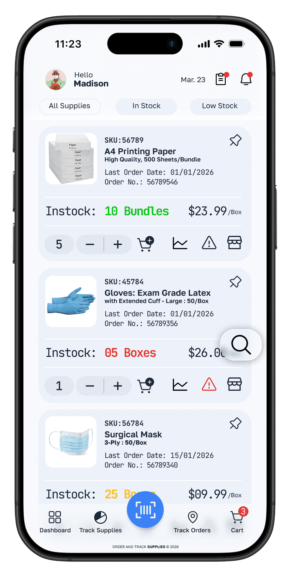
Unified multi-vendor cart
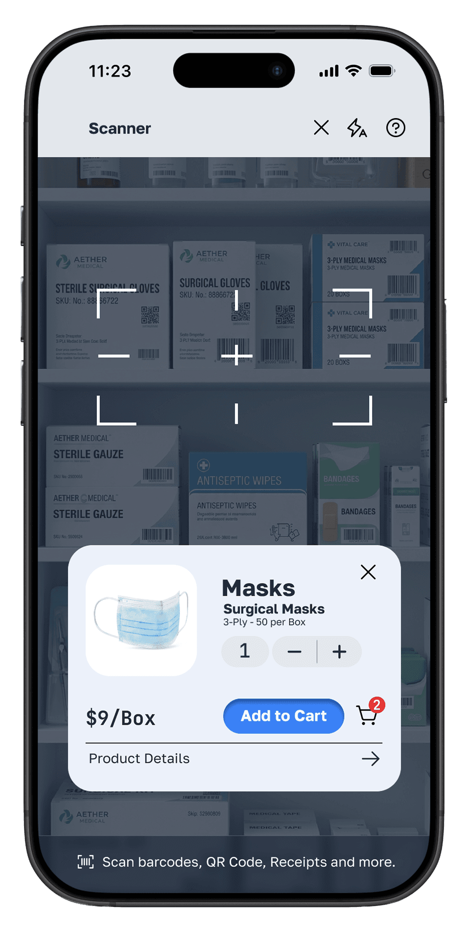
Order from all suppliers in a single cart. One checkout, one order history, one place to track delivery status.
Before: Logging into 5 separate vendor portals to place orders
After: All vendors in one centralised ordering flow
04
Doctor request portal
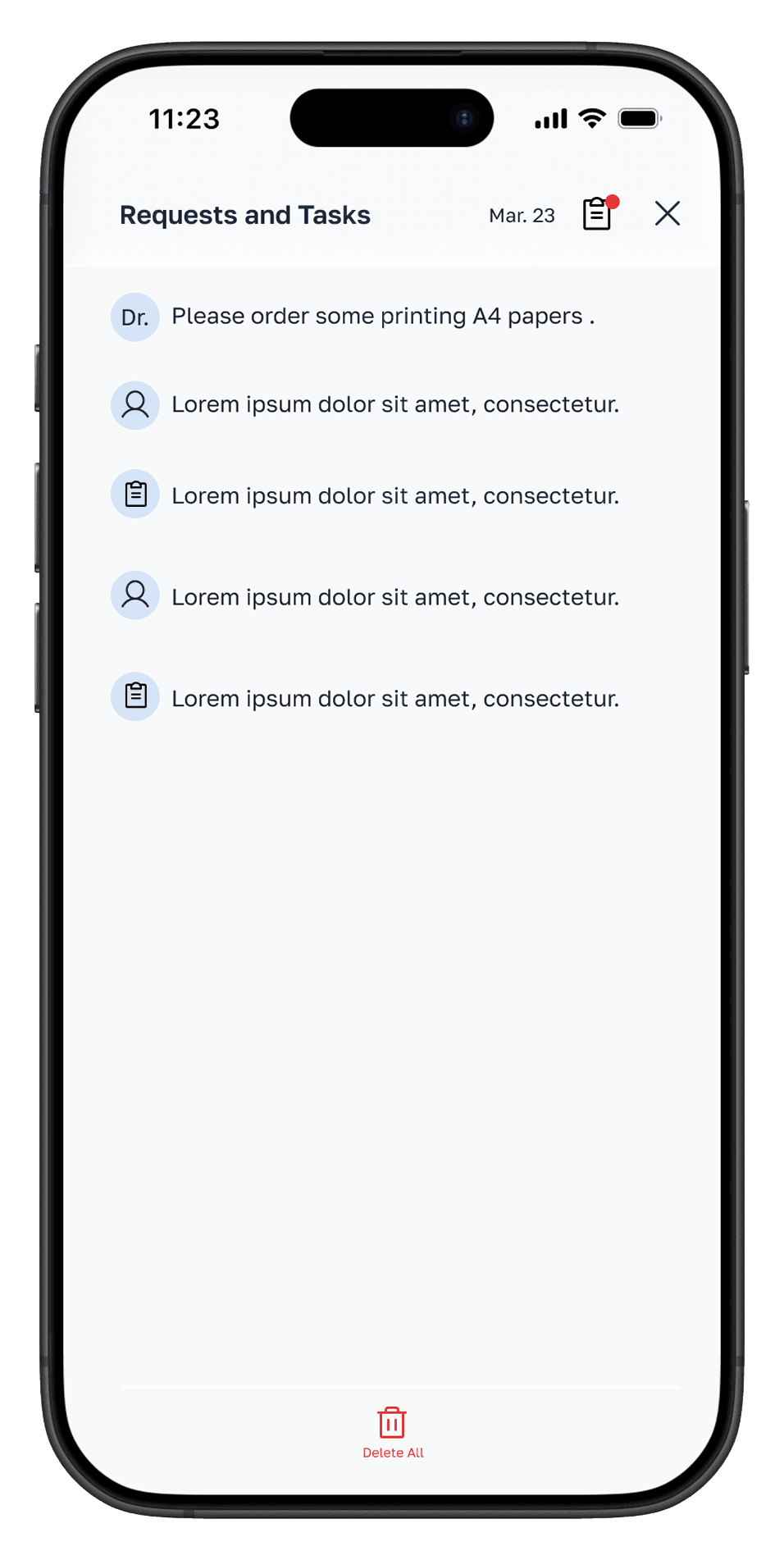
Doctors submit special item requests directly in the app. Madison sees them in the order queue — no interruptions needed.
Before: Doctors interrupting Madison mid-shift for status updates
After: Self-serve visibility for doctors, focused flow for Madison
05
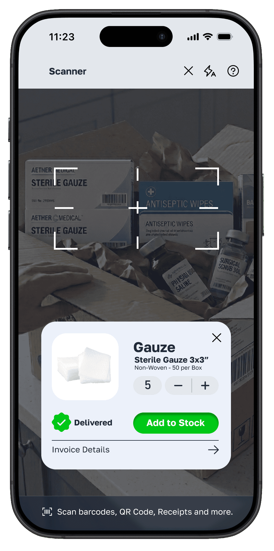
Digital delivery receipting
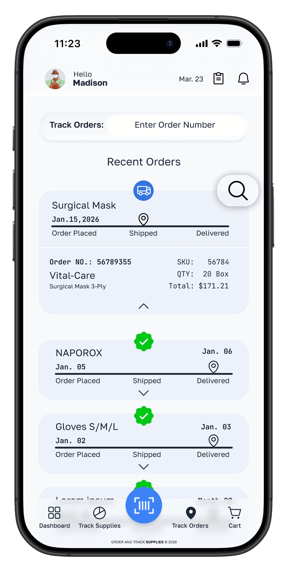
Scan items on arrival — inventory updates automatically. Delivery discrepancies flagged instantly. Manual log entry eliminated.
Before: Manually updating the inventory log after every delivery
After: Scan to receive — inventory syncs automatically
06
Admin dashboard for managers
Office managers get a bird's-eye view of all orders, budgets, and supply levels — with approval controls for large purchases.
Before: No visibility into ordering activity or spend
After: Full oversight — orders, costs, trends in one view
Design Process
Research-led,
iterative design
Empathize
User interviews with pharmacy staff. Observed real supply ordering workflows. Identified emotional friction points.
Define
Built persona and journey map. Synthesised five core pain points into clear problem statements.
Ideate
Sketched multiple flows. Explored how each solution addressed a specific emotional low point in the journey.
Prototype
Lo-fi wireframes → mid-fi in Figma → hi-fi interactive prototype with real supply data
Test
Usability testing with target users. Iterated on navigation, alert hierarchy, and checkout flow.
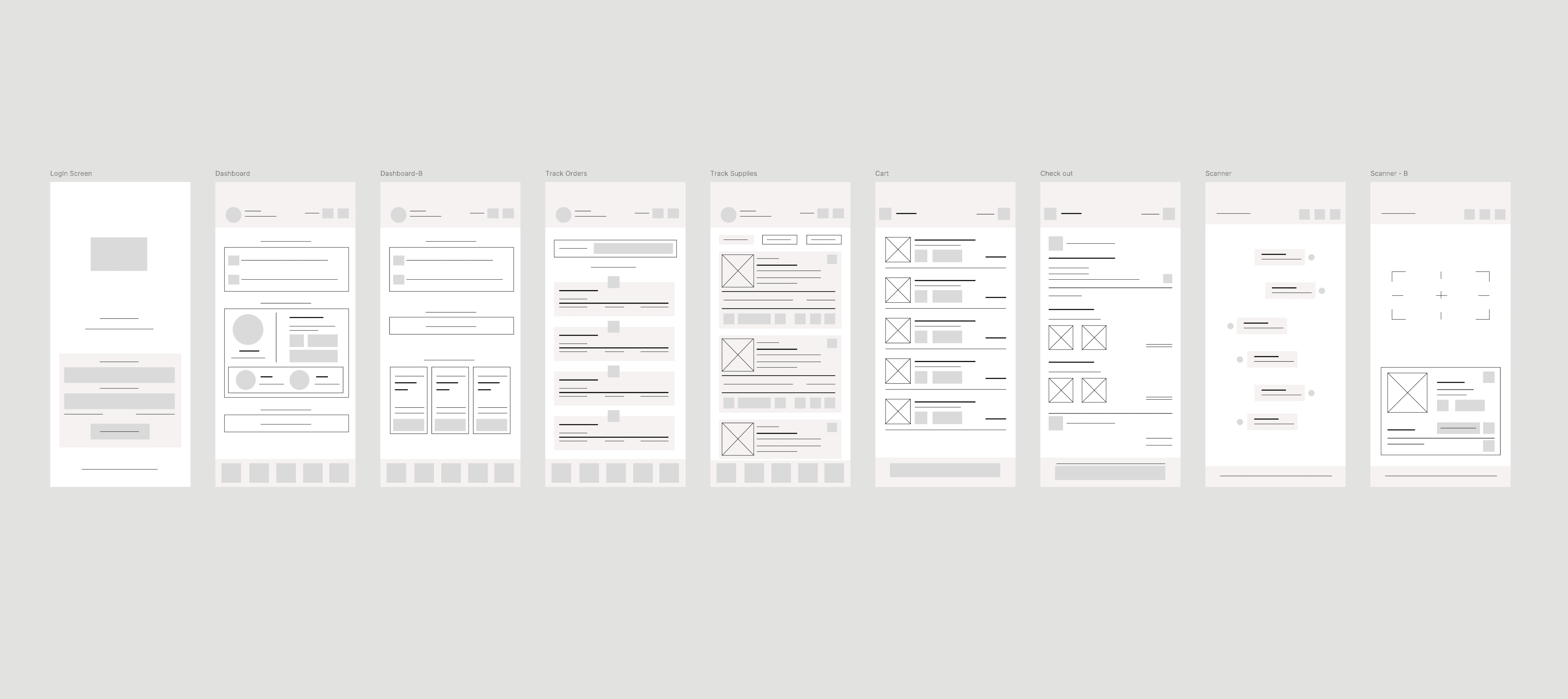
App - Wireframes
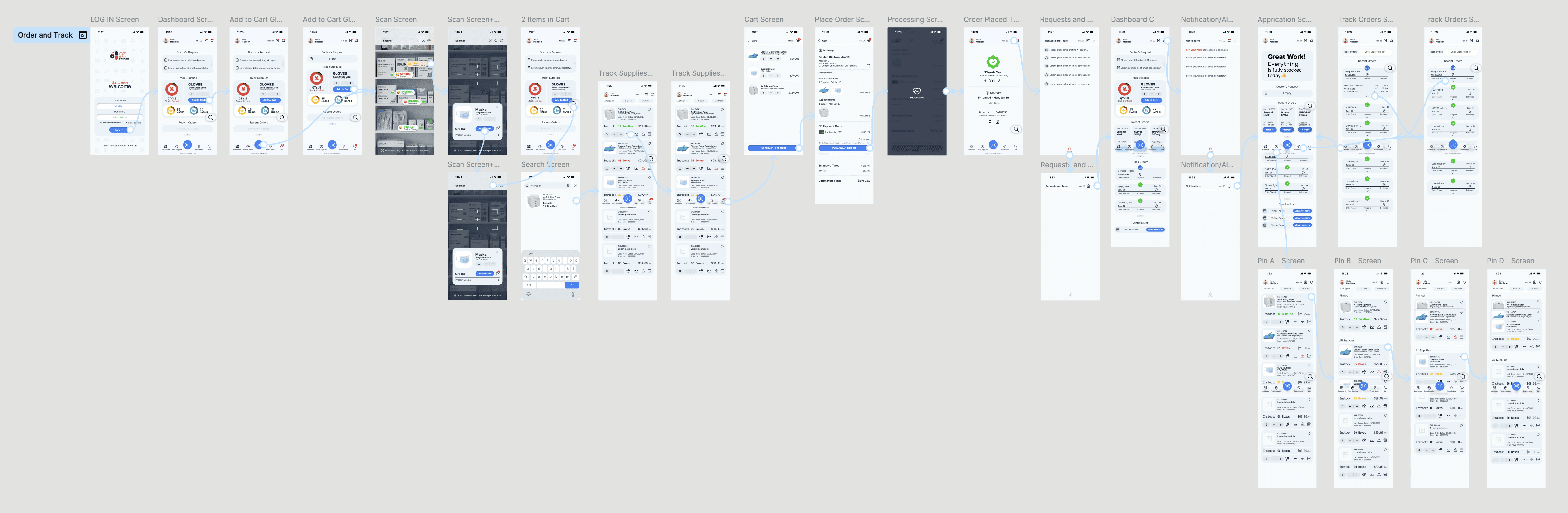
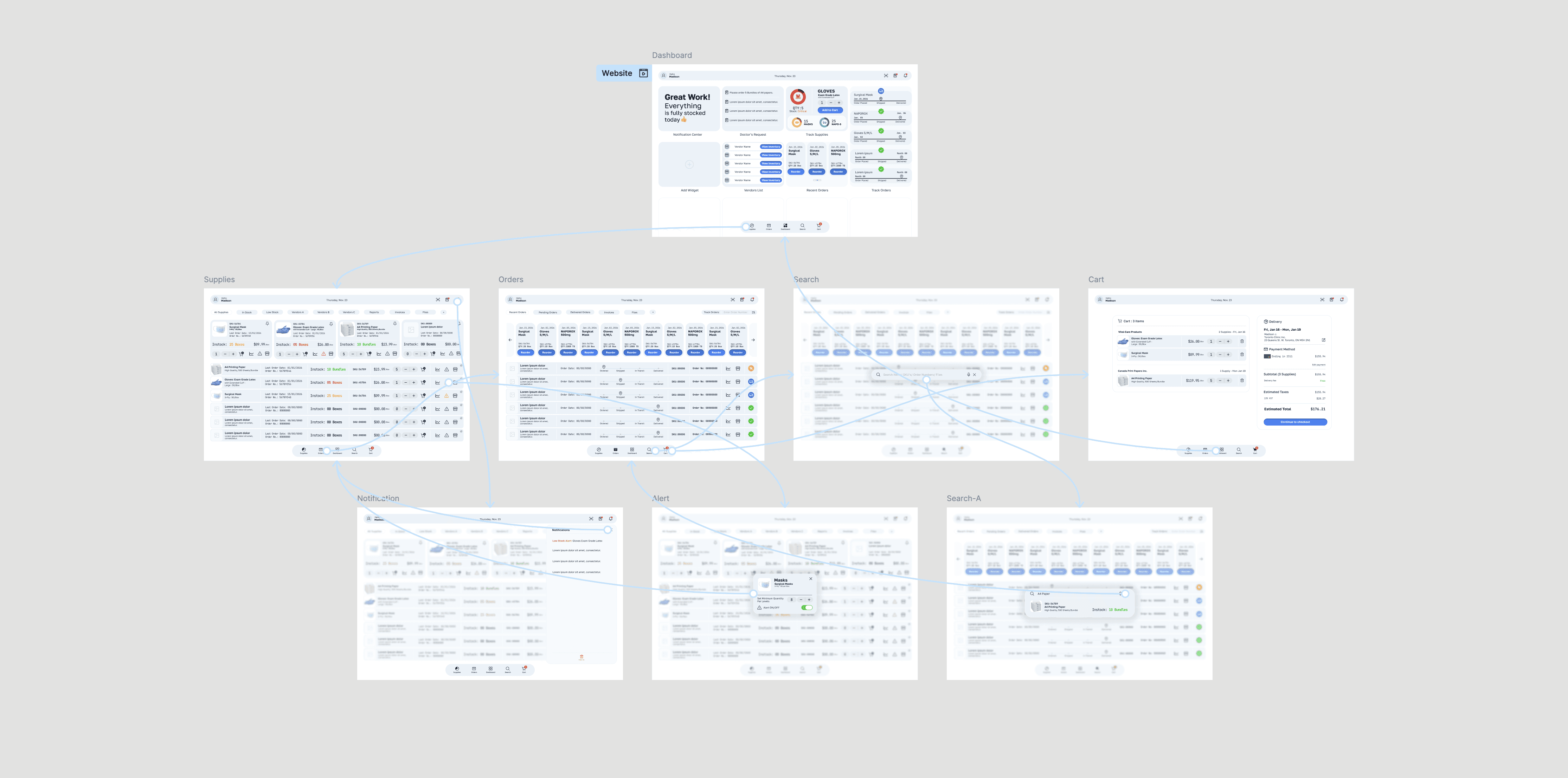
App - HiFidelity Prototype
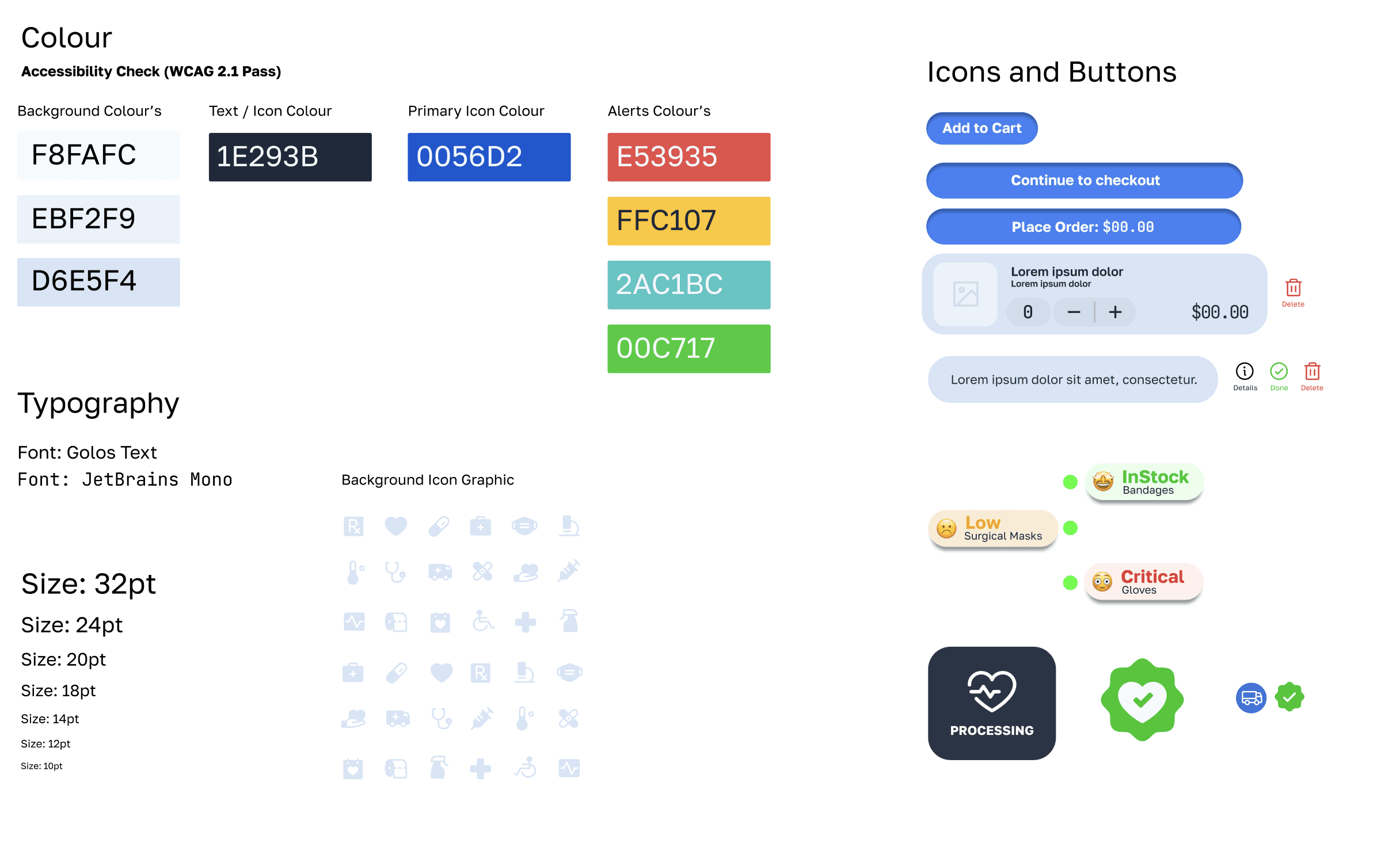
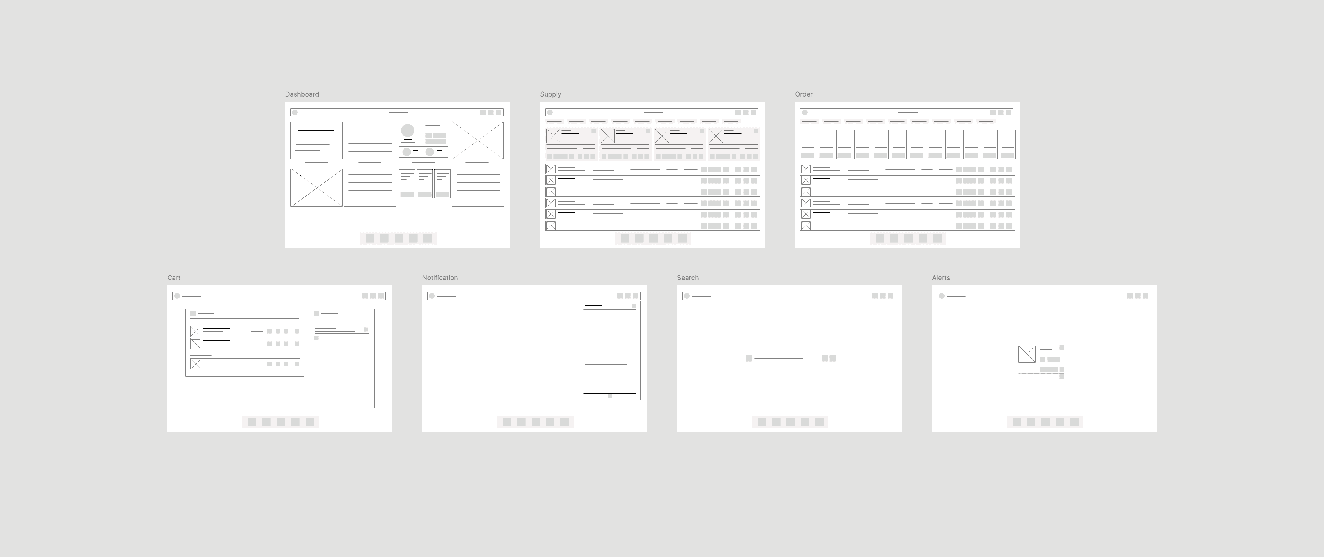
Web - Wireframes
Web - HiFidelity Prototype
Key Screens
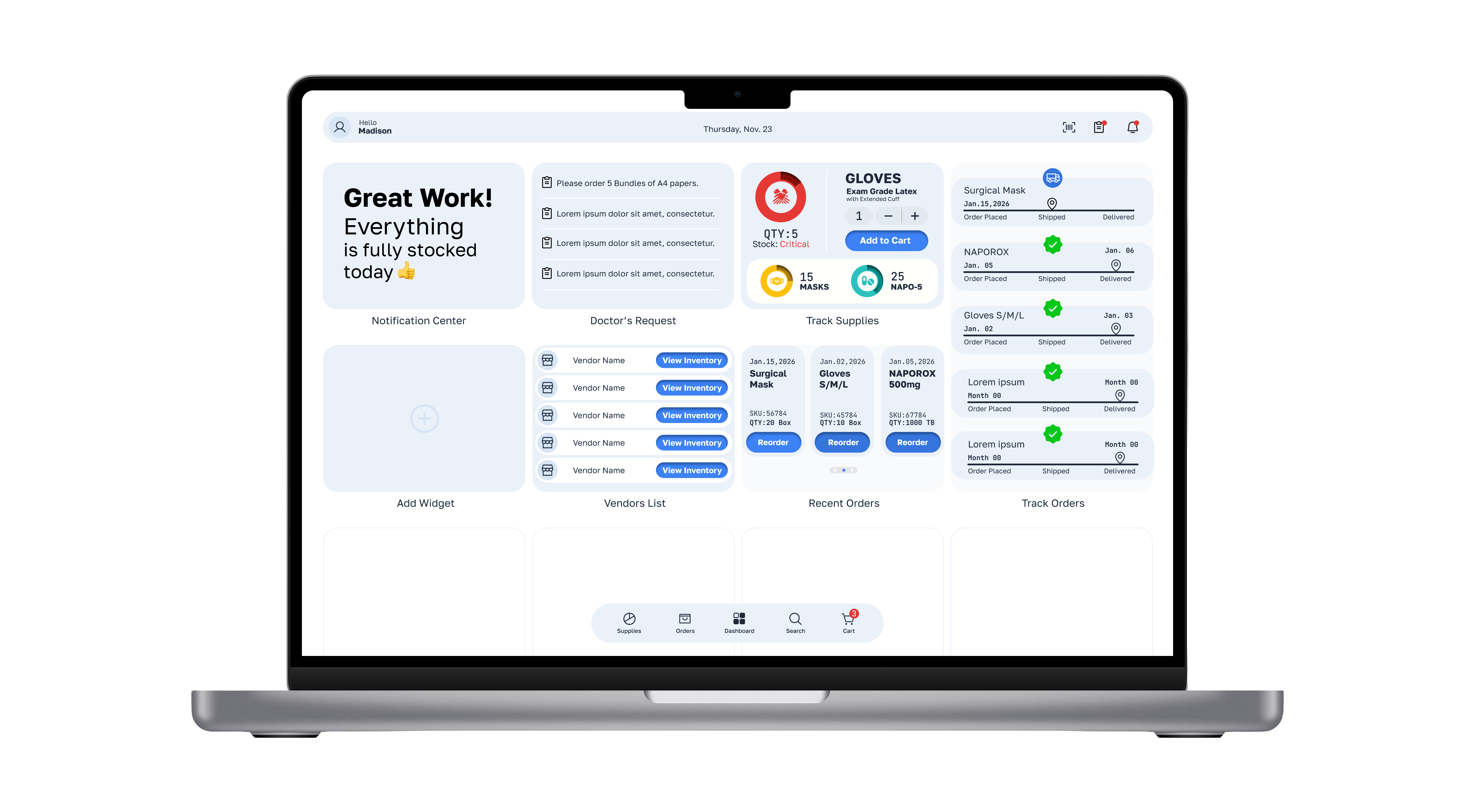
Designed for speed
under real conditions
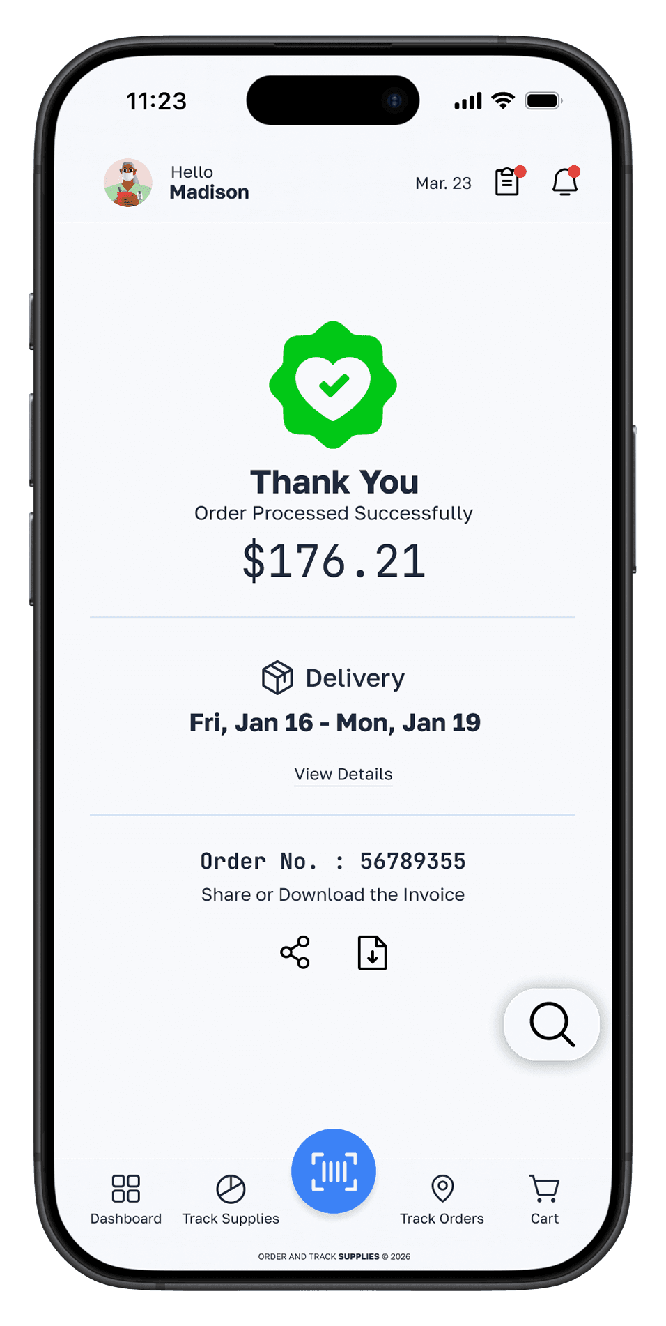
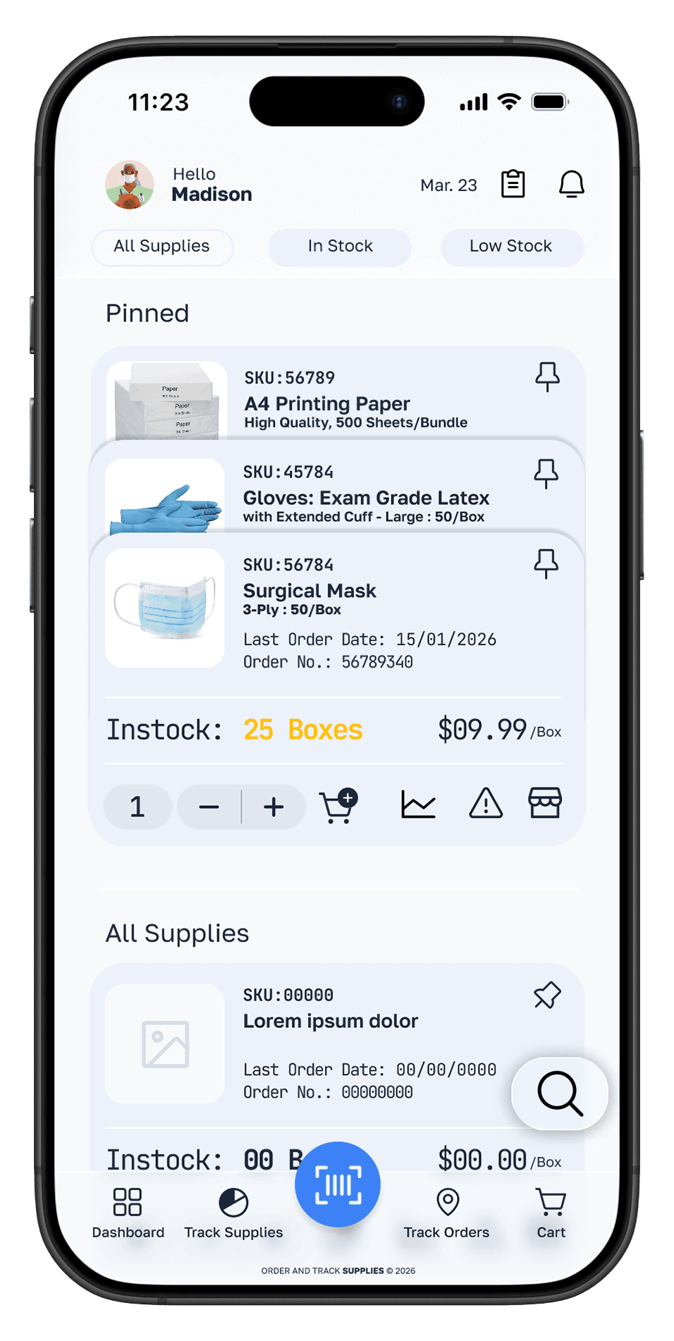
Every screen was designed with one constraint in mind: Madison is mid-shift, possibly interrupted, needs the answer in under three seconds. Cognitive load was the enemy of every design decision.
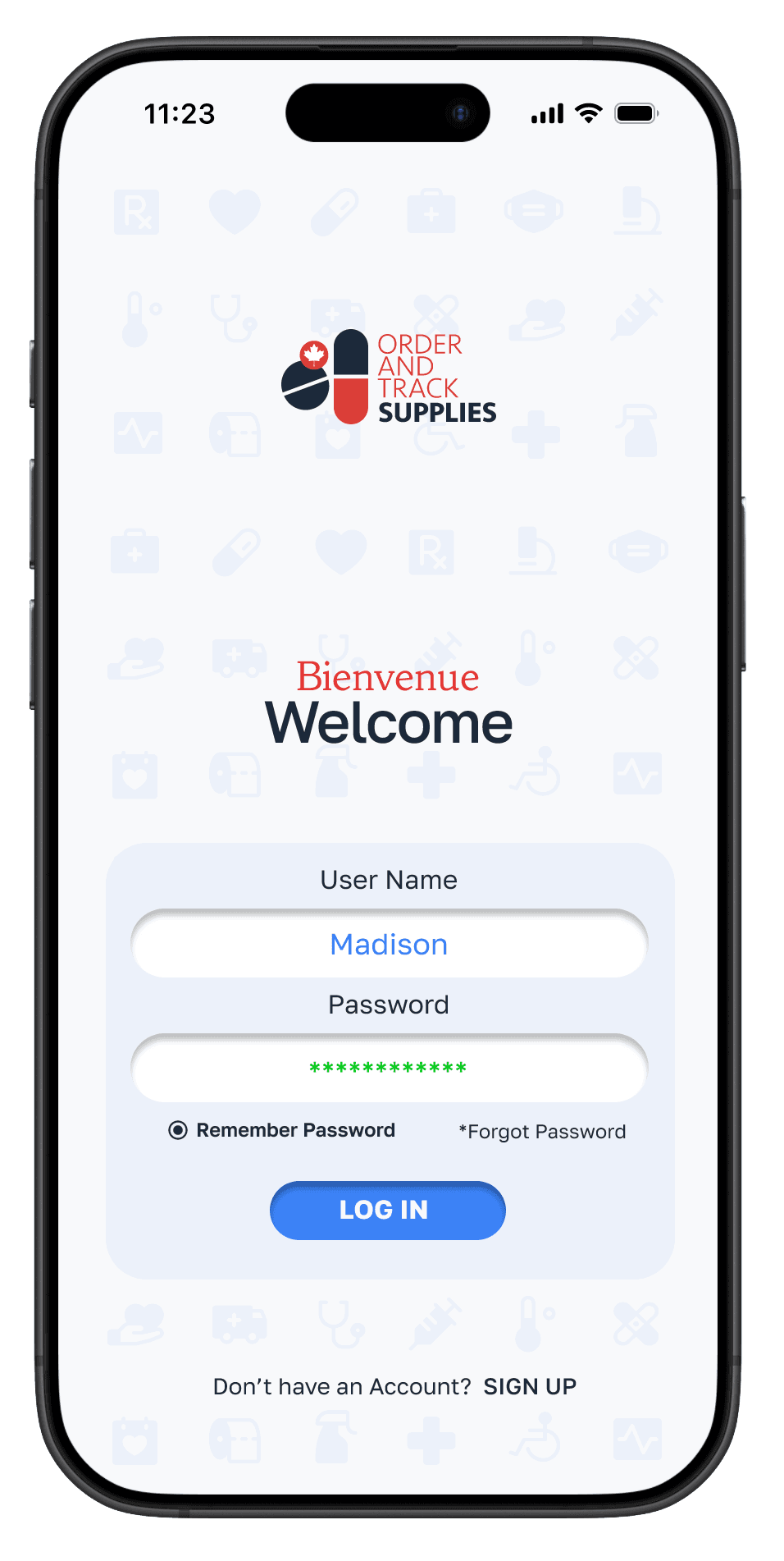
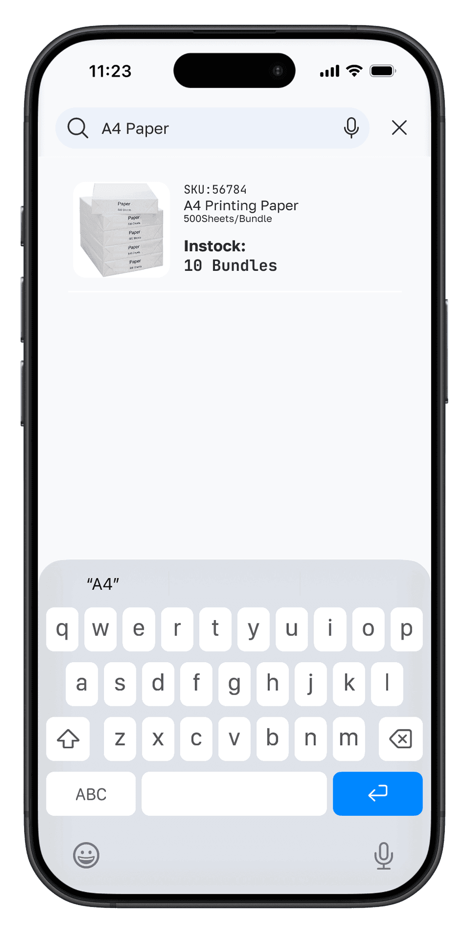
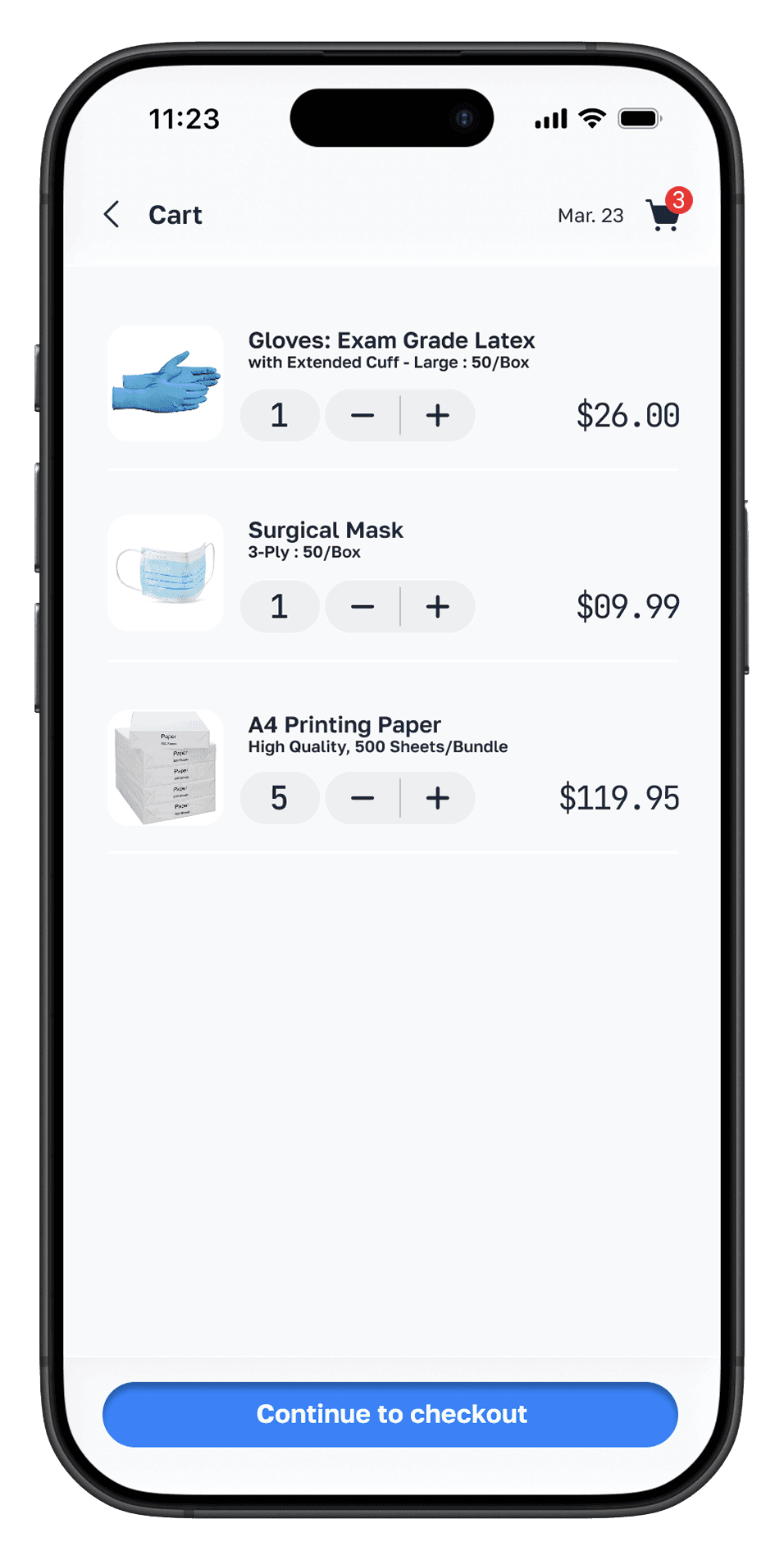
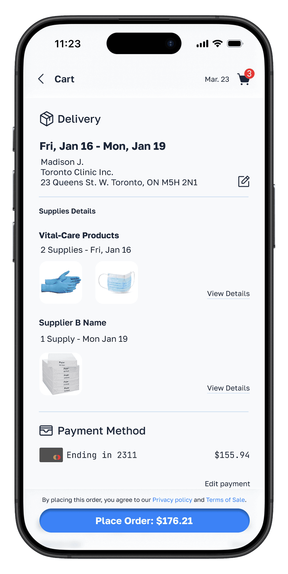
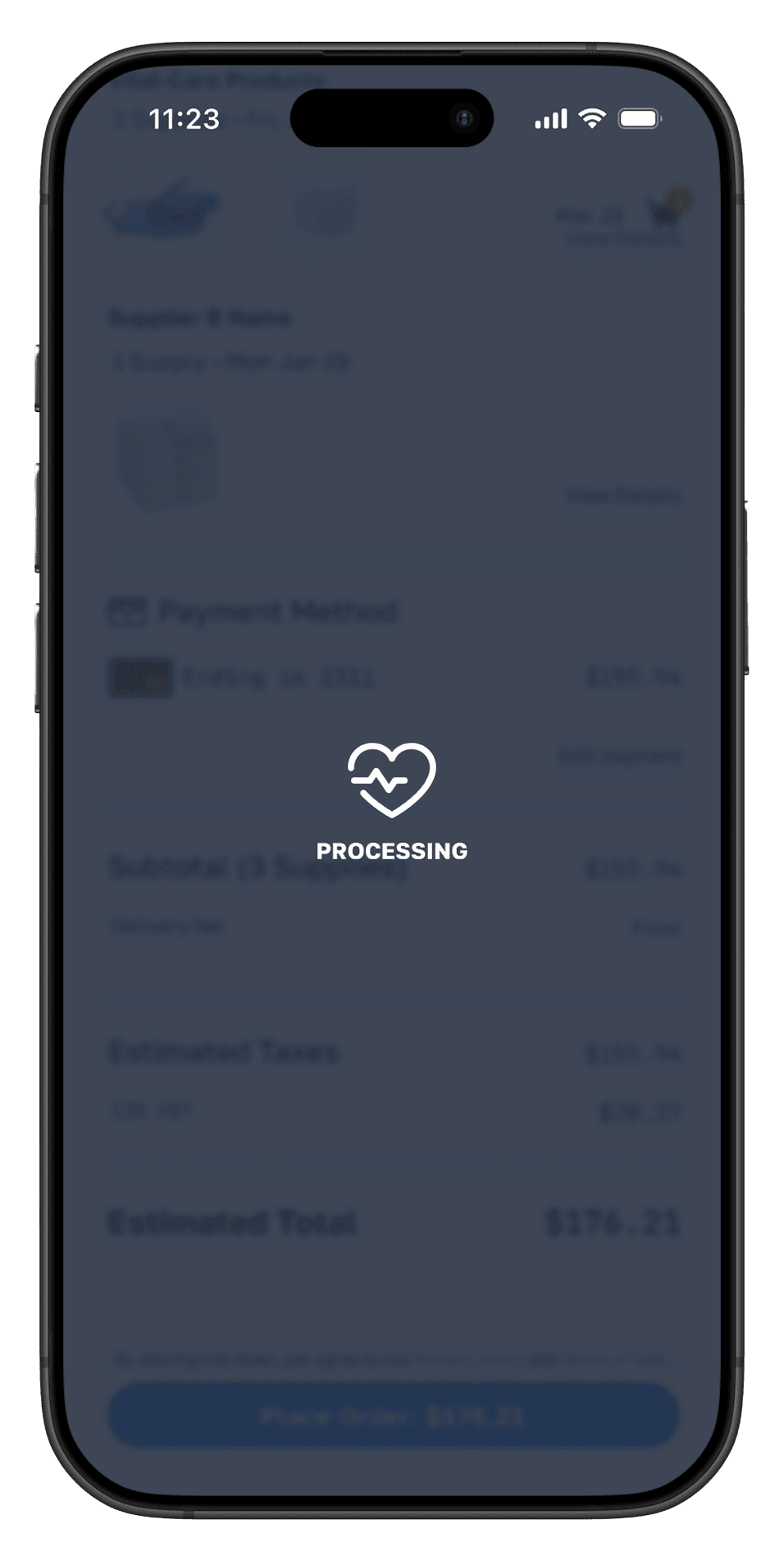
Low
Sugical Mask
☹️
Critical
Gloves
😳
InStockGauze
🤩
InStockBandages
🤩
Low
Sugical Mask
☹️
Design Outcome
From anxious
to in control
The design set out to eliminate the five emotional friction points in Madison's journey.
Each screen was validated against the original journey map to ensure no pain point was left unaddressed.
⚡️
Inventory audit eliminated
Live stock levels replace the clipboard walk entirely. Madison knows supply status without leaving the desk — removing the most time-consuming daily task.
🔔
Anxiety replaced by confidence
Automatic low-stock alerts flip the workflow from reactive to proactive. Madison is notified before a shortage happens — the most stressful moment in the journey, designed away.
🛒
One Flow, All Vendors
The centralized cart collapses five separate vendor portals into one checkout. The most frustrated moment in the journey — simplified to a single screen.
What I Learned
UX is really about
emotional design
The most valuable output of this project wasn't the prototype — it was the journey map. Understanding how Madison felt at each step changed every design decision from a preference into a purposeful response to a real human problem.
01
The journey map is the design brief
Before this project I would have jumped straight to wireframes. Mapping the emotional arc first meant every screen had a specific problem to solve — and I could measure whether it solved it. The frustrated moment at supplier ordering directly became the centralised cart feature.
02
Simplicity is a technical decision
Making the inventory status readable in under three seconds required removing things, not adding them. Progress bars instead of numbers. Colour coding instead of labels. Every simplification was a deliberate tradeoff — and each one was only possible because I understood what Madison needed to know, not just what the system could show.
03
My graphic design background helped
The visual hierarchy of the dashboard — which numbers are large, which are small, where the eye goes first — drew on composition skills I built as a graphic designer. UX and visual design aren't separate disciplines. The best interfaces require both, working together.
04
Design for the mid-shift moment
The constraint that sharpened every decision: Madison is mid-shift, probably interrupted, needs the answer fast. Designing for stress, not for ideal conditions, is what separates a portfolio piece from a product someone actually relies on.