Roles: UX/UI Designer End to End
Duration: 2 Weeks
Harmonium
Music Instrument Learning App
A harmonium learning app that makes Indian classical music accessible, joyful, and culturally grounded for a new generation of players.
20+ Screens Designed · 5 UX Phases · 1 User Persona · 4 Nav Sections
THE BRIEF
A melody recipe
for the digital age
The harmonium is a cornerstone of Indian classical, devotional, and semi-classical music — taught for centuries through oral tradition and one-on-one instruction. The brief was to reimagine that learning experience as a mobile app — accessible, culturally respectful, and intuitive enough for a 17-year-old Bhangra instructor in Brampton to pick up without a teacher present.
The project required designing the complete UX system from scratch: research, persona development, concept mapping, information architecture, wireframes, usability testing, icon design, brand persona, visual language, and hi-fi mockups across more than 20 screens.
THE CHALLENGE
How do you bring a centuries-old tactile learning experience onto a 4-inch screen — without losing the cultural soul of the instrument or overwhelming a first-time user?
TARGET AUDIENCE
South Asian youth in Canada — culturally connected, mobile-first, wanting to learn Indian music on their own terms and timeline.
DISCIPLINES
User Research · Concept Mapping · Persona Design
Information Architecture · Wireframing · Icon Design
Usability Testing · Brand Persona · Visual Design
Hi-fi Mockups.
APP SECTIONS
Let's Play · Models
Lessons · Settings
THE USER RESEARCH
Meet Harjot.
The user who
shaped everything.
Research revealed a clear primary user — a young, culturally connected South Asian Canadian who is already embedded in Indian music culture but has no structured way to learn the harmonium digitally. Every design decision flows back to Harjot.
Harjot
Student
/Bhangra Instructor
AGE
17 years old
LOCATION
Brampton
TECH COMFORT
Mobile phone
CAREER GOAL
Computer Science
"The app should be easy to navigate. Maybe a voice assistant could help. I want to start where I left off — on my phone, on the go, at any time."
IDEAL EXPERIENCE
Voice assistant for accessibility and navigation.
Able to connect a real instrument to the app.
Targets different cultural communities.
Mobile app that saves progress and resumes anywhere.
FRUSTRATIONS
Complicated systems will frustrate immediately
Concerned online learning won't be as effective as in-person.
Relying on internet connection to learn music.
Not truly mobile — can't pick up mid-session.
BRAND PERSONA
Aria — the friendly
voice of the app.
Rather than a generic interface, the app needed a personality — someone who feels like a friend who happens to know a lot about harmonium. Aria was designed as the emotional and tonal backbone of the entire experience.
Voice & Tone
Familiar, friendly, and above all, human. Aria communicates with the folksy warmth of an old friend — suggesting musical notes, sharing stories about famous singers, never getting in the way of the workflow. In critical situations, Aria drops the suggestions and speaks directly.
Surprise & Delight
Keynotes pop up from the corner of the screen with questions related to the user's musical interests. Random funny greetings appear at the top of each main page. Giveaways reward users who complete a full music composition — audio CDs, for example. Fun is always around.
Visual Language
Cool, warm tones evoke the feel of folk music and cultural heritage—a mixture of sans-serif and decorative typefaces — one for function, one for feeling. Sizes are clear and readable. Photography of the instrument itself is the primary visual texture throughout the app.
Childish but actually FUN
Simplistic but actually EASY
Stodgy but actually TRUSTWORTHY
Complicated but actually POWERFUL
RESEARCH & ARCHITECTURE
Mapping every
dimension of the harmonium.
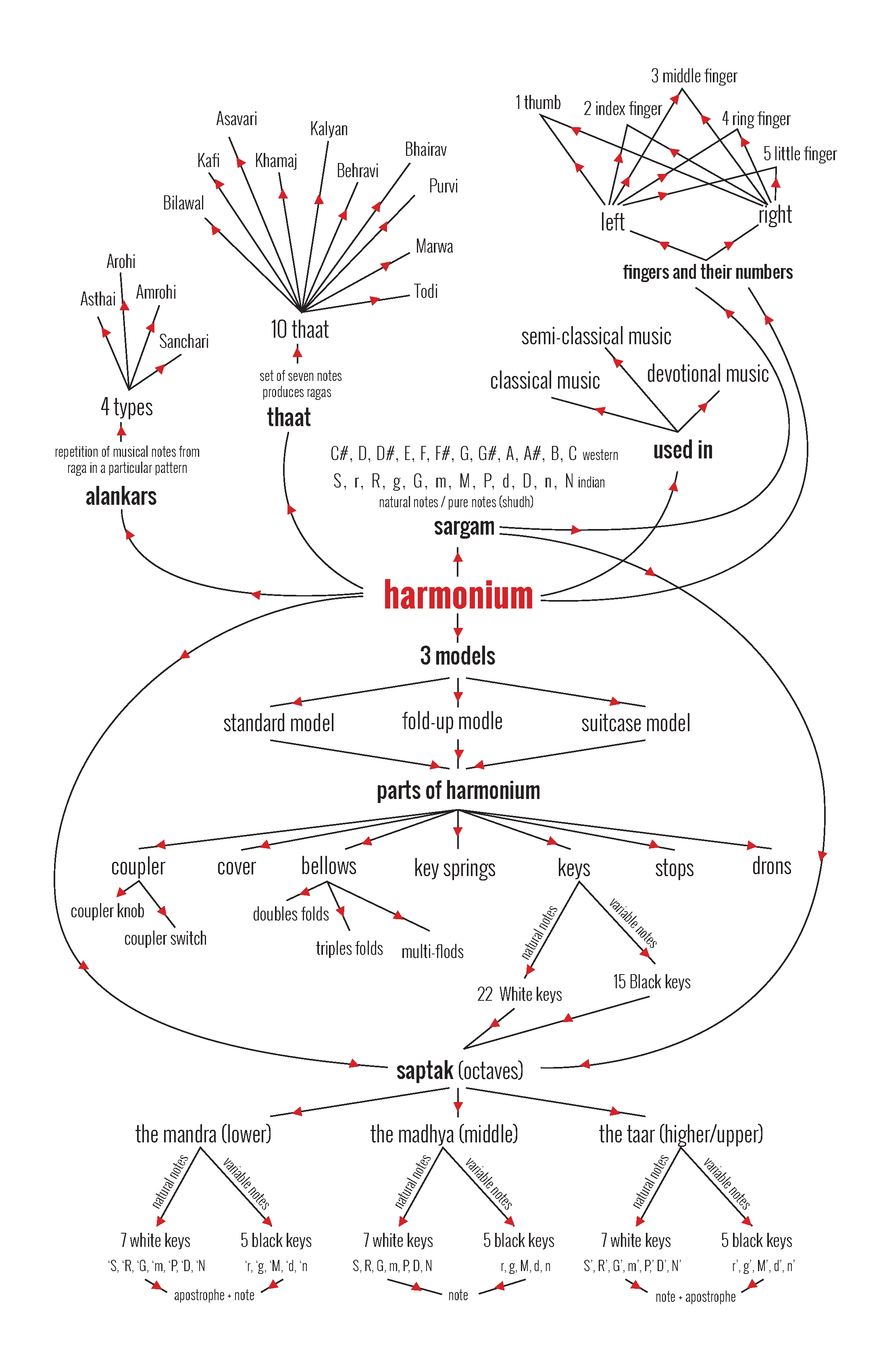
Before a single wireframe was drawn, a concept map organised everything a user might need to know about the harmonium — from its three models and seven parts to the musical theory of sangam, thaat, and alankars. This became the blueprint for the information architecture.

DESIGN PROCESS
Five phases
from research
to hi-fi.
01
RESEARCH
Concept mapping & user research
Mapped the full domain of the harmonium — its parts, models, musical theory, and cultural context — into a concept hierarchy. Developed the primary user persona through research into South Asian youth in the GTA, identifying key frustrations and ideal experiences.
Concept map
User persona — Harjot
Motivation analysis
02
ARCHITECTURE
Site map & information architecture
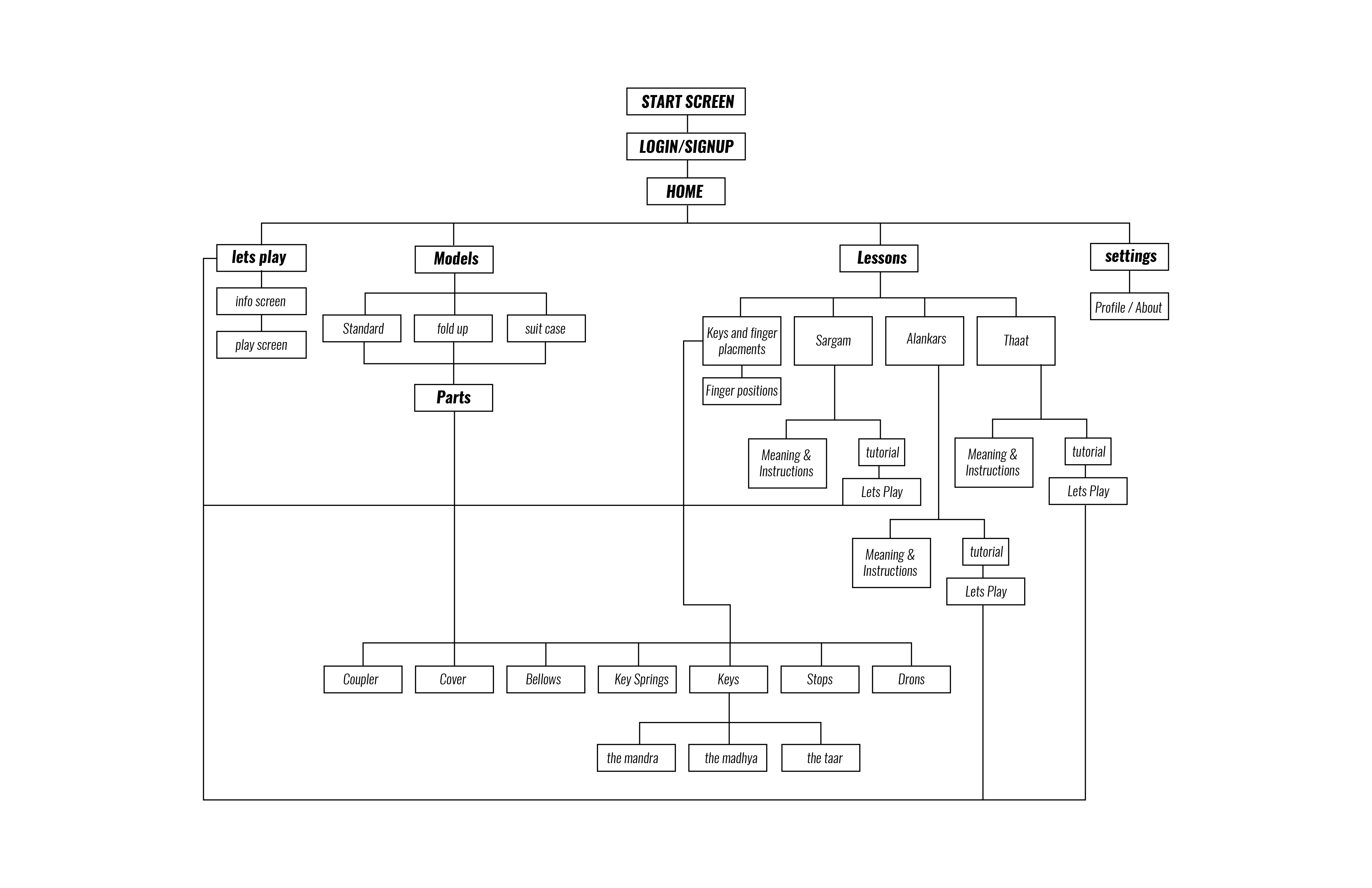
Translated the concept map into a navigable information architecture. Defined four primary sections — Let's Play, Models, Lessons, Settings — and mapped every sub-screen beneath them. The Lessons section alone required four branches: Keys & Finger Placement, Sargam, Alankar, and Thaat.
Full site map
Navigation structure
Screen inventory
03
IDEATION
Process flow diagram & wireframes
Built a complete process flow diagram — "Melody Recipe" — mapping every user decision from onboarding through playing. Wireframed 20+ screens across the full app: start screen, login, signup, home, menu popup, models, parts, keys, octaves, all lesson screens, and the play screen in landscape mode.
Flow diagram
20+ wireframes
Landscape play screen
04
BRAND & VISUAL
Brand persona, icons & mood board
Developed the Aria persona — voice, tone, visual lexicon, personality map, and engagement methods. Designed a complete custom icon set of 12 icons in a distinctive map-pin bubble shape. Built a mood board drawing on South Asian cultural visual references, warm earthy tones, and folk music aesthetics.
Aria persona
12 custom icons
Mood board
Visual lexicon
05
TESTING & HI-FI
Usability testing & hi-fi mockups
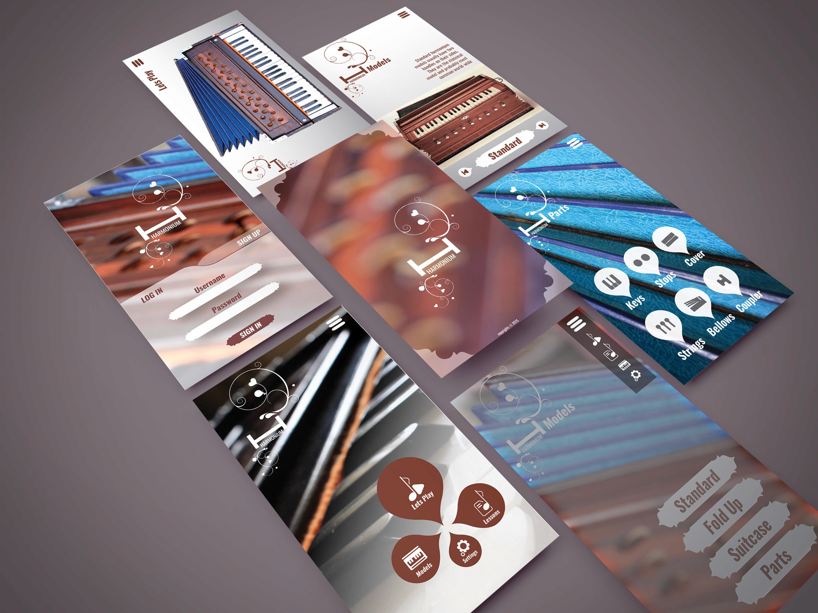
Conducted usability testing that surfaced multiple issues across the design. Applied fixes and produced hi-fi mockups across nine key screens — from the atmospheric start screen through to the landscape play interface with the full harmonium keyboard rendered on screen.
9 hi-fi mockups
Iteration report
KEY SCREENS
20+ screens.
One coherent
system
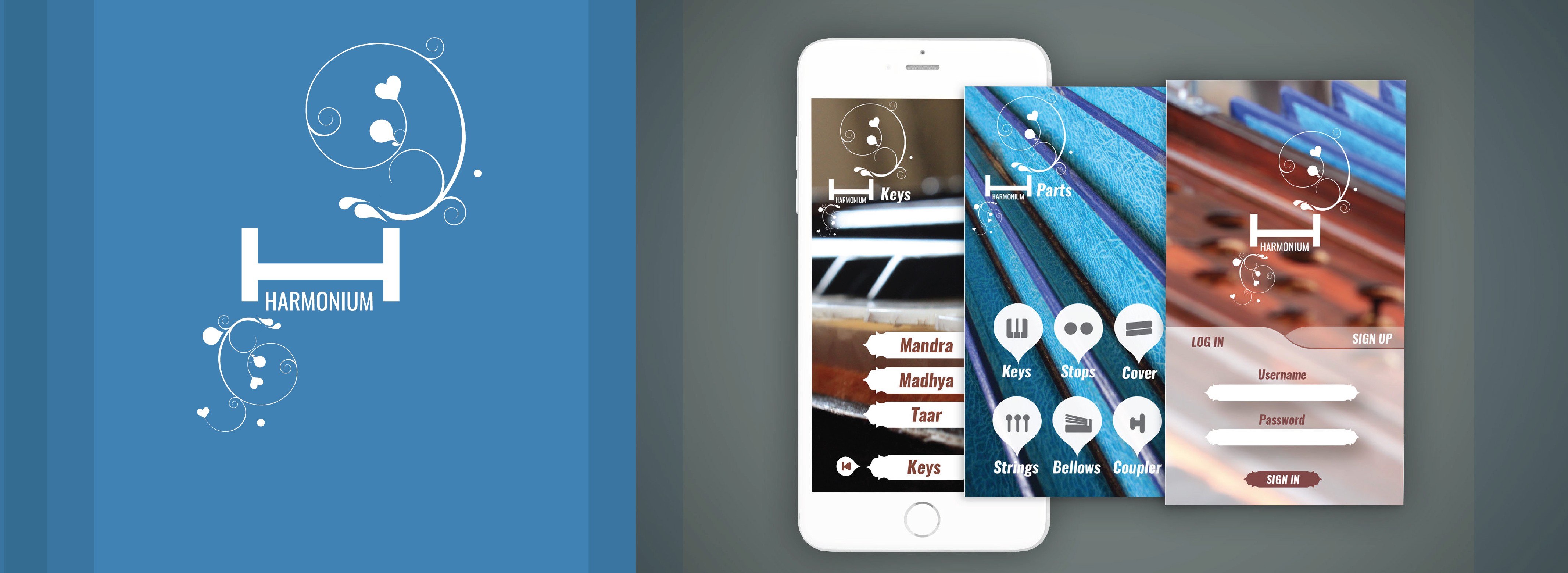
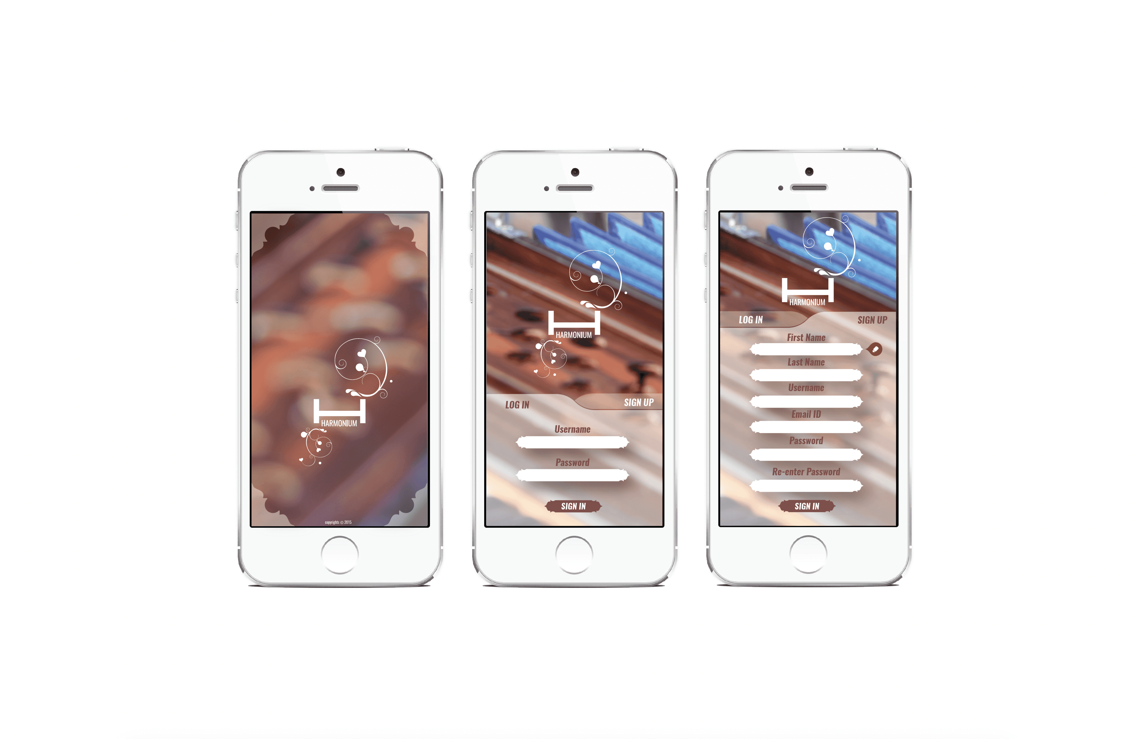
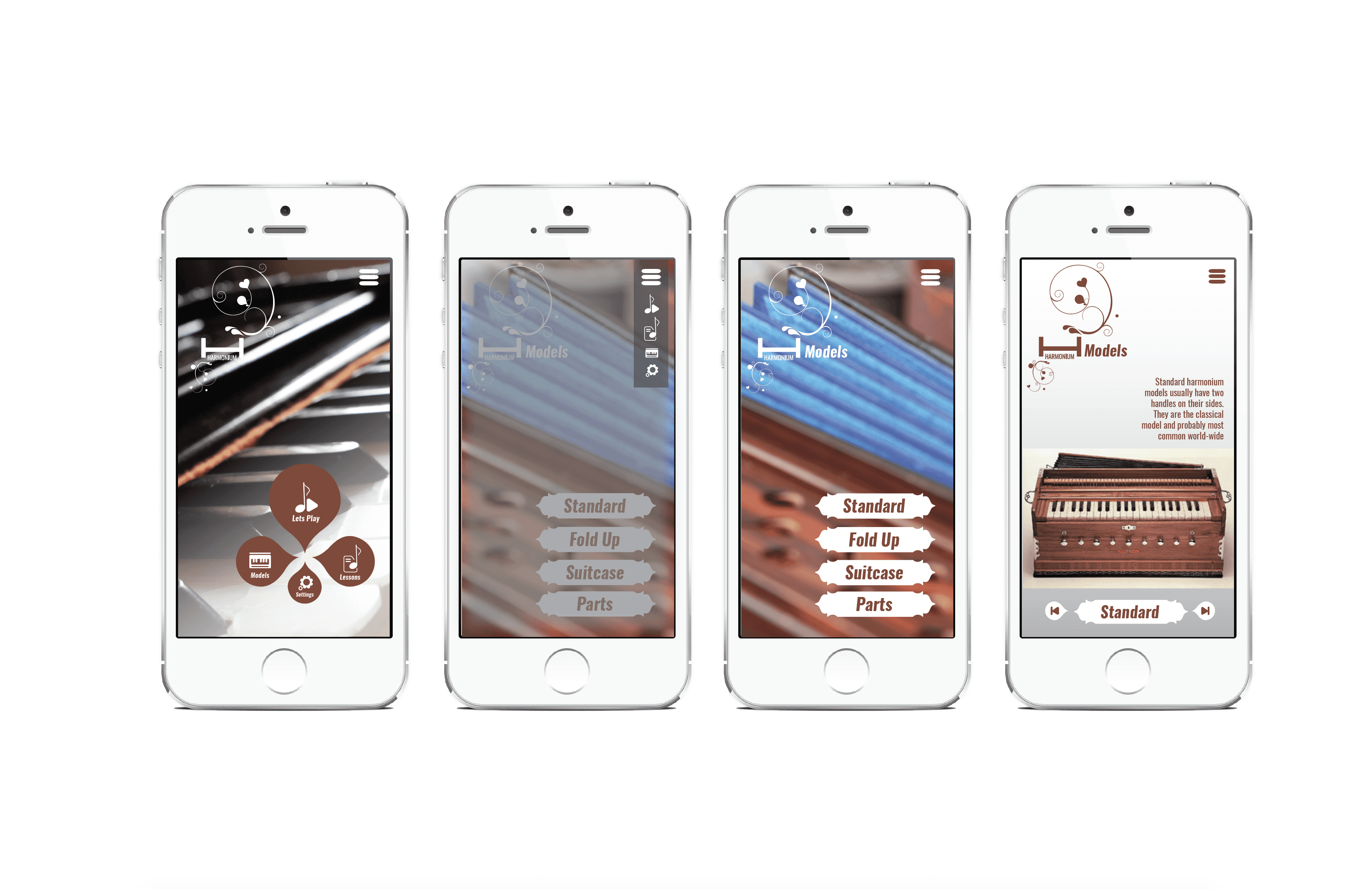
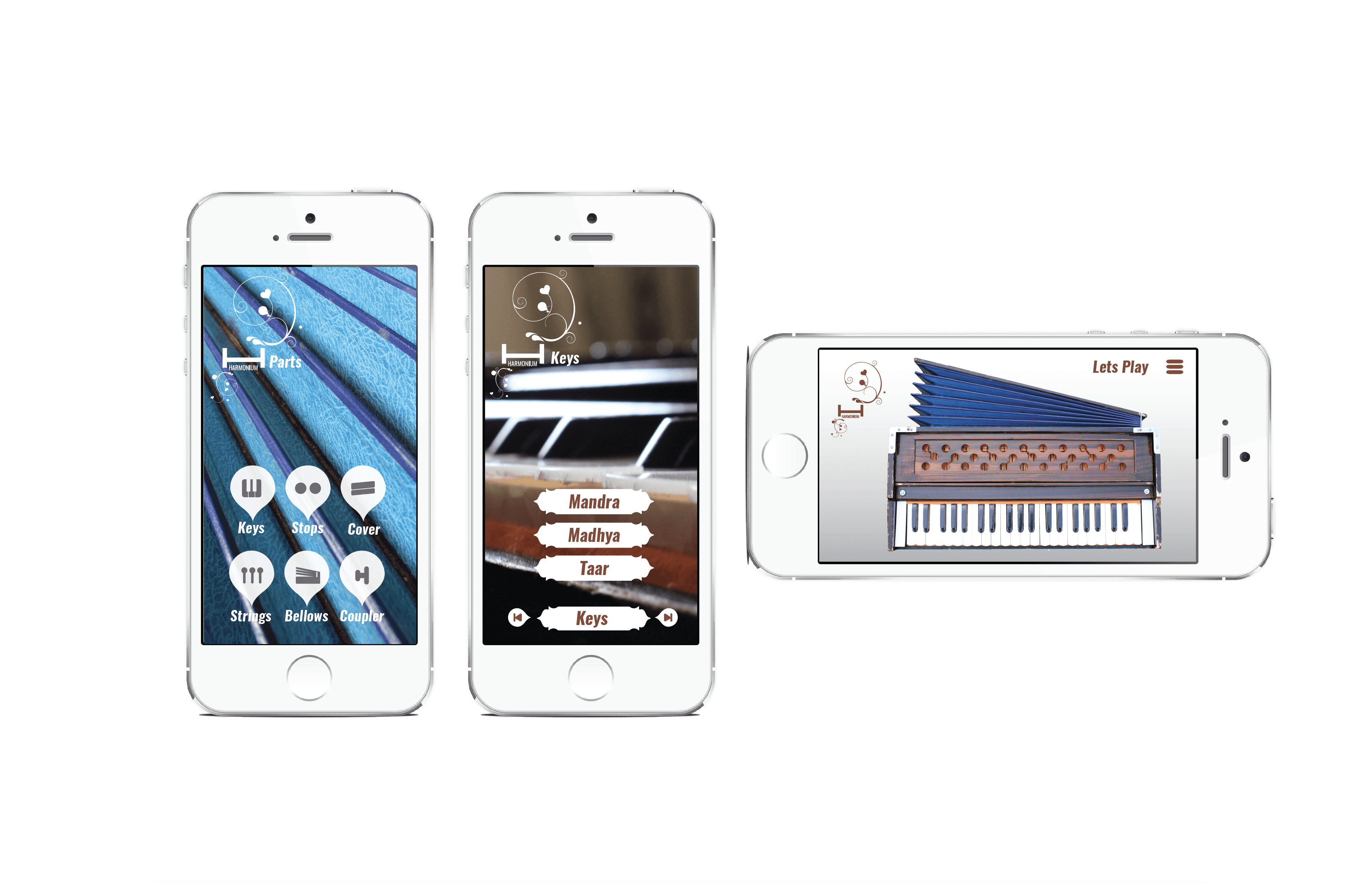
Every screen follows the same visual grammar — warm photography as background texture, the Aria logo mark top left, the hamburger menu top right, and the custom icon navigation at the bottom. Consistency at every level.
WIREFRAMES —
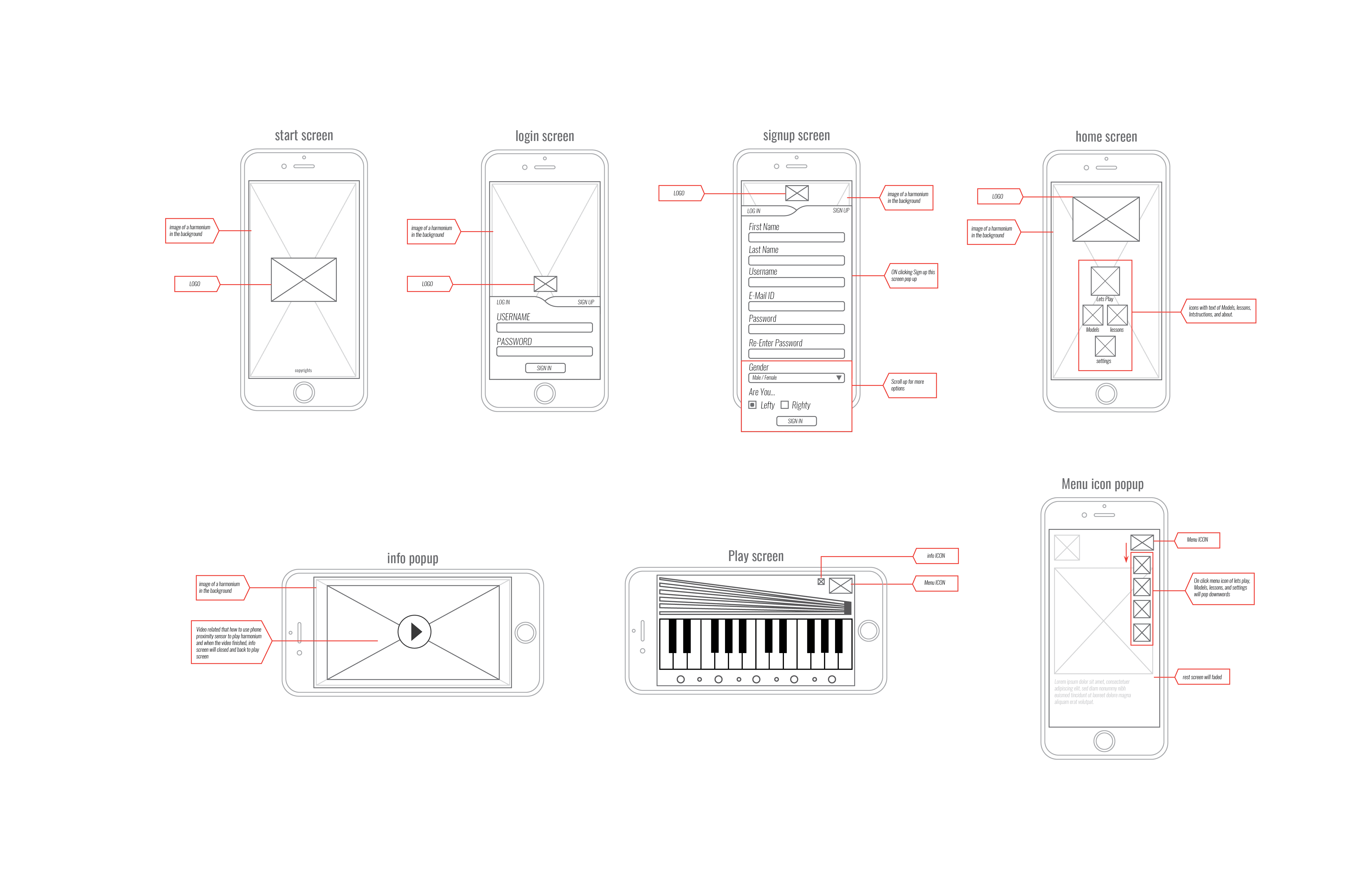
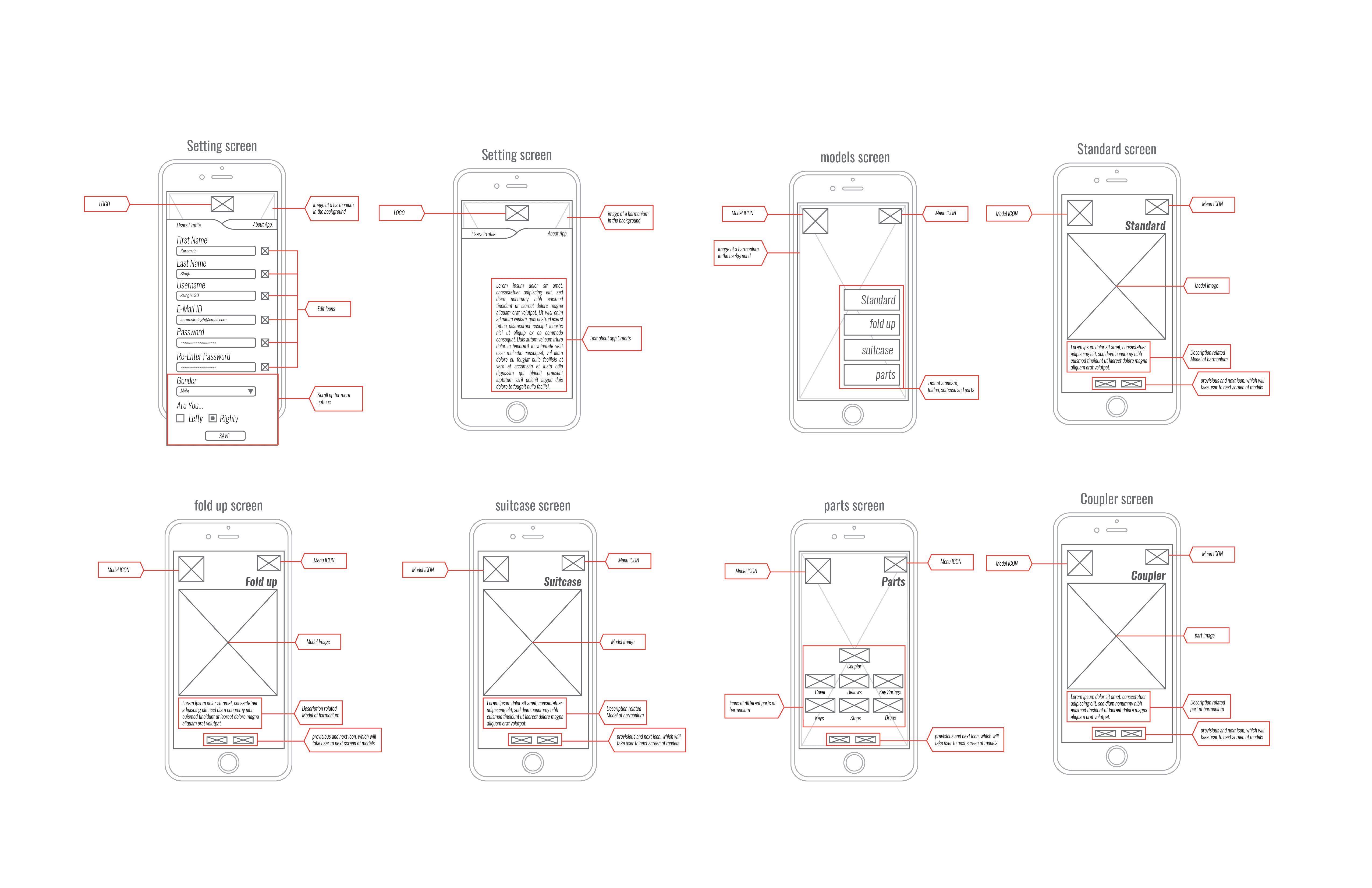
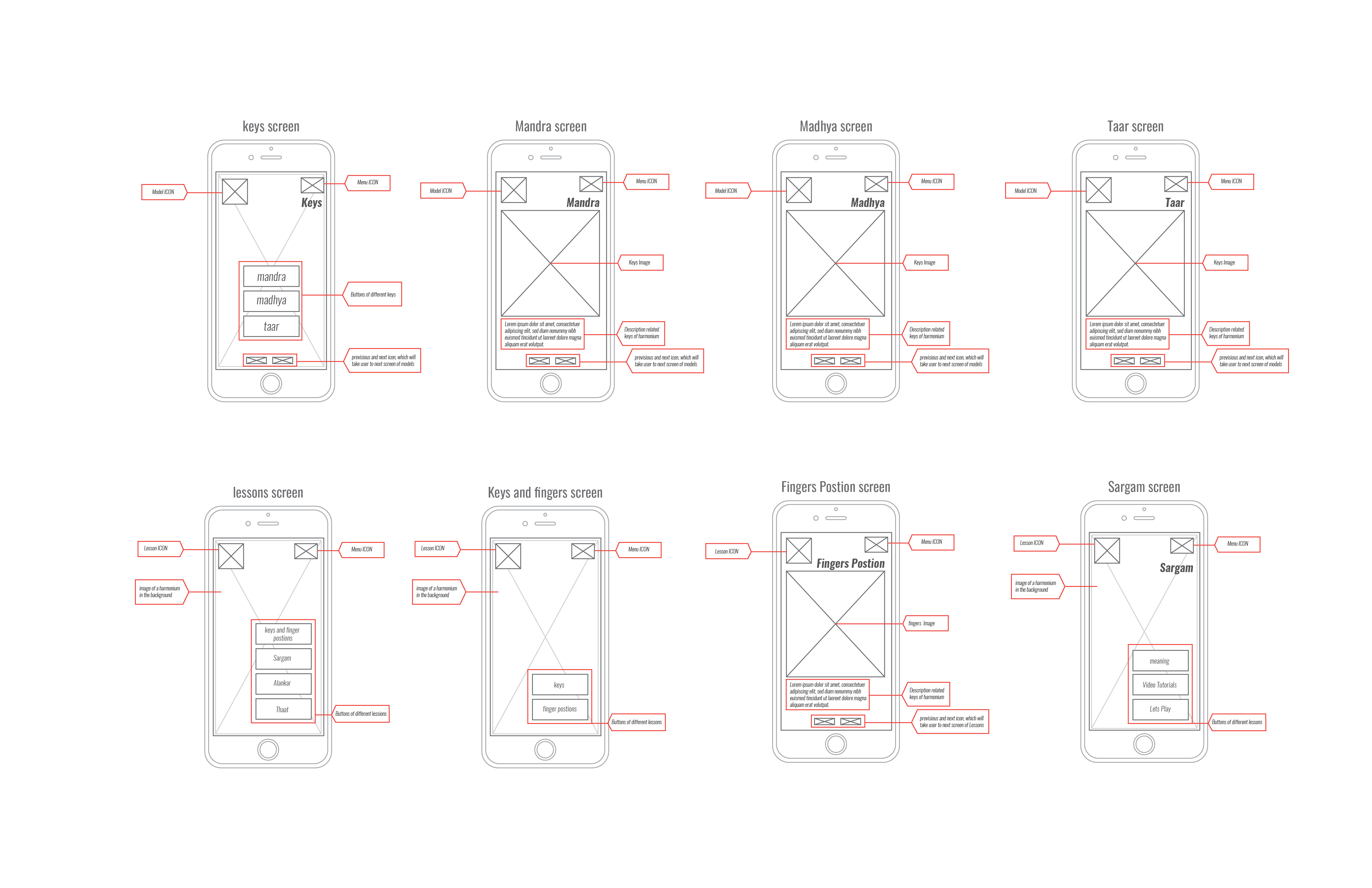
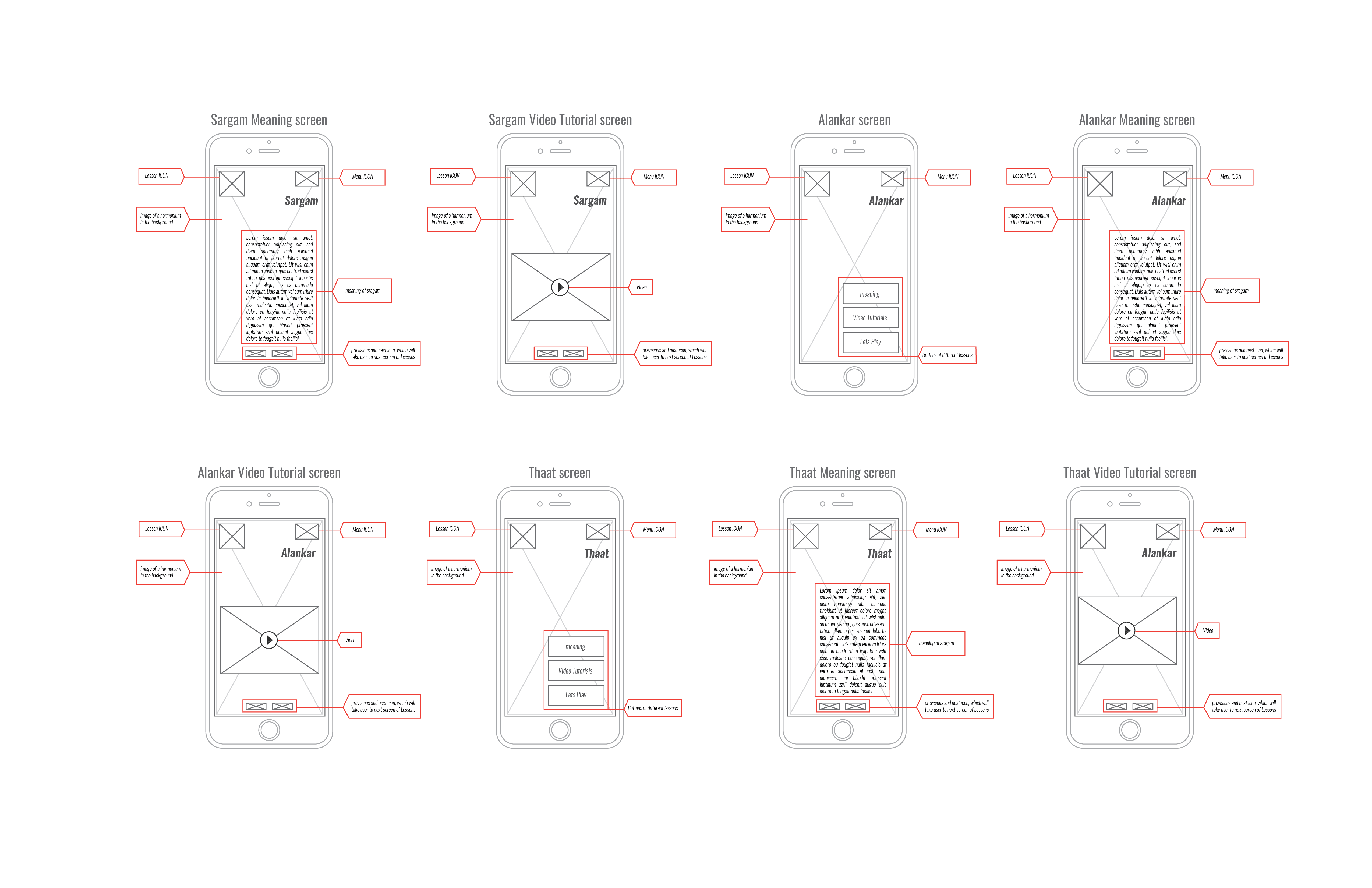
DIGITAL HIFI MOCKUPS —
ICON DESIGN
14 custom icons —
one distinctive shape.
Every icon uses the same map-pin bubble shape — a circle pointing downward — rendered in dark charcoal with a white symbol. The shape echoes the cultural idea of a landmark, a place of learning. Consistent, scalable, and immediately recognizable as Aria.














VISUAL LANGUAGE
Colours of folk
culture & craft
The palette draws from the visual world of Indian folk music — earthy terracottas, warm browns, deep charcoal, and the warm ochre of aged wood. Cool accent tones enter on the Parts screens, reflecting the blue-steel colour of harmonium key caps. Every colour choice has a cultural and functional reason.
Rust Red
#C0392B
Primary accent · Aria red
Harmonium Brown
#6B362A
Buttons · navigation
Warm Sand
#C49A6C
Secondary UI elements
Deep Ink
#0E0D0B
Icons · play screen
Steel Blue
#3B5B8C
Parts screens · keys
Warm Cream
#F7F3EC
Text · UI surfaces
USABILITY TESTING
Problems found.
Problems fixed.
Usability testing surfaced multiple friction points across the design. Each one was addressed with a specific fix before the hi-fi mockups were produced.
01
Lesson & tutorial button labels
Buttons labelled generically — users couldn't distinguish Lessons from Tutorials
Before:
Renamed to clearly differentiate: "Meaning & Instructions" vs "Video Tutorial" vs "Let's Play"
After:
02
Copyright on interlinked pages
Copyright notice appearing on internal screens, cluttering
the UI
Before:
Copyright removed from all interlinked pages, kept only on the opening screen
After:
03
Dropdown menu icon clarity
The original dropdown icon was ambiguous — users didn't recognize it as a menu
Before:
Changed to the standard hamburger (three-line) icon — universally understood
After:
04
Home screen navigation gaps
Home screen missing Settings button and Let's Play CTA — users were stranded
Before:
Added Settings and Let's Play directly to the home screen navigation system
After:
OUTCOMES
What this project
proved.
Research shapes everything
The concept map and persona development weren't preliminary steps — they were the design. Every screen, every label, every navigation decision traced back directly to what Harjot needed and what the harmonium's domain required.
Personality is a design decision
Aria wasn't decoration — she was architecture. Defining a brand voice before designing the interface kept every screen consistent in tone. The "fun but never in the way" principle became a practical filter for every feature decision.
Testing reveals what intuition misses
The usability testing phase caught issues that seemed invisible during design: the dropdown icon, the missing home screen buttons, and the copyright clutter. None of these were obvious until real users interacted with the prototype.
"If I were not a physicist, I would probably be a musician. I often think in music. I live my daydreams in music. I see my life in terms of music."
— ALBERT EINSTEIN
REFLECTION
What this taught
me about UX.
01
Domain research is UX research
Before I could design a single screen, I had to understand the harmonium deeply — its parts, its music theory, its cultural role. The concept map wasn't a deliverable; it was how I learned the domain well enough to make design decisions. That knowledge shaped the information architecture more than any UX framework did.
02
Culture a design material
The warm earthy palette, the folk music photography, the friendly Aria persona — these weren't aesthetic choices in isolation. They were responses to who the user was and what world they came from. Harjot isn't just 17 and from Brampton — he's a Bhangra instructor with a deep cultural connection to Indian music. The design had to honour that.
03
Graphic design roots strengthened UX work
My Applied Arts training — typography, composition, visual hierarchy — made the wireframes clearer and the hi-fi mockups more polished than they might otherwise have been. The icon system, in particular, came from graphic design instincts: one shape, consistent meaning, scalable. UX and visual design aren't separate disciplines when they're done well.
04
20 screens is a system, not a collection
The challenge of designing 20+ screens isn't making 20 good screens — it's making 20 screens that feel like one product. The shared visual language, the consistent icon treatment, the Aria persona running through every interaction: these are what turn a collection of screens into a system a user can navigate intuitively.