
BRAMPTON
Brand & Wayfinding
Four Zone Designed · Banners · Logo · Directory · Signs · Academic
Roles: Graphic Designer
The Brief & Challenge
Identity Design
An academic exploration of how a civic navigation system could improve wayfinding across a growing urban landscape. The goal of the Brampton civic identity project was to design a comprehensive, accessible, and highly visible wayfinding system that connects residents and visitors to key city sectors seamlessly.
The Challenge
Civic environments suffer from information overload. The system needed to establish a strong visual rhythm that cuts through urban noise, works across varying weather conditions, and remains legible for drivers, cyclists, and pedestrians alike.
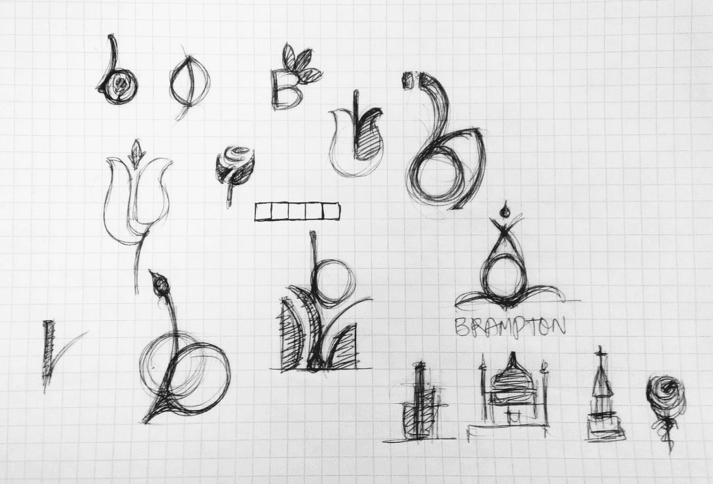
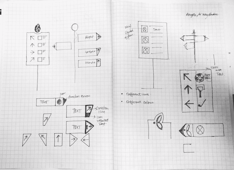
Ideation

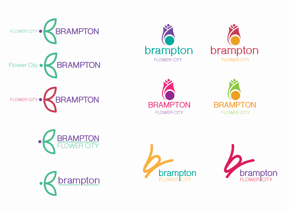
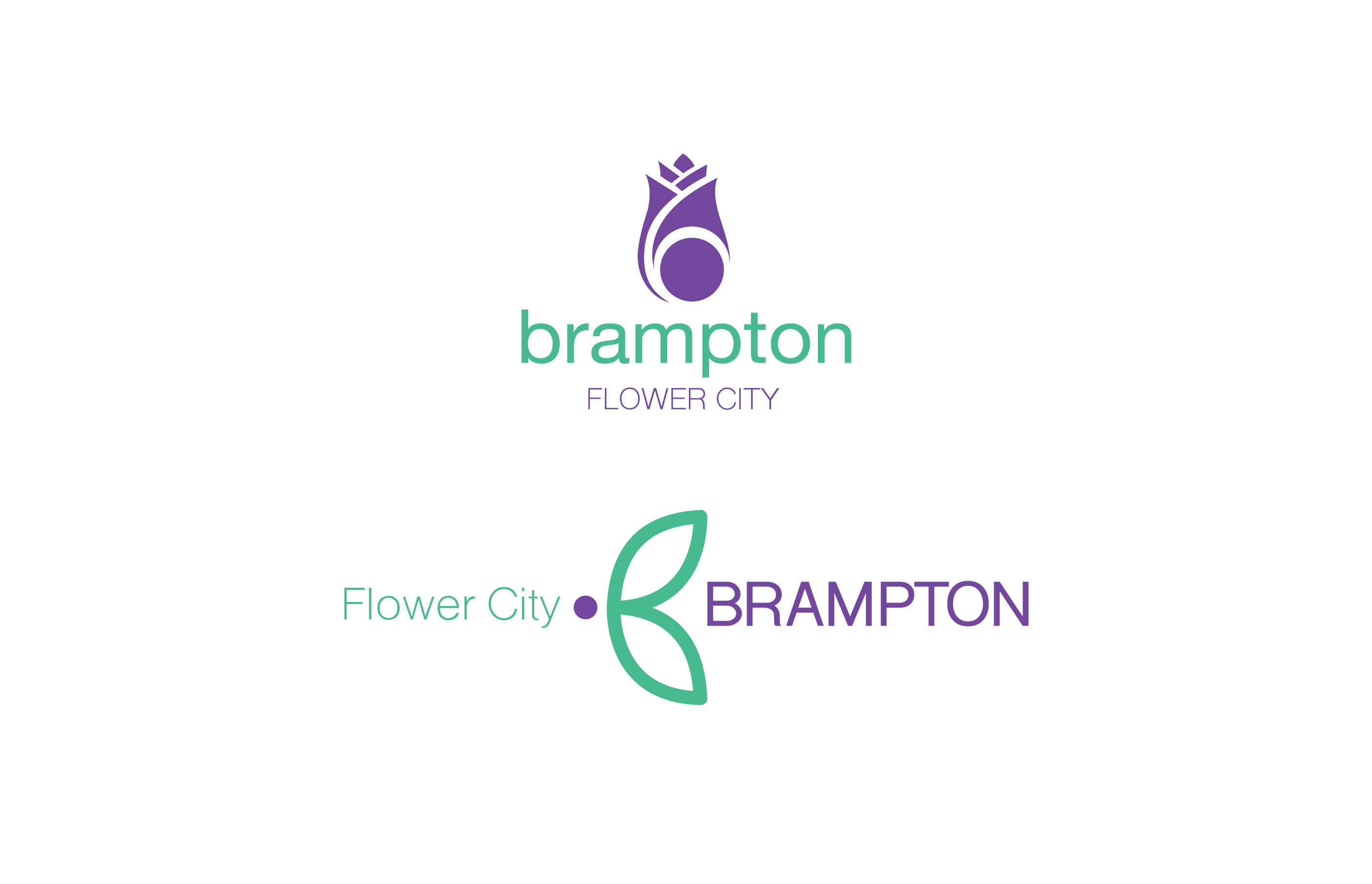
Final Designs
The System Architecture
The Wayfinding System
A Color-Coded Urban Matrix
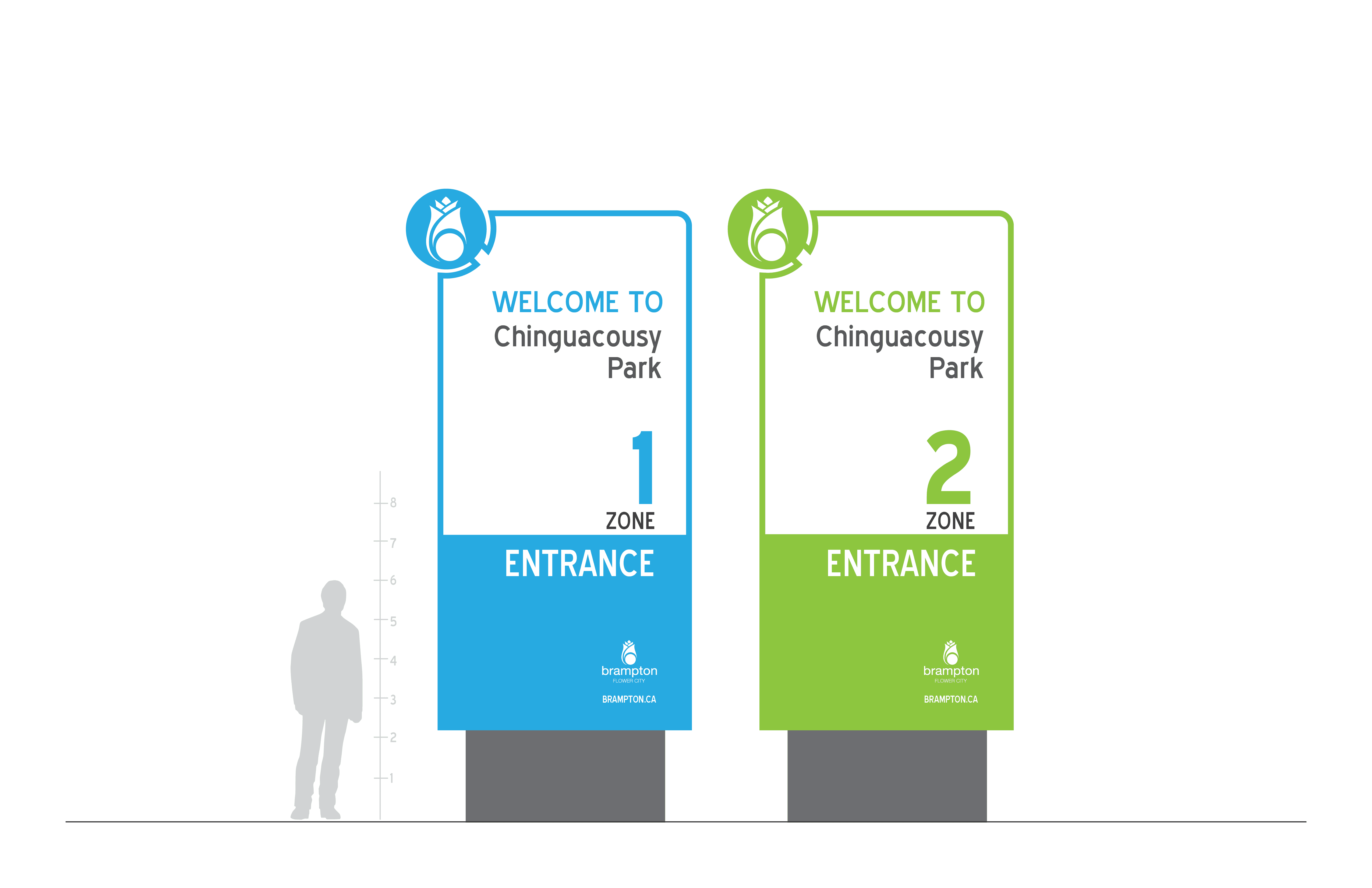
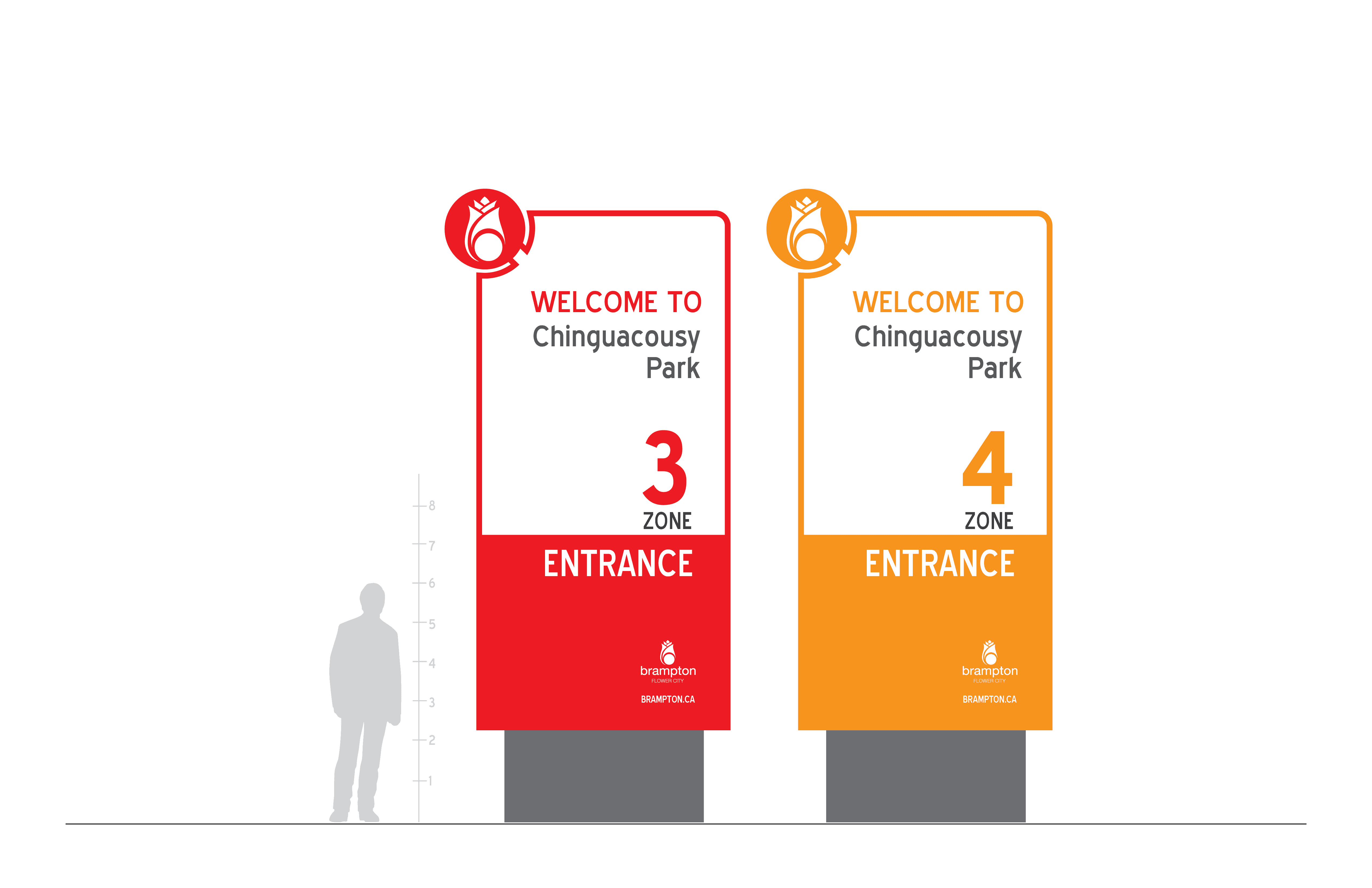
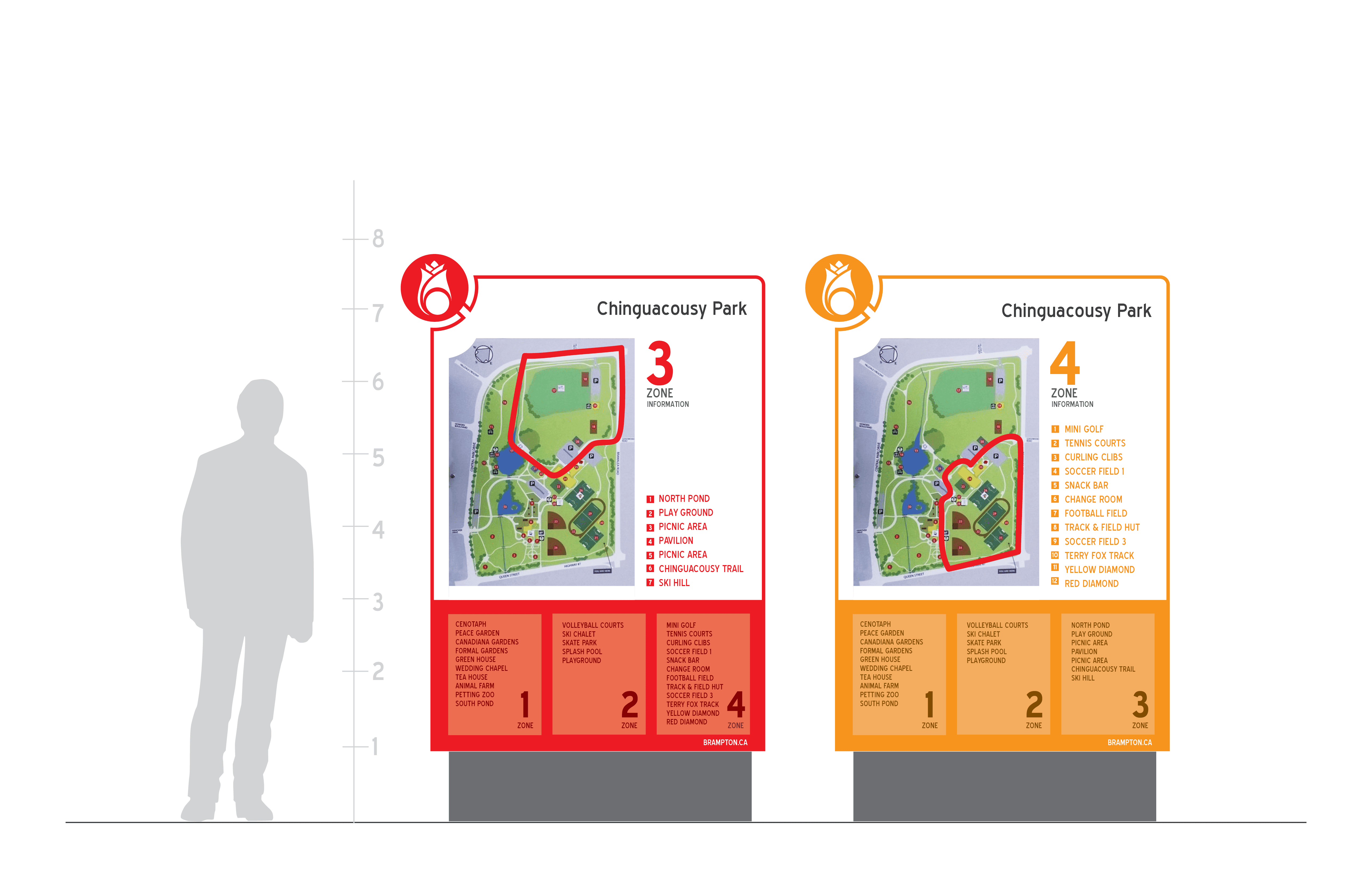
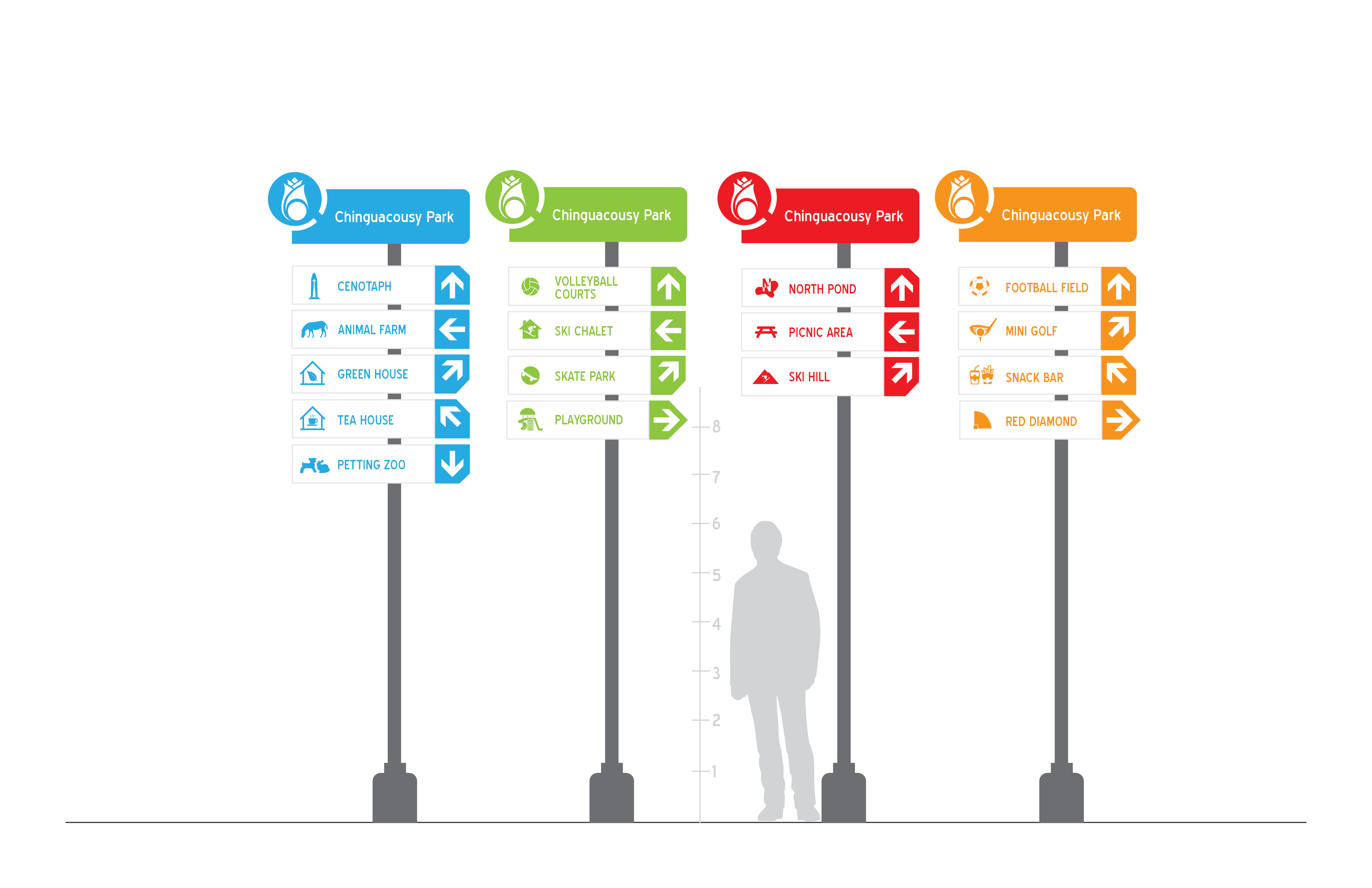
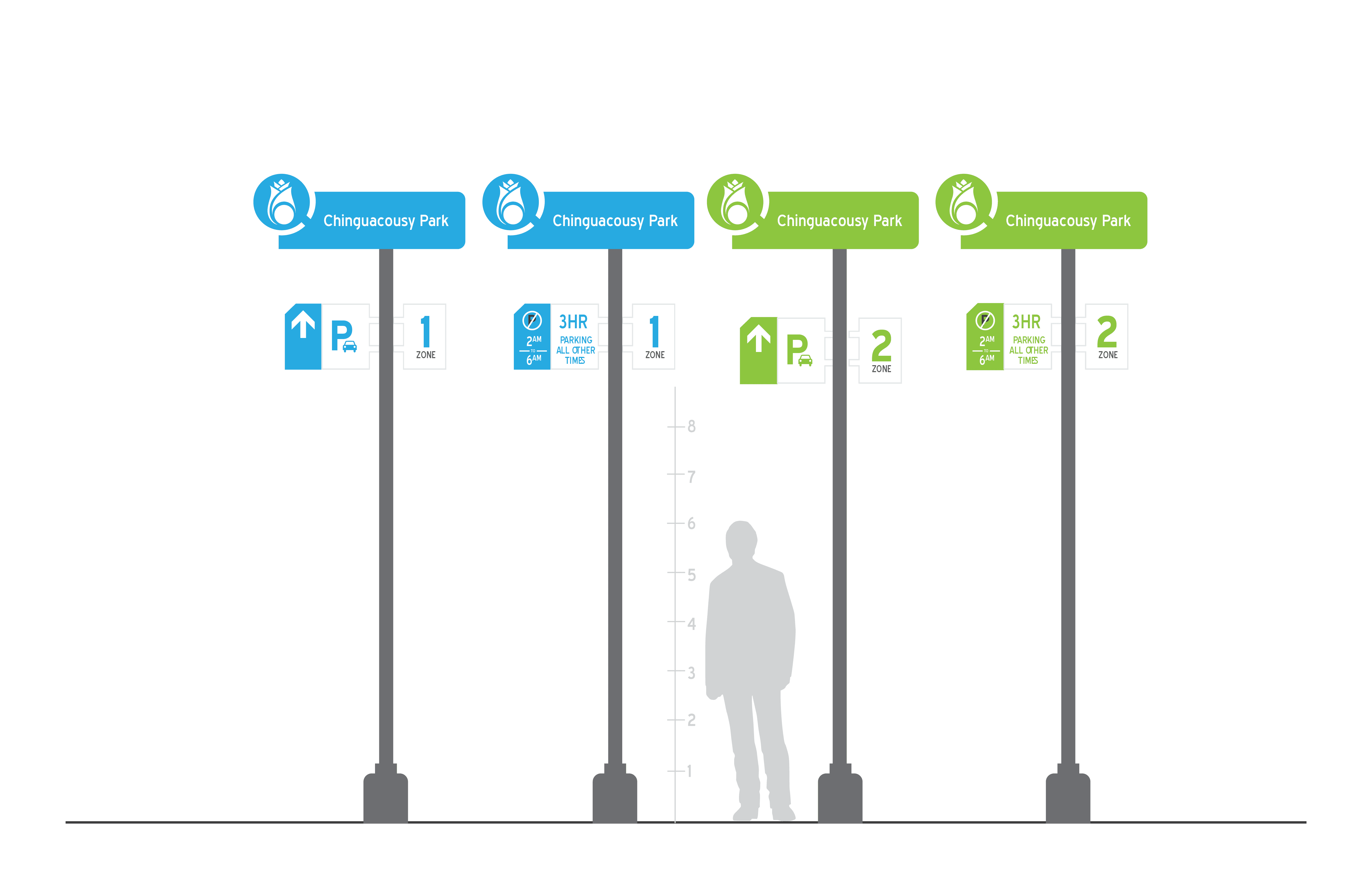
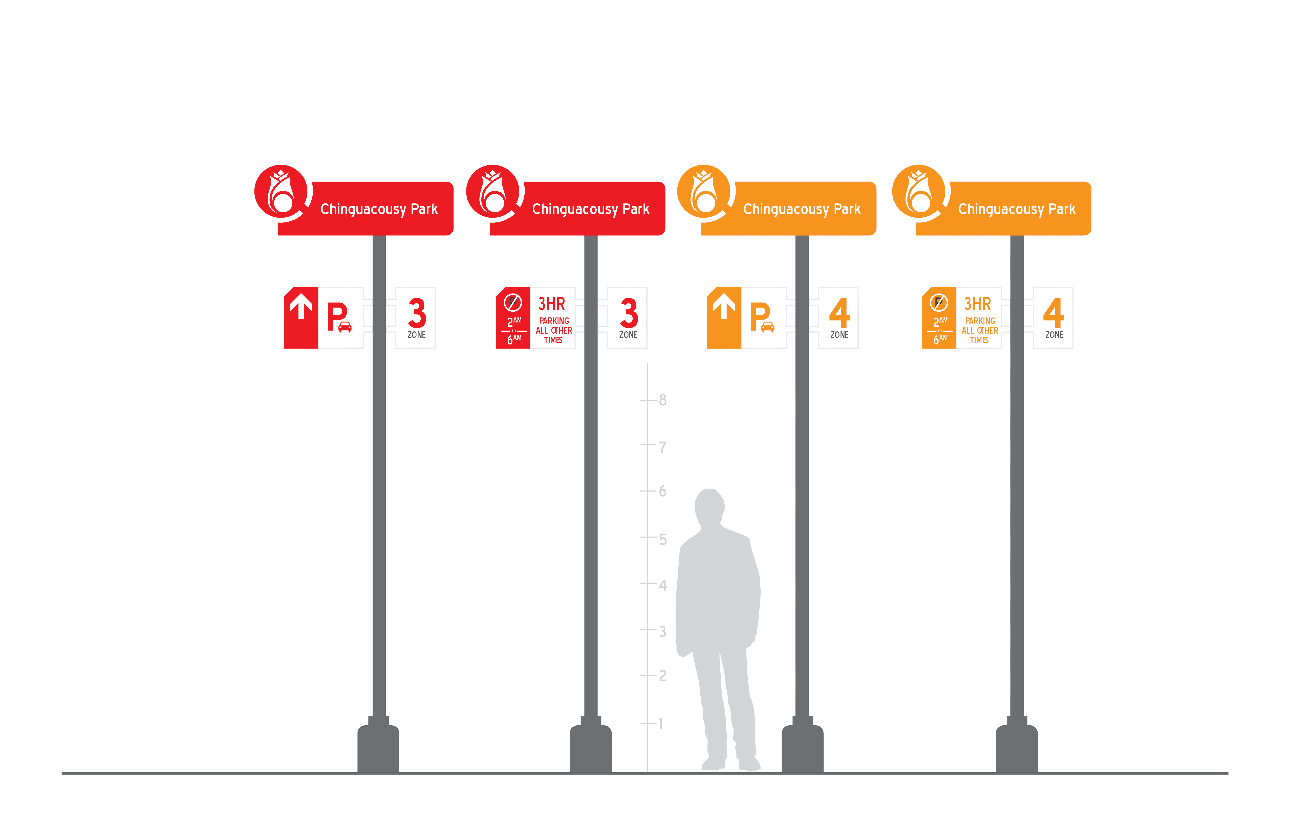
To make navigation instinctive, the city was divided into four distinct color zones. Each zone utilizes a high-contrast palette mapped to specific districts, enabling visitors to orient themselves instantly without relying on dense textual directions.
Zone Mapping
Structured color hierarchy across four primary sectors.
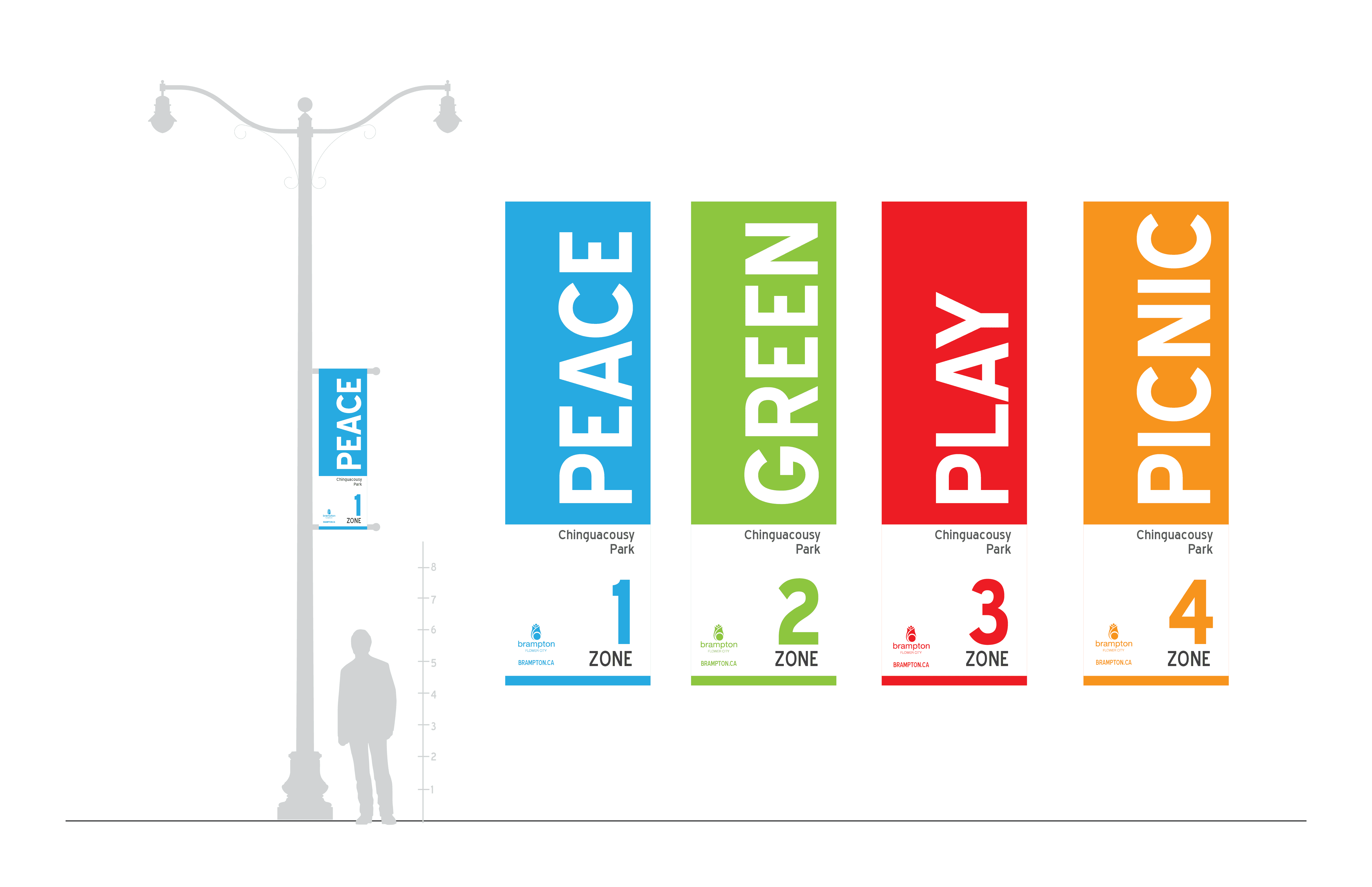
Civic Banners
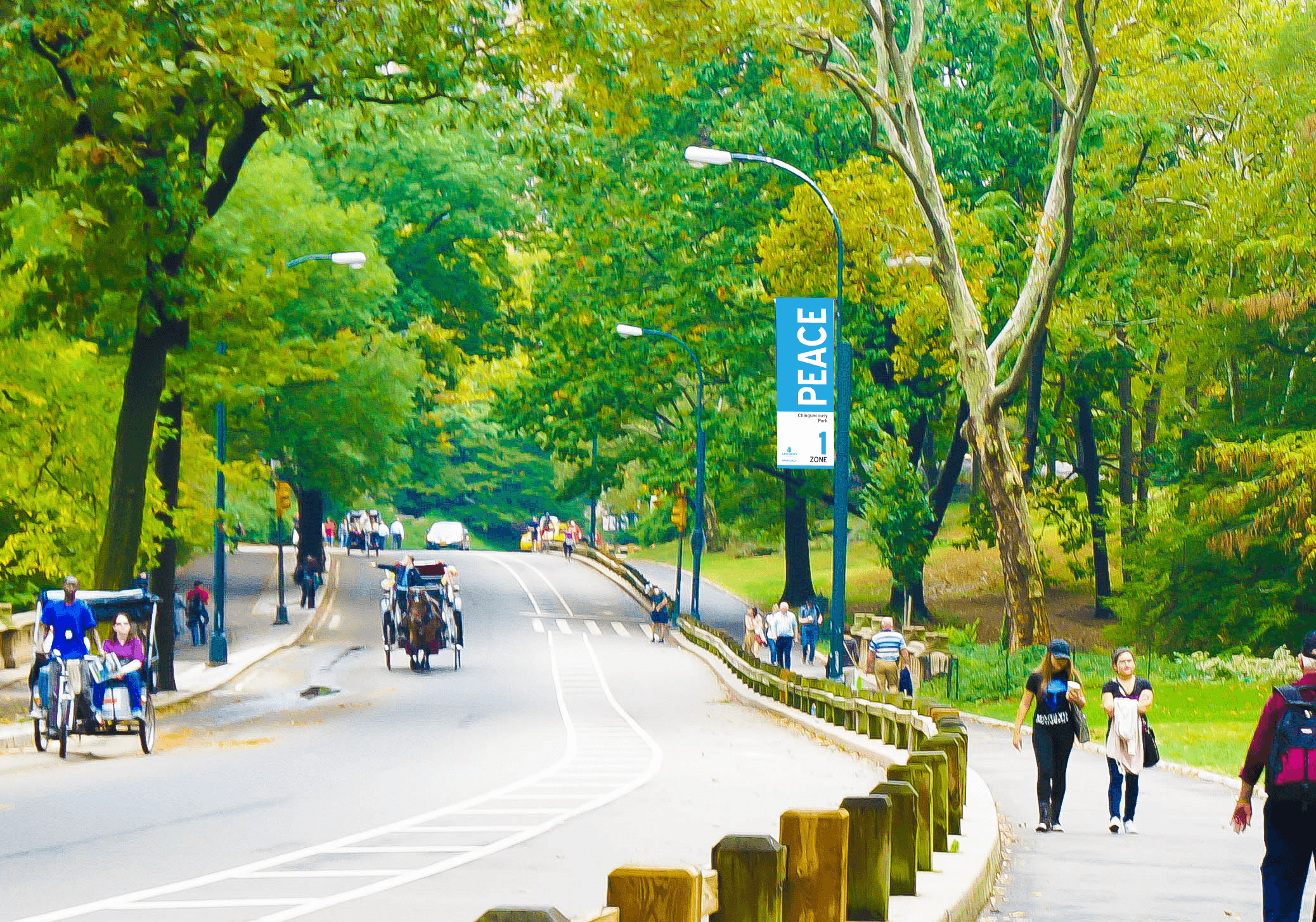
High-visibility vertical assets designed for street poles to reinforce district boundaries.
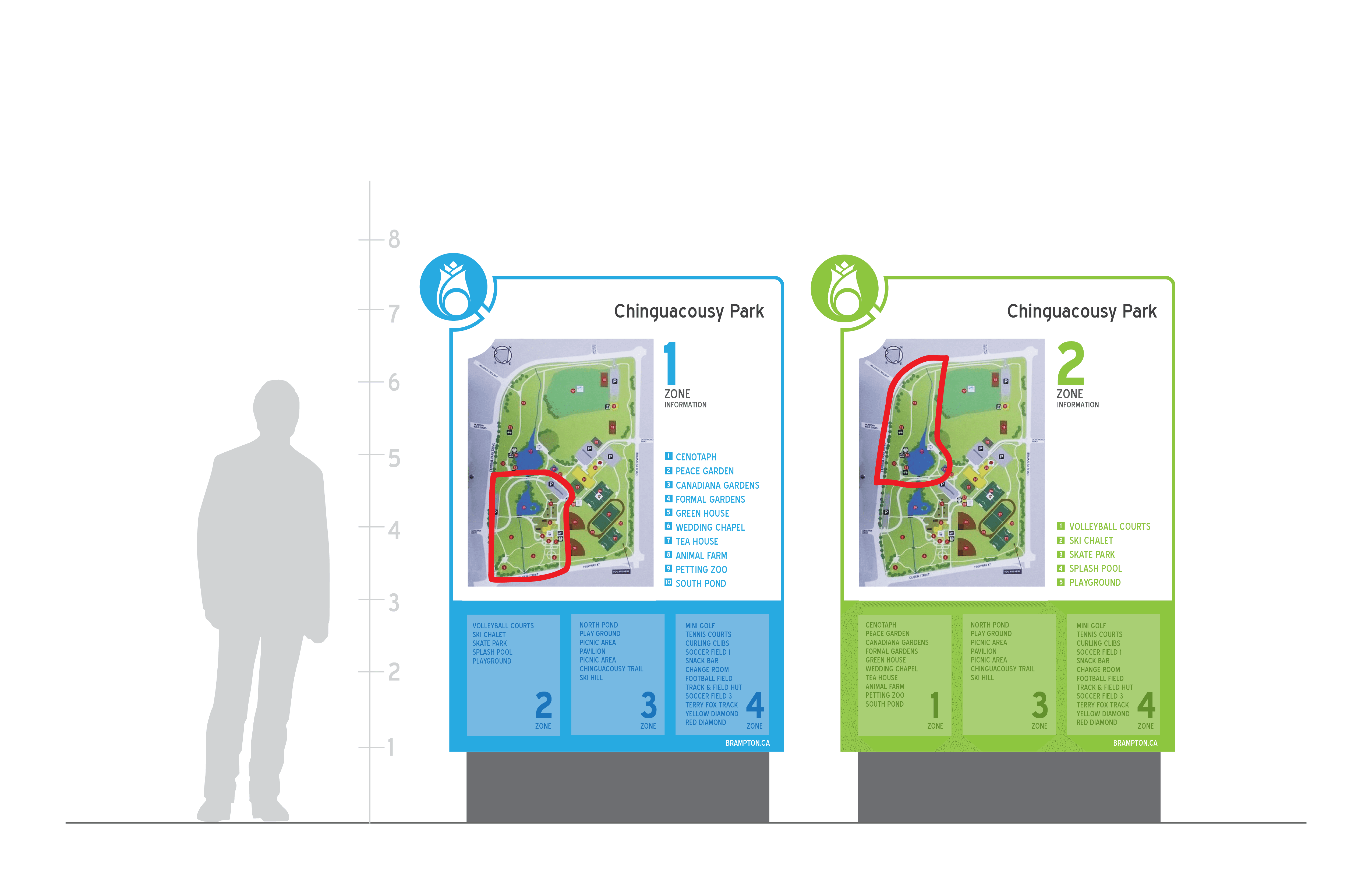
Directory Infrastructure
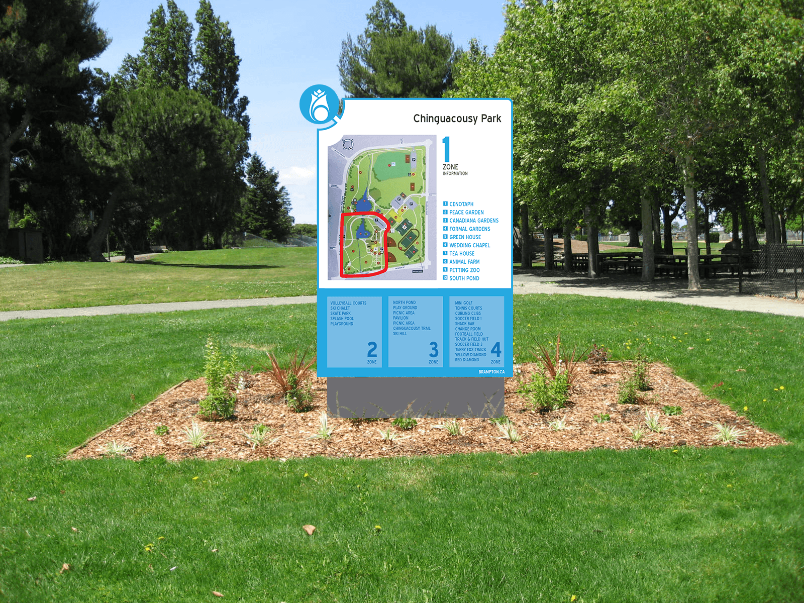
Centralized structural maps with clear "You Are Here" indicators positioned at high-traffic pedestrian hubs.
Structural Signs, Typography & Outcome
Design & Application
Precision Under Real Conditions
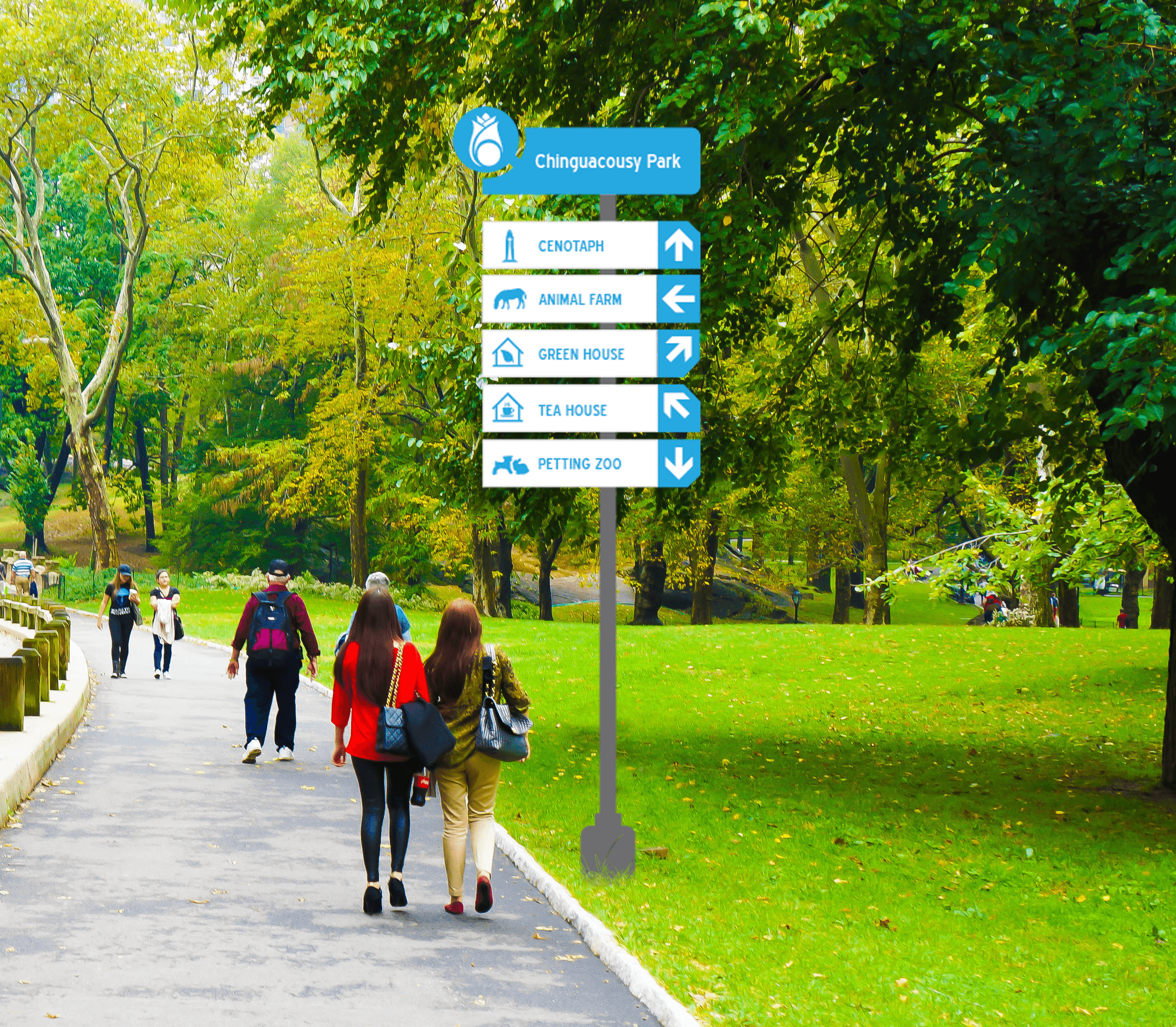
Every sign asset was developed with clear typographic scale constraints using clean, highly readable sans-serif letterforms. The physical enclosures—ranging from pedestrian pylon directories to structural directional signs—were mapped out using exact geometric grids to balance message density with white space.
Typeface
Blue Highway.
Legibility Considerations
Stroke weights and letter-spacing were designed to support rapid recognition at a distance.
Material Integration
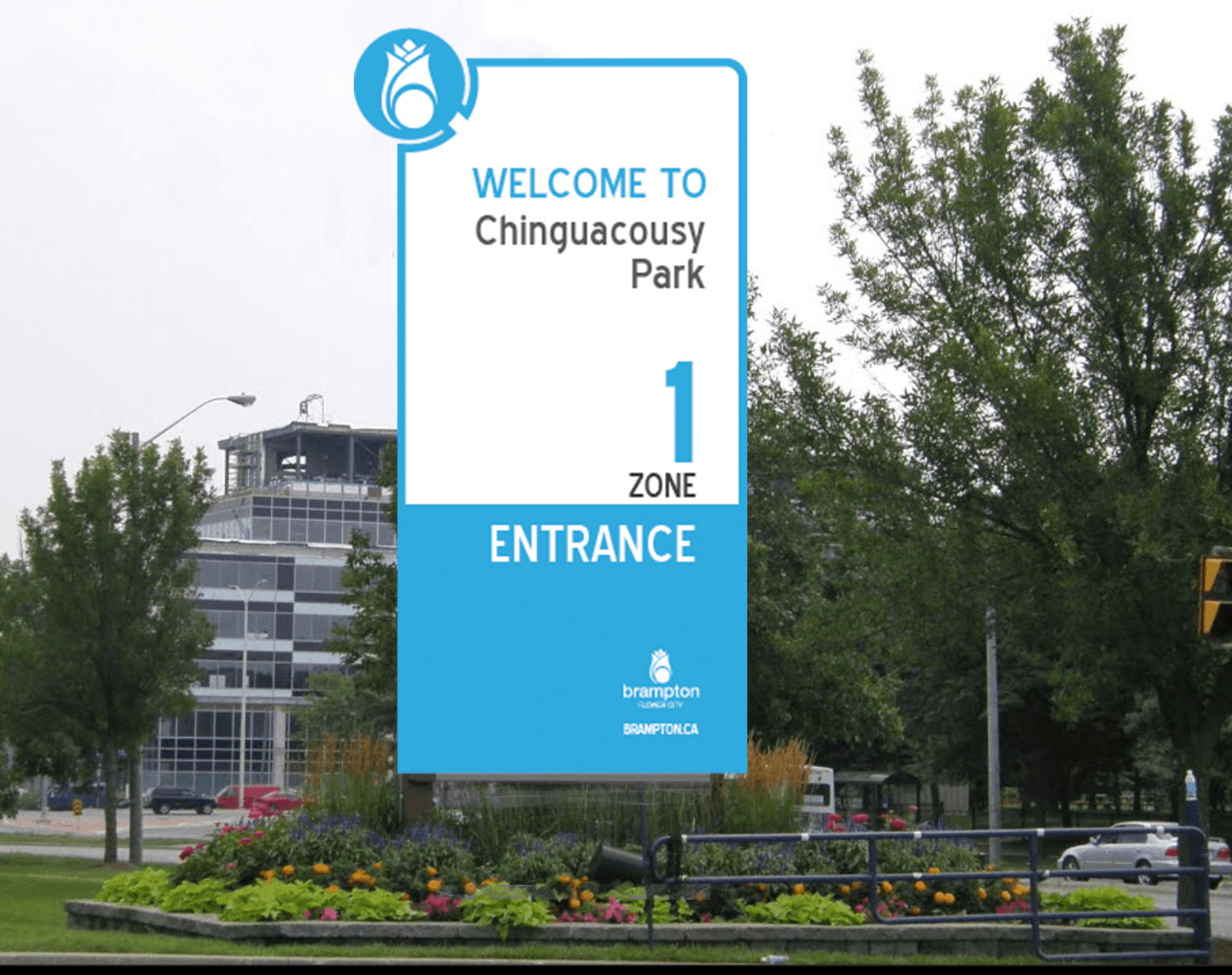
Signage mockups simulate clean, durable industrial finishes that seamlessly integrate into modern public streetscapes.
Reflection and Outcome
This project proved that wayfinding is not just graphic design—it is information architecture mapped onto a physical environment. By prioritizing color theory, typographic hierarchy, and consistent spatial placement, the system transforms a chaotic municipal grid into a legible, welcoming human experience.