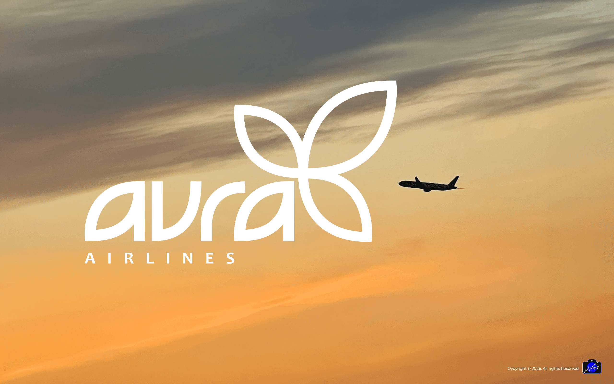
Brand System
Logo · Colour System · Stationery · Brand Application · Icon Graphics
Roles: Graphic Designer · Brand Design Lead
THE BRIEF
About Aura
Aura Airlines is a rapidly growing company as well as a respected mid sized airline. We have a clear vision for the future and a redesigned brand will assist us in meeting our goals. The entire company has been involved in the branding process and the board has sanctioned the final decisions. We are excited about our future as a well branded airline.
Any company needs to be well branded but this is especially true of an airline. Passengers want to feel they are flying with a strong, welcoming airline that prioritizes safety above all else. The brand must communicate this identity to the public clearly, consistently, and accurately at all times.

BRAND IDENTITY
Logo Design
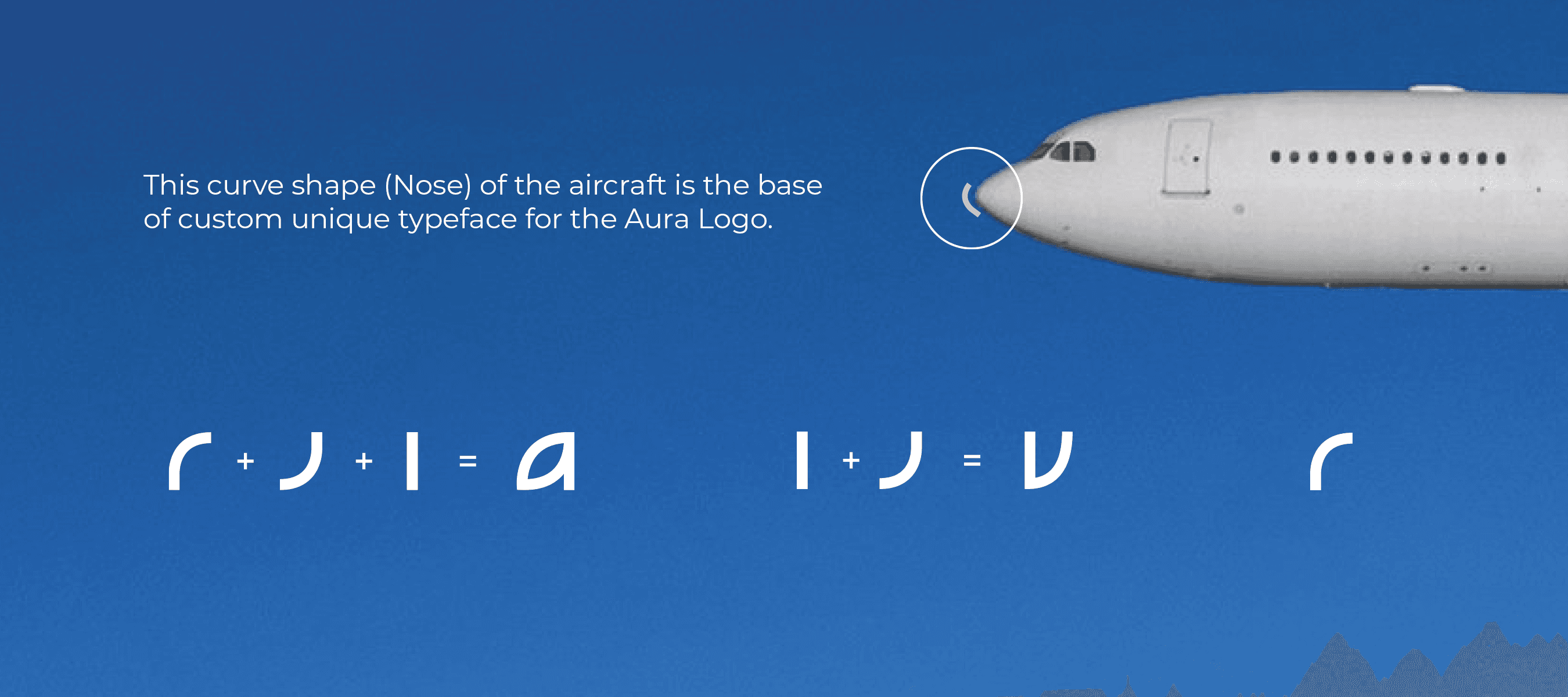
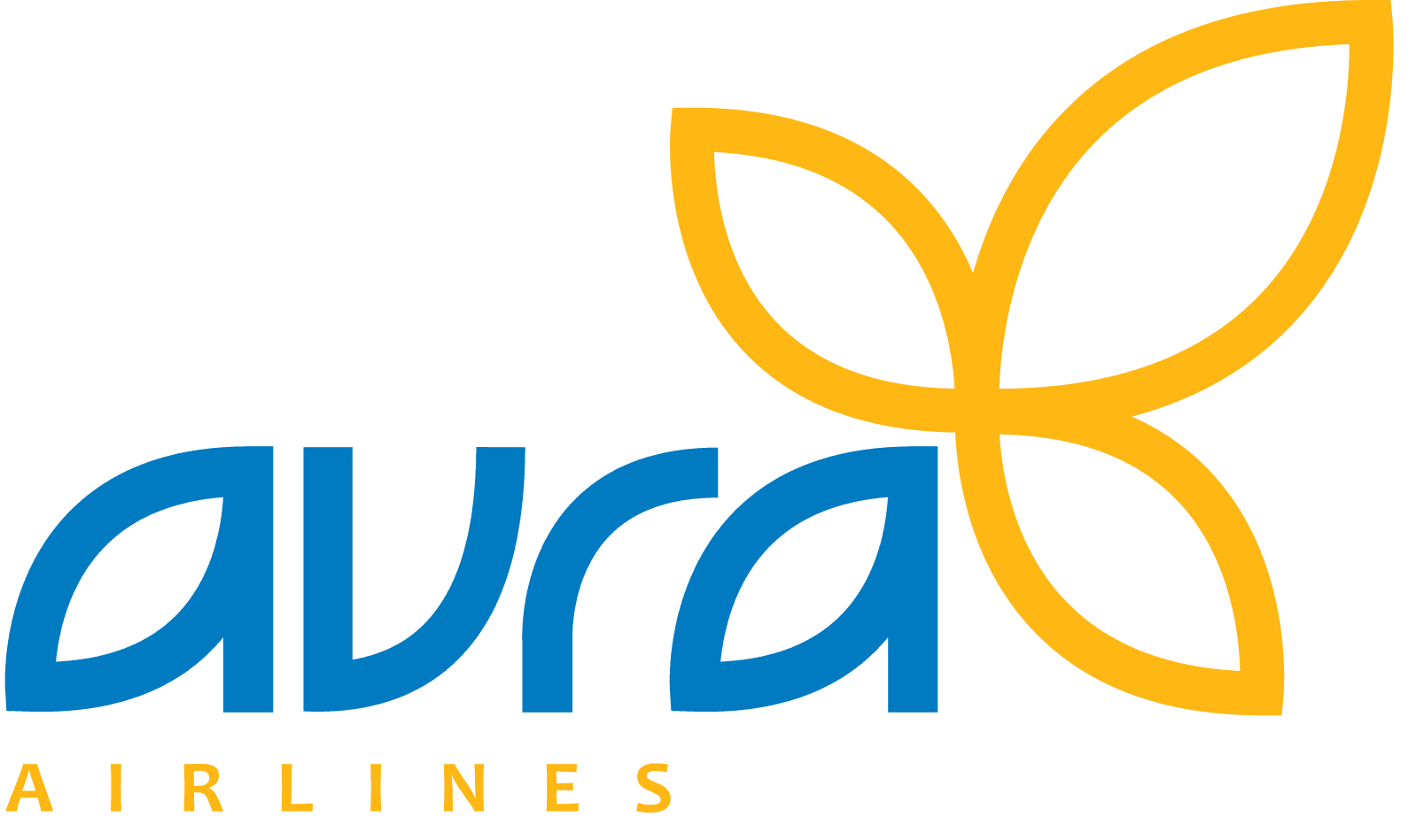
The Aura logotype features custom letterforms designed to evoke a sense of atmosphere and motion. The curves within the typography reference the streamlined nose of an aircraft, while the three upward-pointing leaves symbolize reaching the zenith of success. The overall silhouette reflects structural aviation lines. The isolated brand symbol can be deployed independently depending on spatial constraints, balanced precisely using a calculated safety area method."
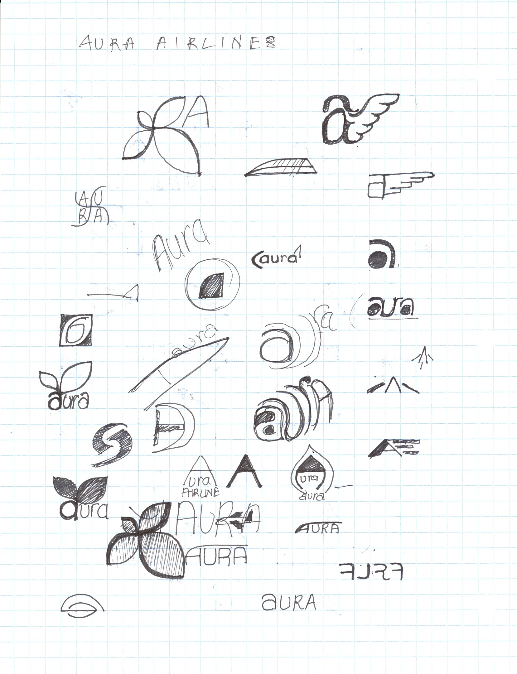
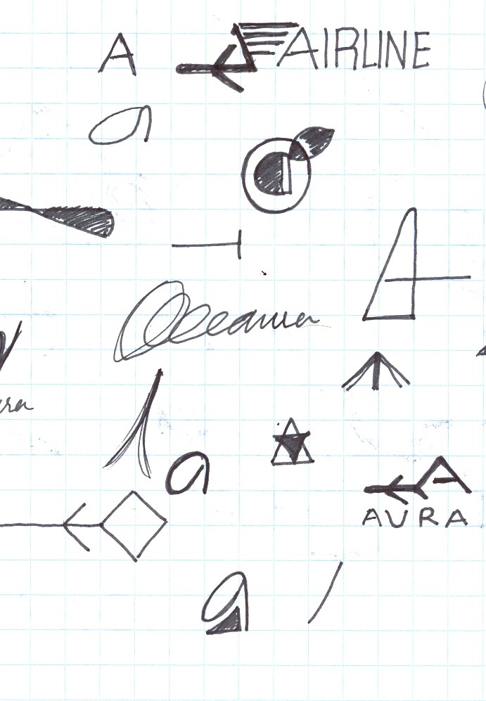
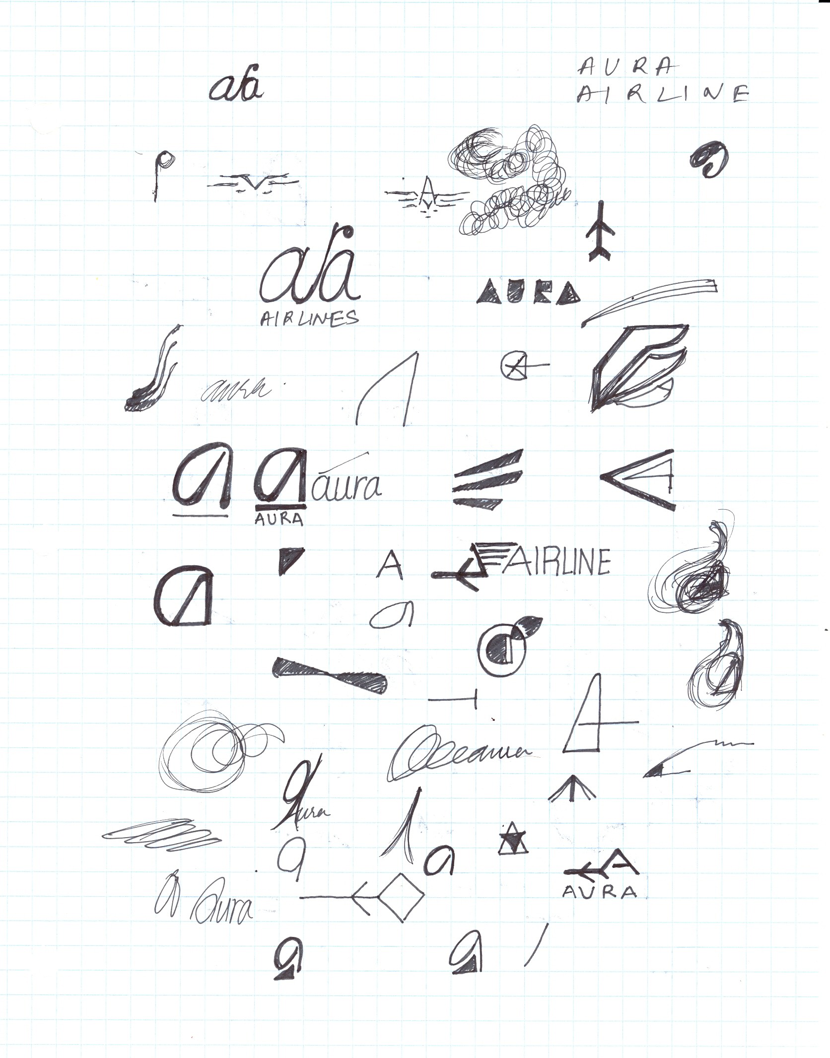
Rough Sketch
COLOUR SYSTEM
Aura Colours
Aura means Atmosphere, scent, mood, feeling.
Pantone 300
R252 - G177 - B22
C0 - M34 - Y100 - K0
Pantone 134
R0 - G121 - B193
C100 - M44 - Y0 - K0
Black 90% / K90
Black 60% / K60
TYPOGRAPHY
Stationery Design
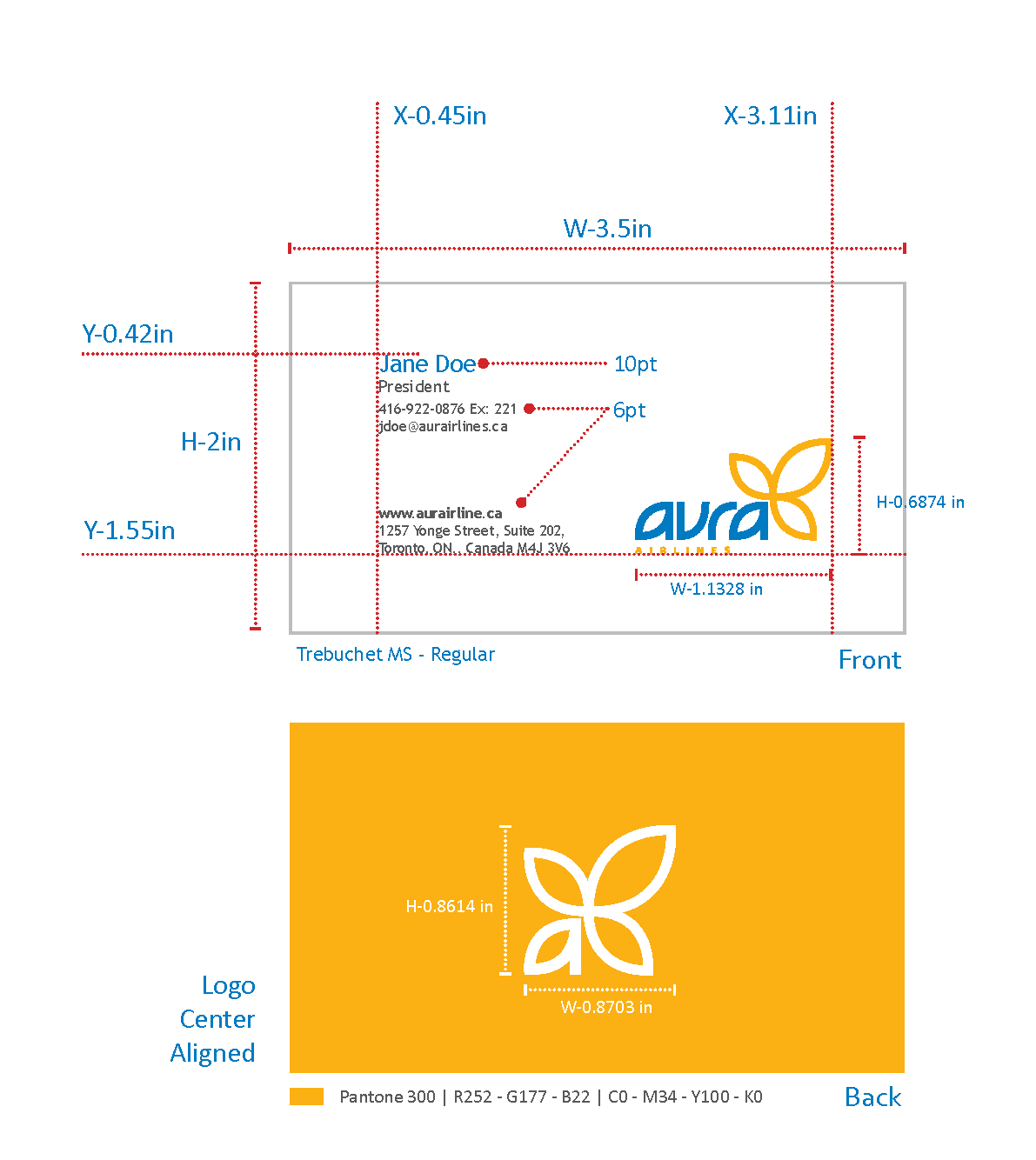
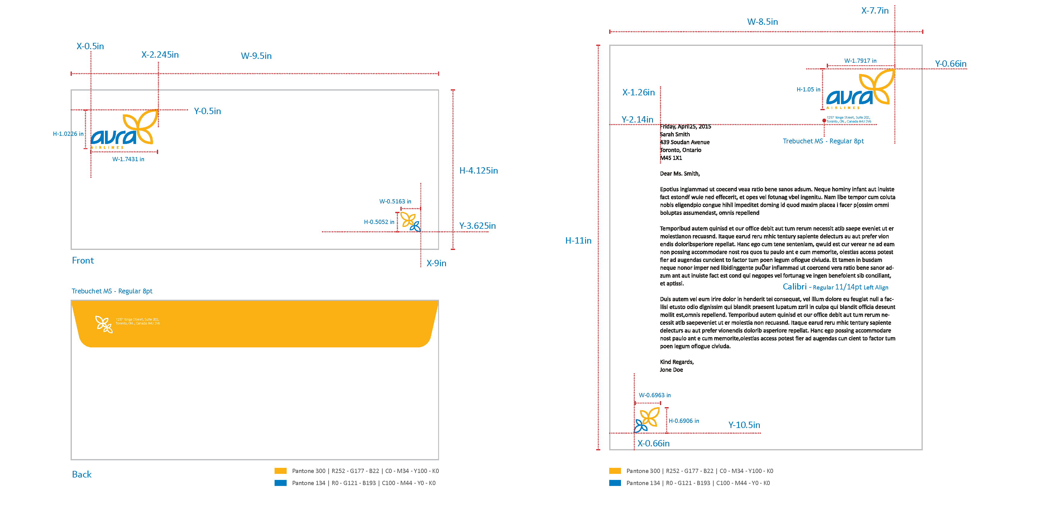
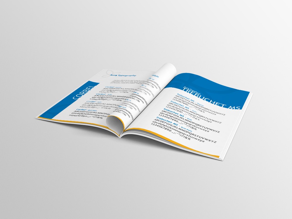
The two fonts used in the Aura Airlines identity are Corbel and Trebuchet. A number of complimentary fonts have been established. Stationery letter body copy is Calibri. The body copy font for print materials is Corbel, Trebuchet.
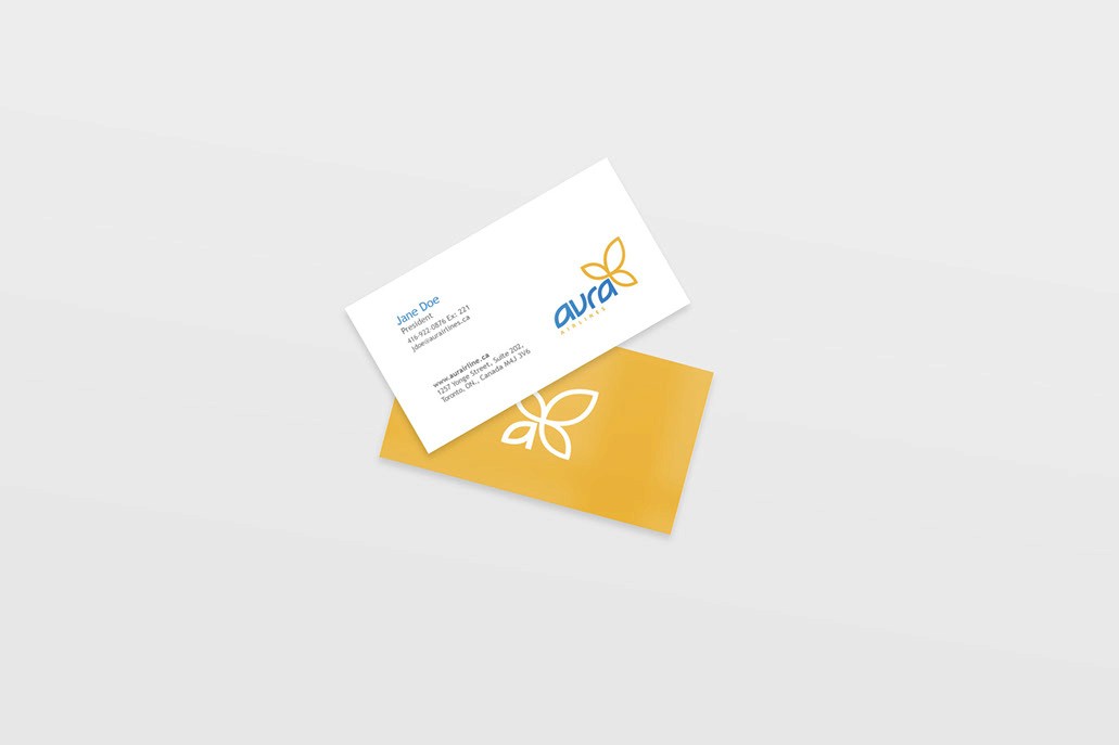
Business Card
Envelope & Letterhead
IDENTITY MANUAL
Print Guidlines
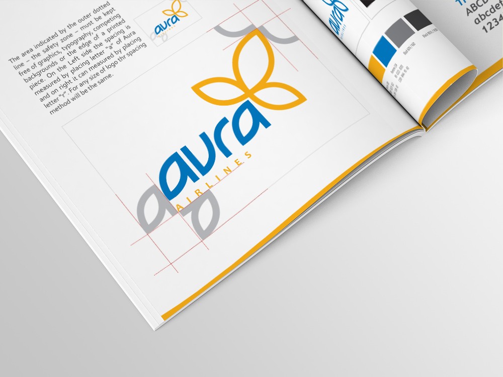
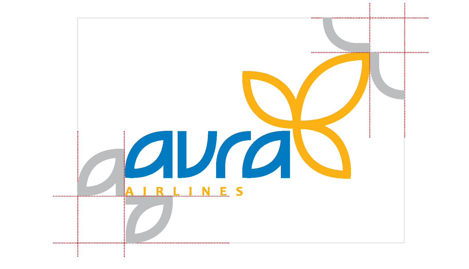
The area indicated by the outer dotted line – the safety zone – must be kept free of graphics, typography, competing backgrounds or the edge of a printed piece. On the Left side the spacing is measured by placing letter “a” of Aura and
on right it can measured by placing letter “r”. For any size of logo the spacing method will be the same.
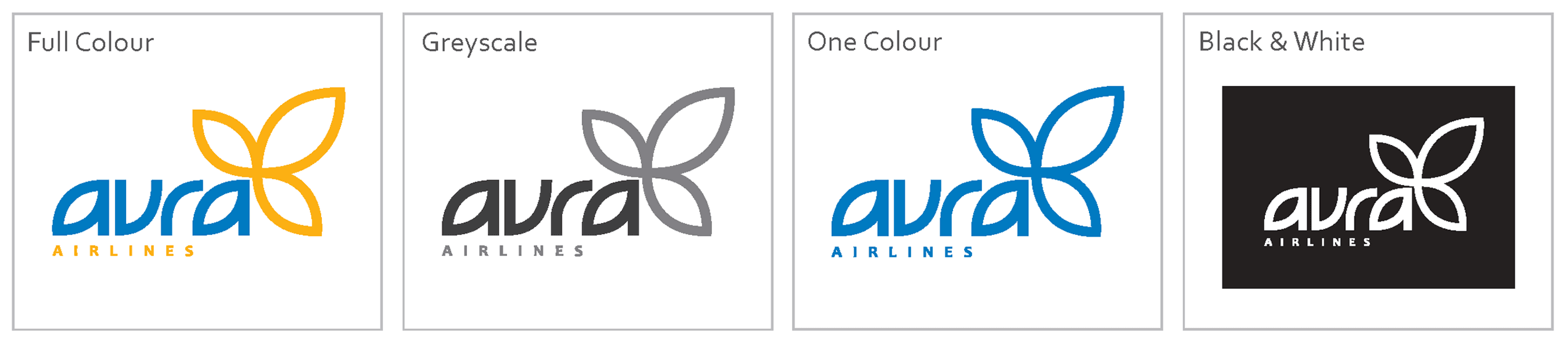
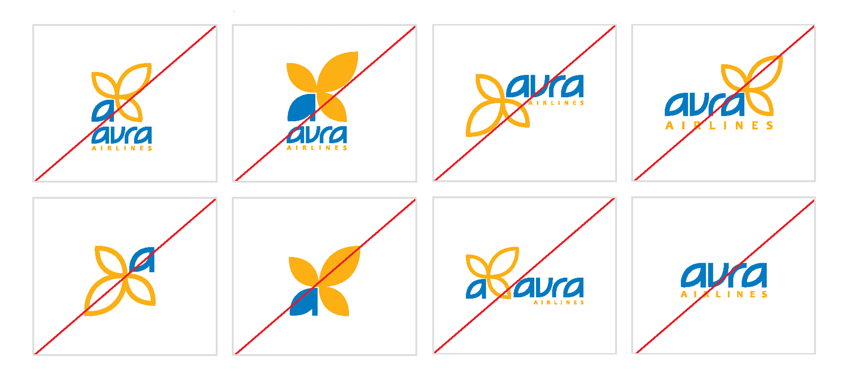
Aura Logo’s can’t be used in these formations. The Placement of the element and design should on the actual placement of design. The colours of the logo must always remain consistent.
MARKETING
Brand Application