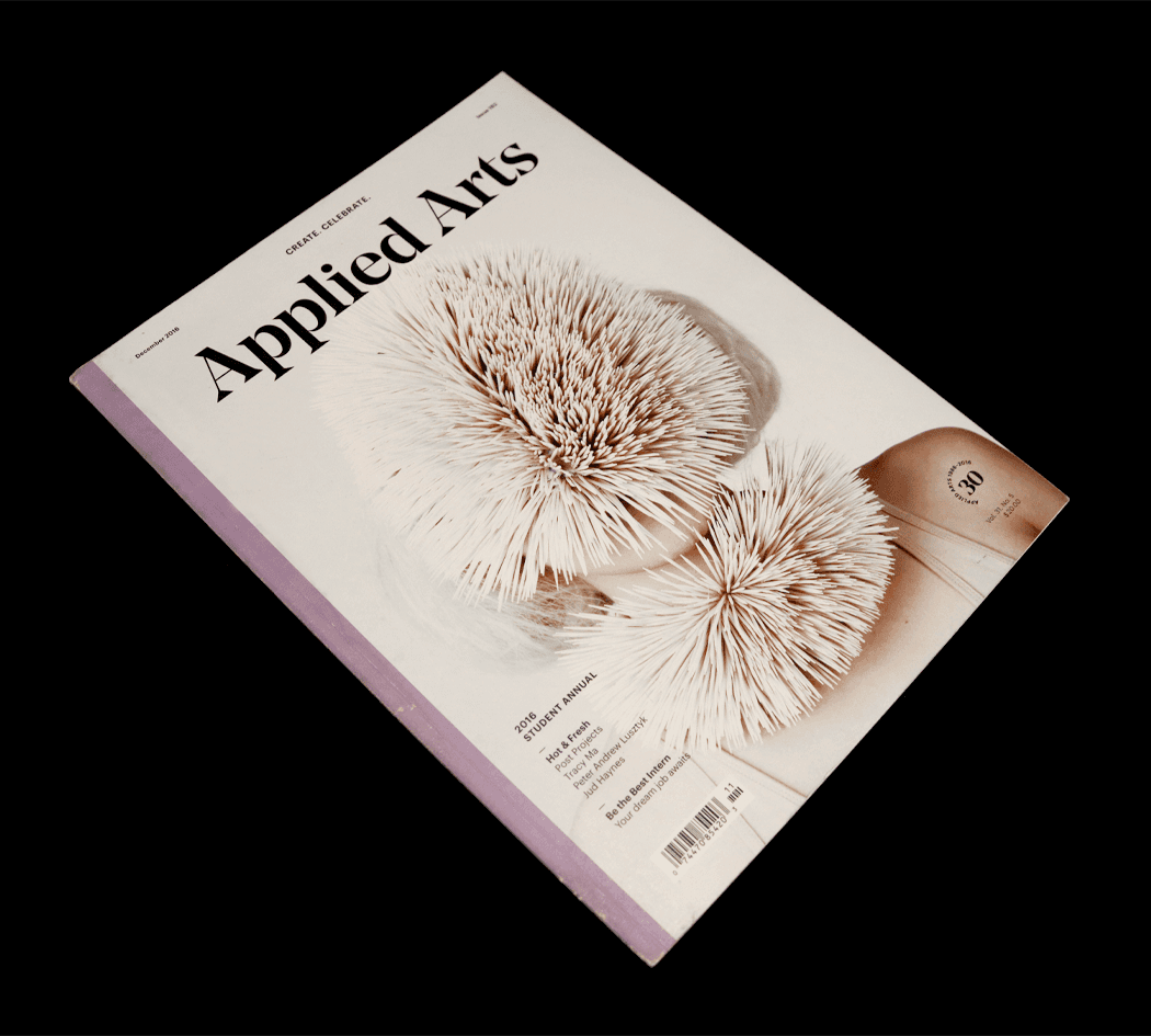
🏆 APPLIED ARTS AWARD — PUBLISHED 2016
Visualization
14 Days Data Research · Visual · Typography · Concept
Roles: Visual Designer
THE BRIEF
Personal Data Visualization
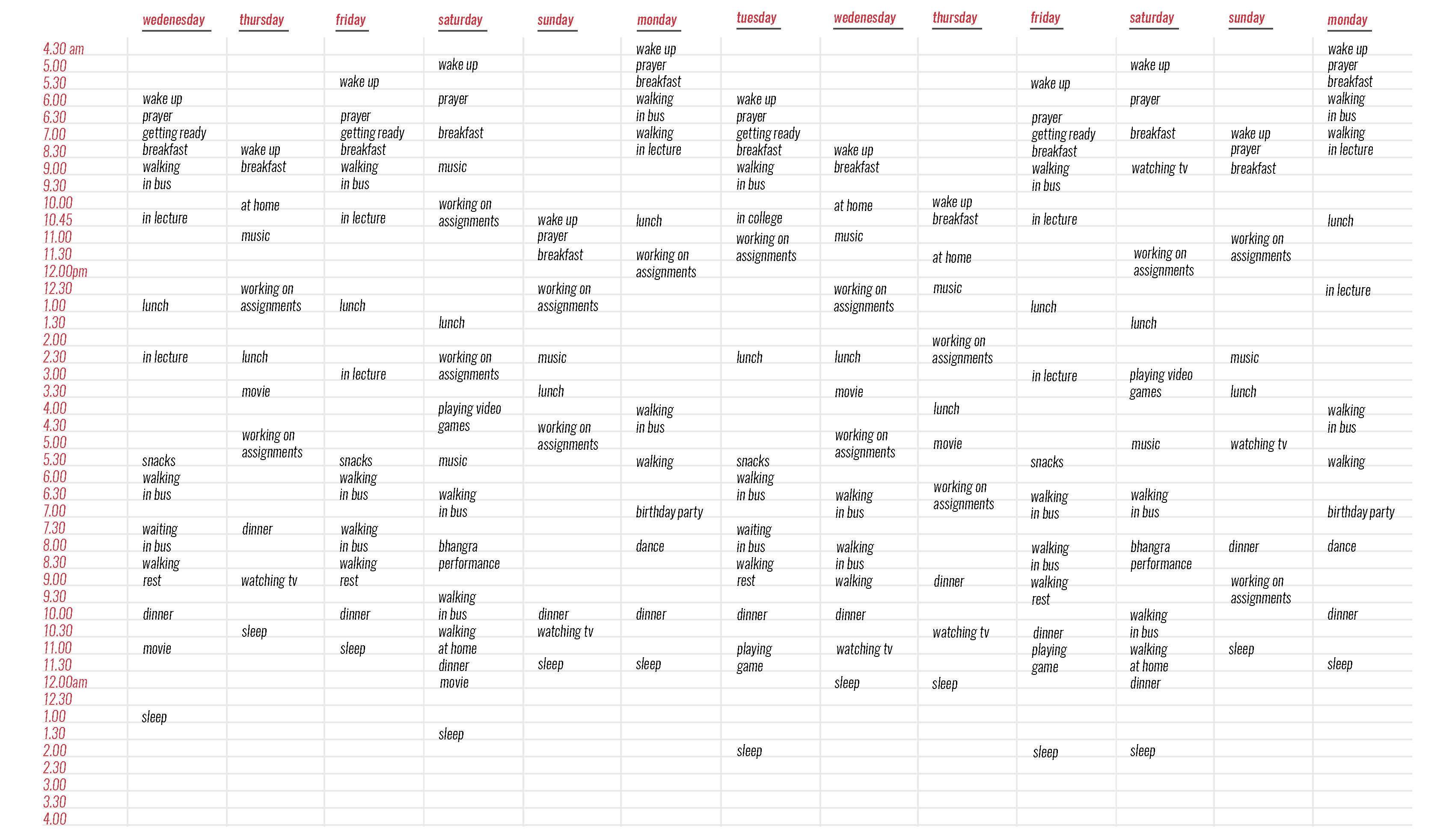
An intensive personal data logging experiment. Over a continuous 14-day period (January 28 to February 10), I tracked my life hour-by-hour, recording the exact duration of daily activities to explore human behavioral patterns through abstract information architecture.
SKETCHES
Ideation
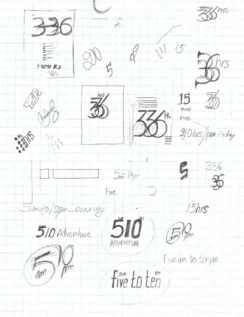
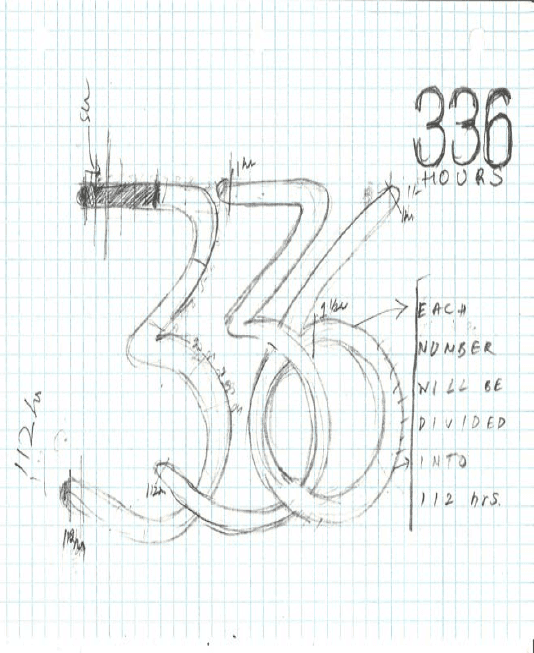
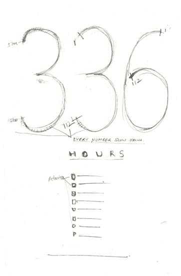
We begin with knowing that there are 336 hours in 14 days span.
TYPOGRAPHY
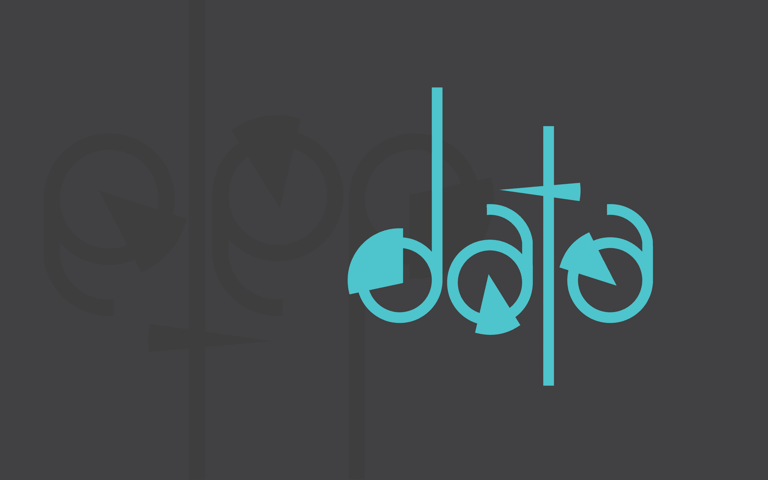
Typefaces
Exploration
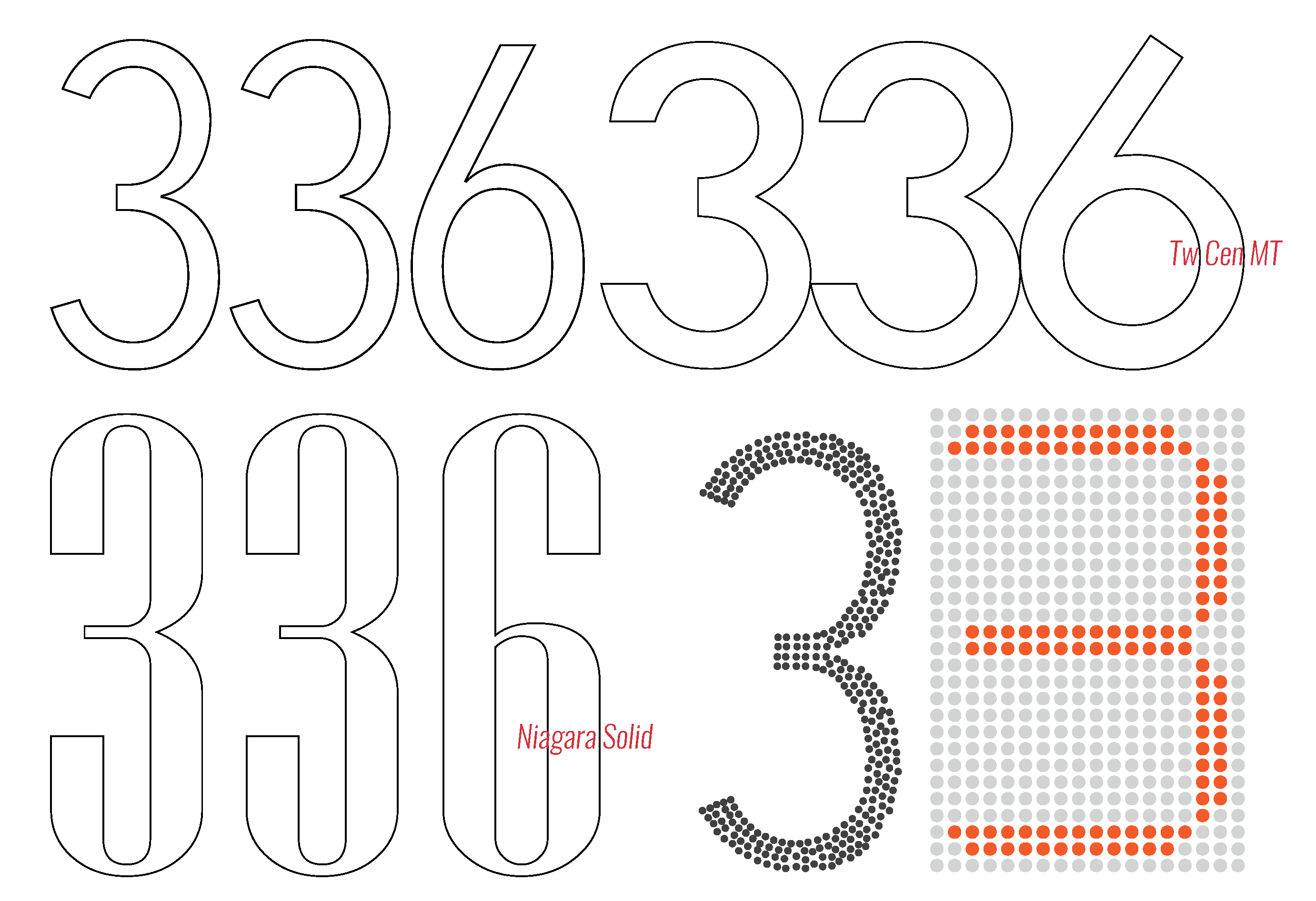
Font Used: TwCen MT
VISUAL LANGUAGE
Color Palette
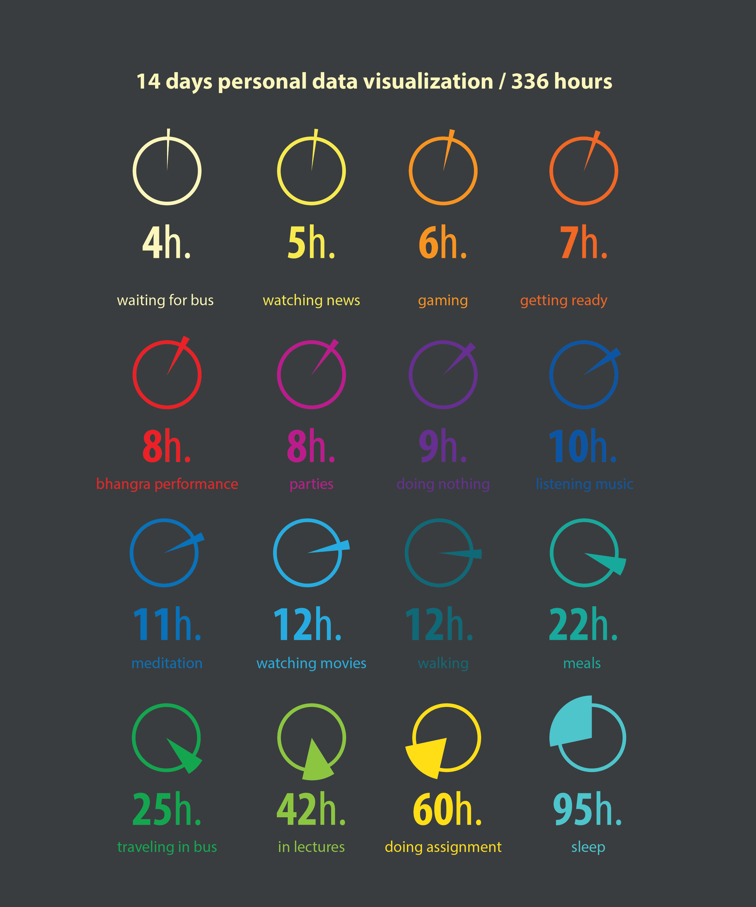
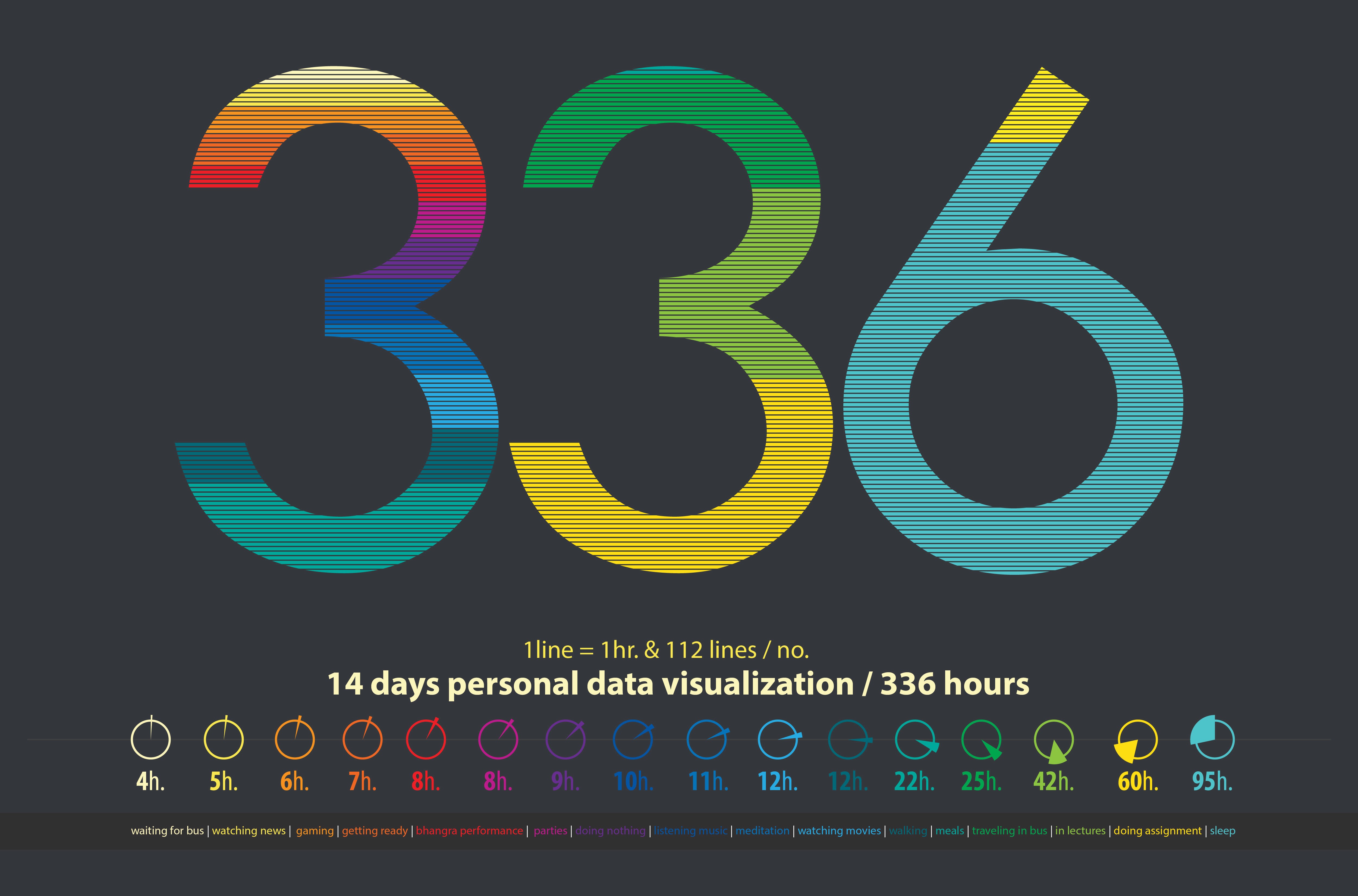
Each selected color represents different activities performed during the 14 days period.
Waiting for Bus
Watching News
Gaming
Getting Ready
Bhangra Performance
Parties
Doing Nothing
Listening Music
Meditation
Watching Movies
Walking
Meals
Traveling in Bus
In Lectures
Doing Assignment
Sleep
IDEATION
Digital Roughs
The Mathematical Matrix
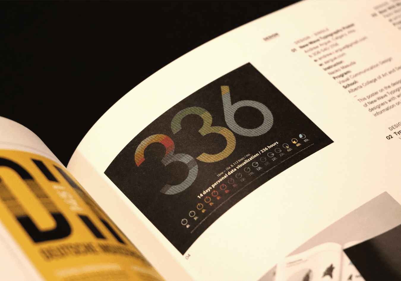
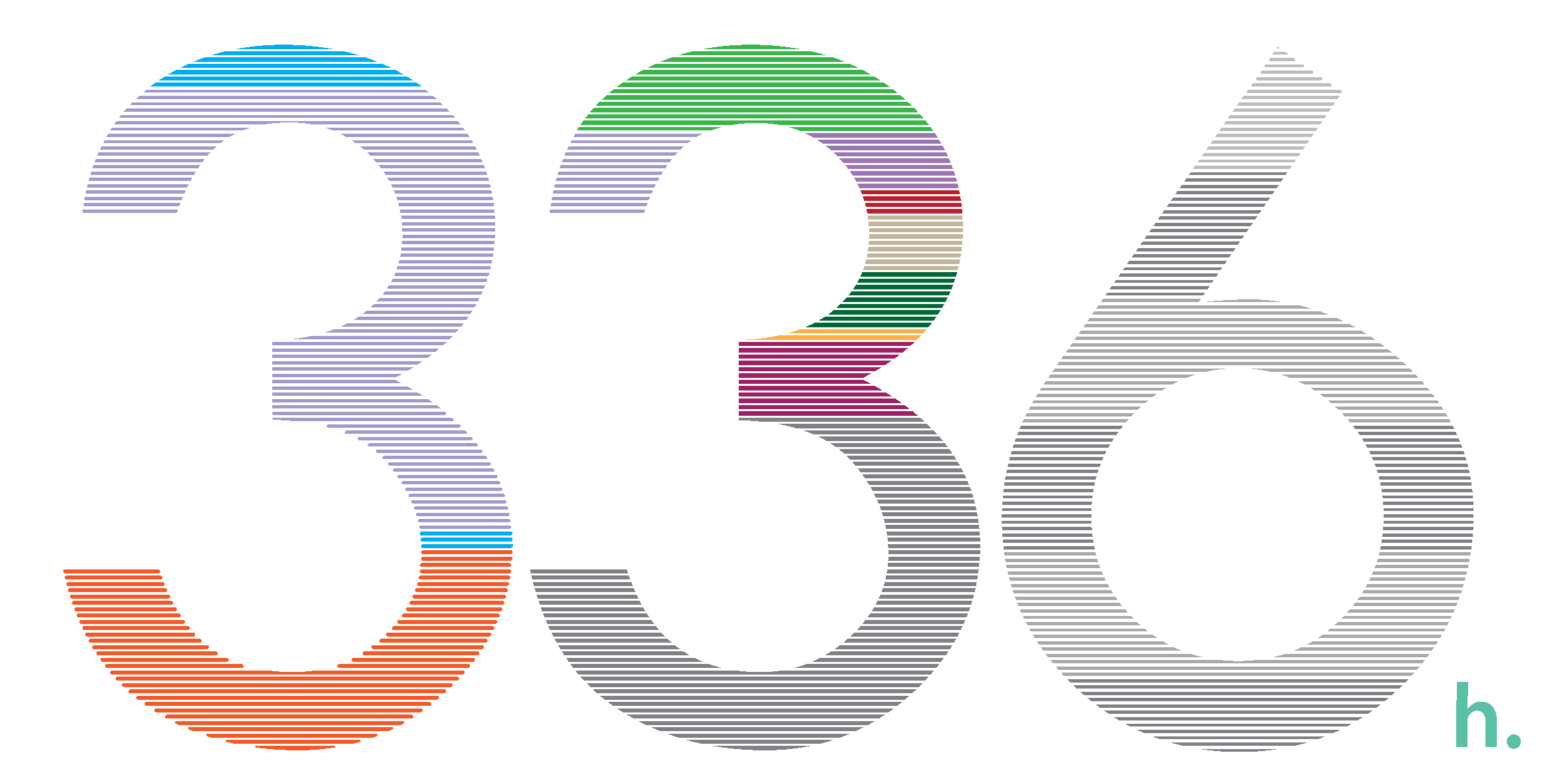
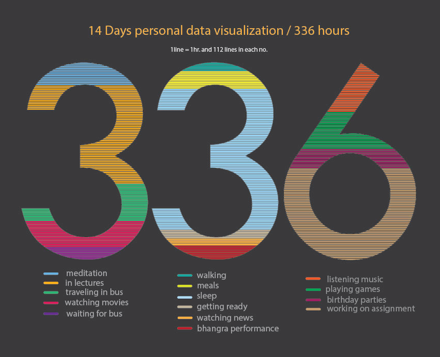
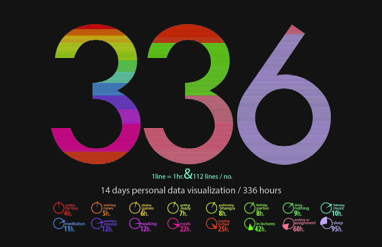
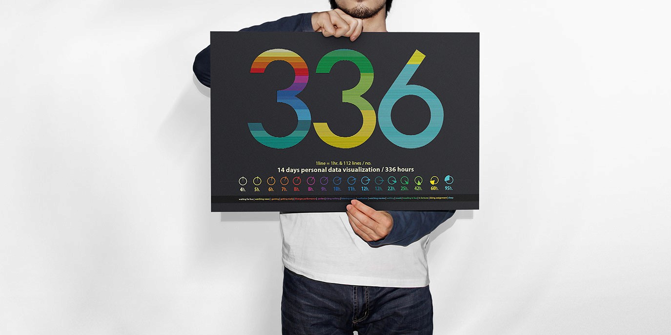
The total data pool spans 336 individual hours. To visually translate this data, the illustration is divided into three typographic glyphs—"3", "3", and "6"—with each digit composed of exactly 112 vector data stripes (112 X 3 = 336).
Each individual colored line corresponds to exactly one hour of documented time, with the thickness of the color
blocks expanding relative to the cumulative duration of that specific activity.
Final Design
RECOGNITION & PUBLICATION
Applied Arts
Design Award
This project was selected and published in the December 2016 print issue of Applied Arts Magazine,
recognizing conceptual excellence in creative data visualization..